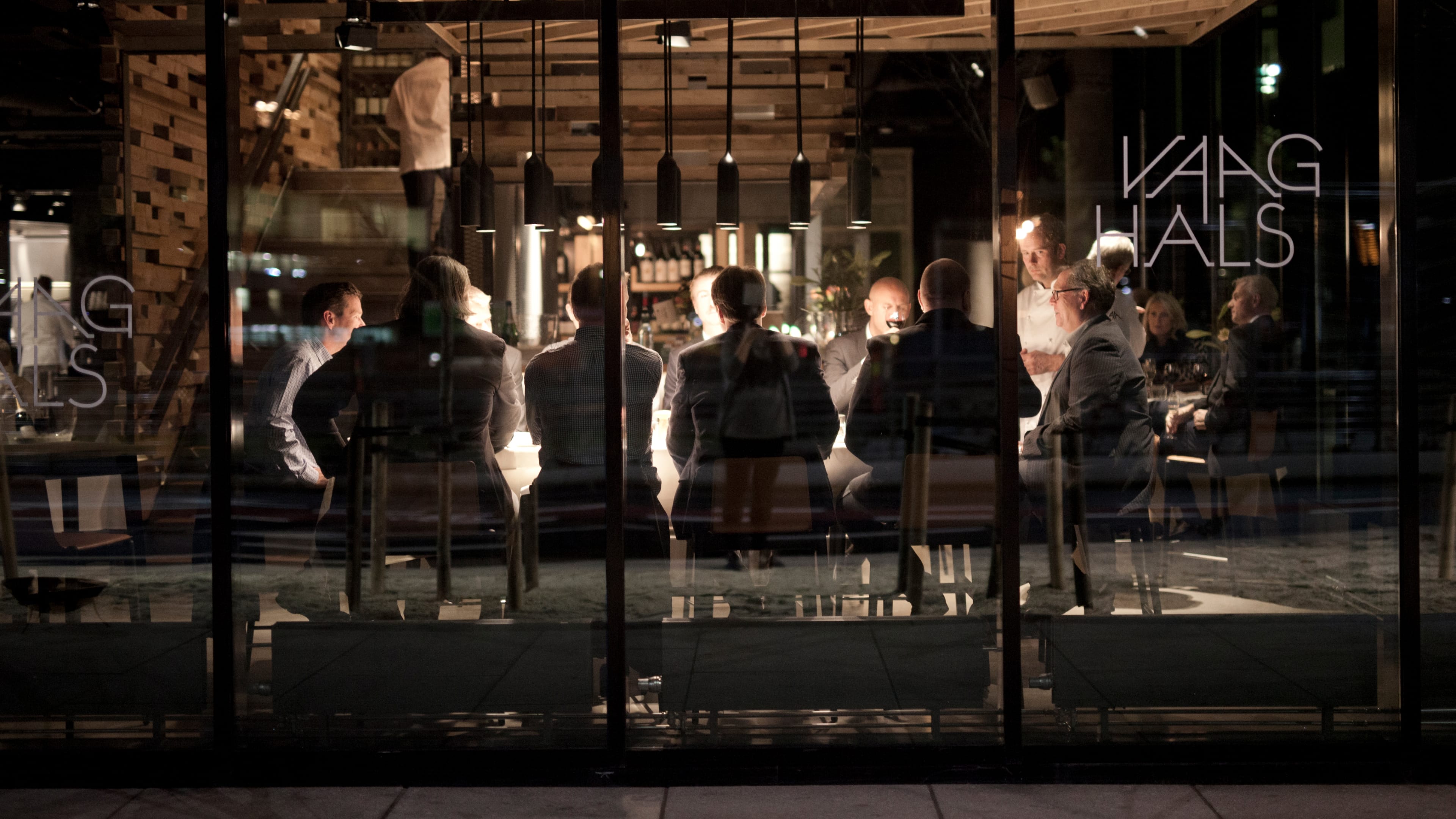
Vaaghals is a new restaurant in the Barcode area in Oslo, Norway. Evoking the traditional Sunday dinner, the finest Norwegian ingredients are combined into delightful platters and shared around the table like a Nordic take on ‘tapas’.
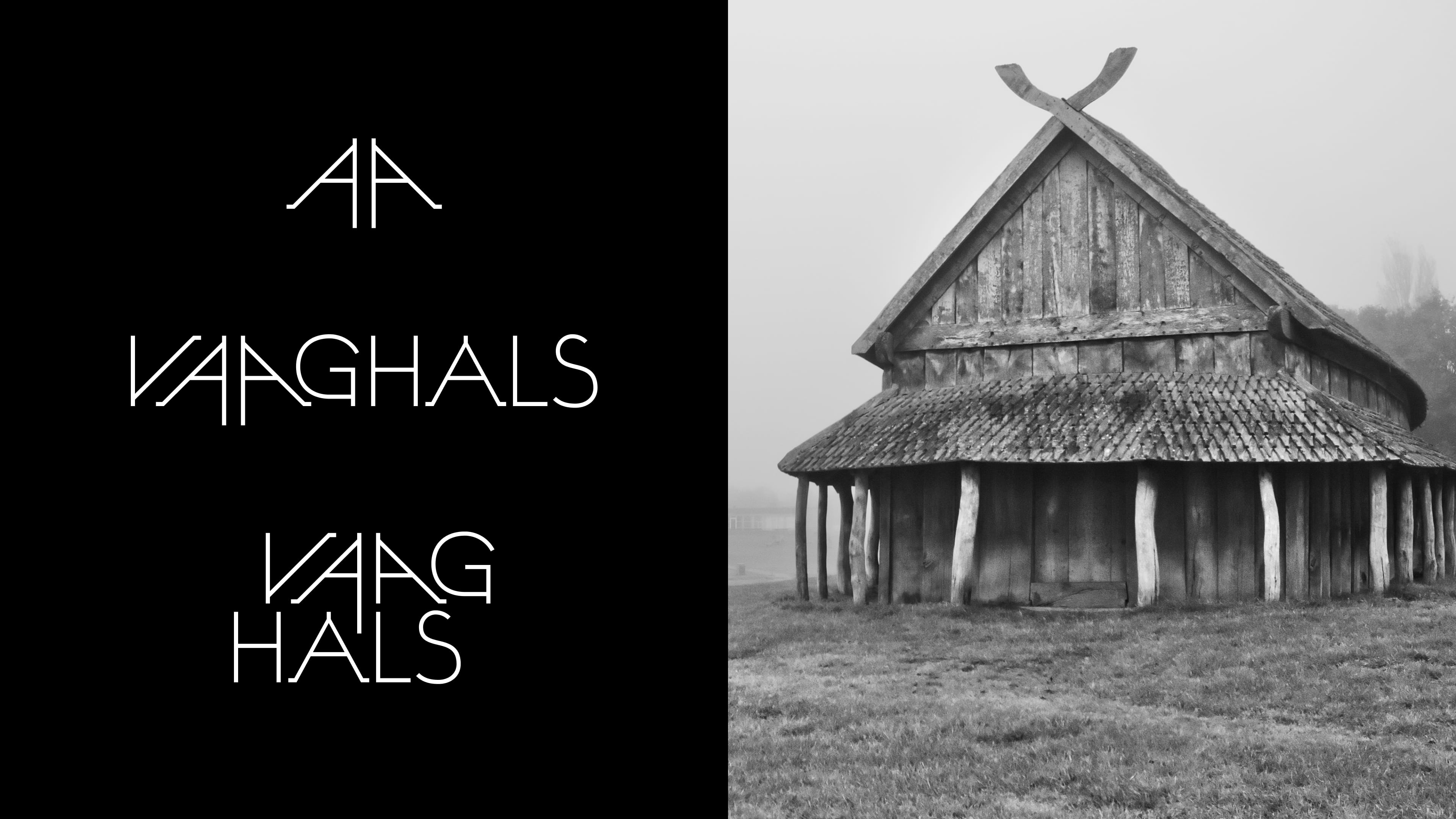
The minimalist logotype is inspired by Norwegian tradition and nature – log houses, gables from the Viking era and reindeer antlers. The twin A’s face each other to combine into a subtle hint towards the gathering for the feast, and are also used on their own as a monogram.
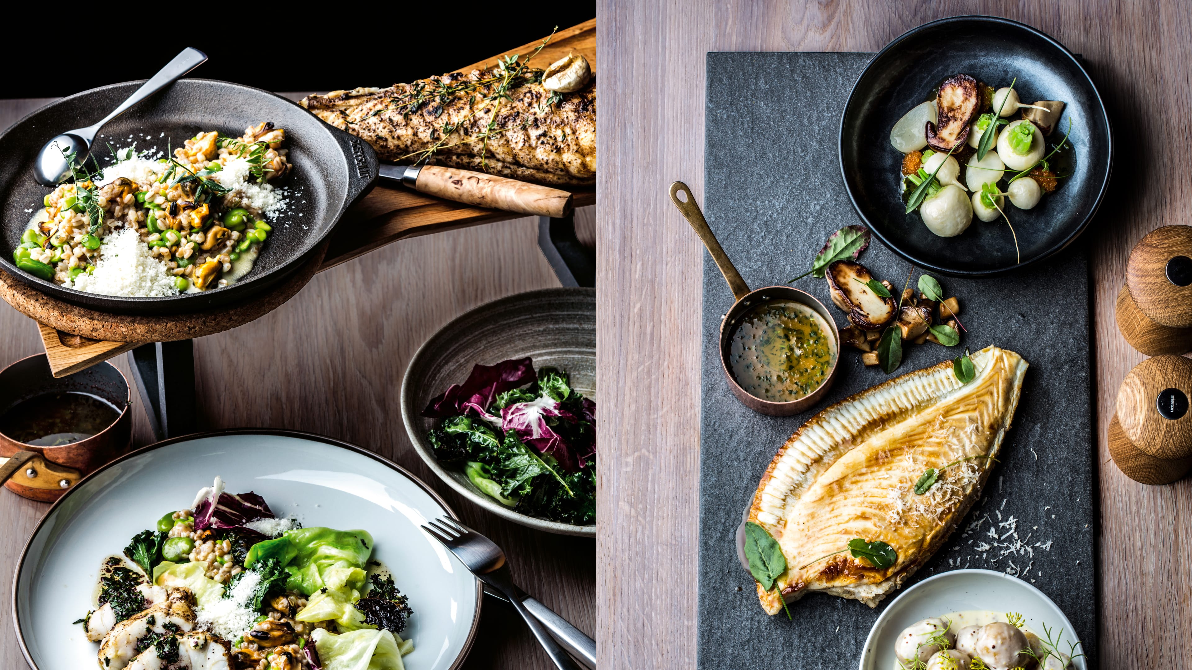
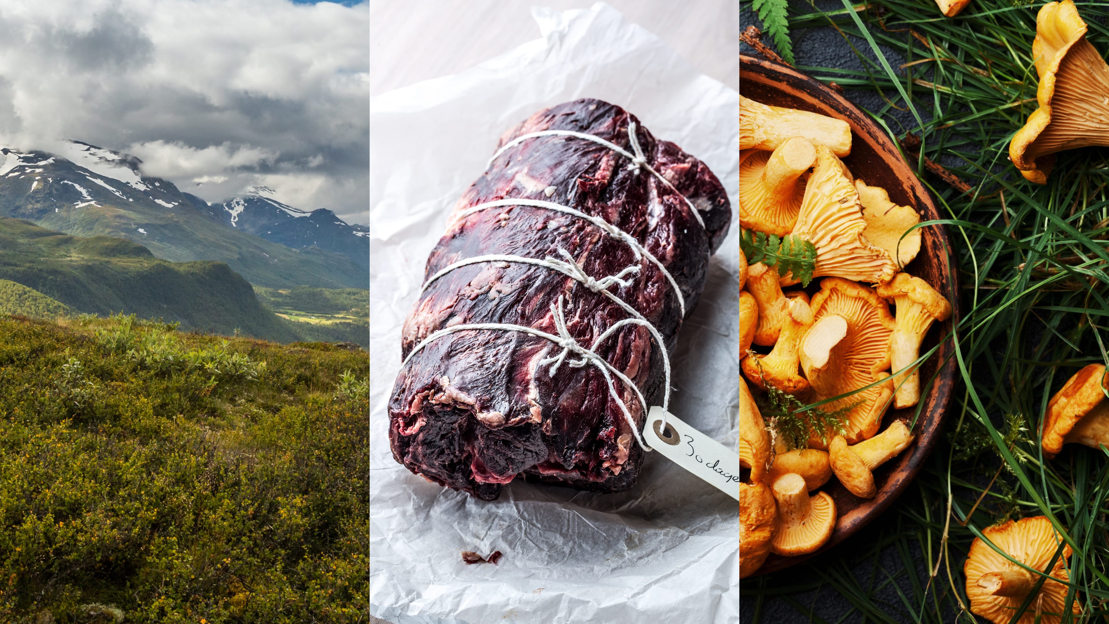

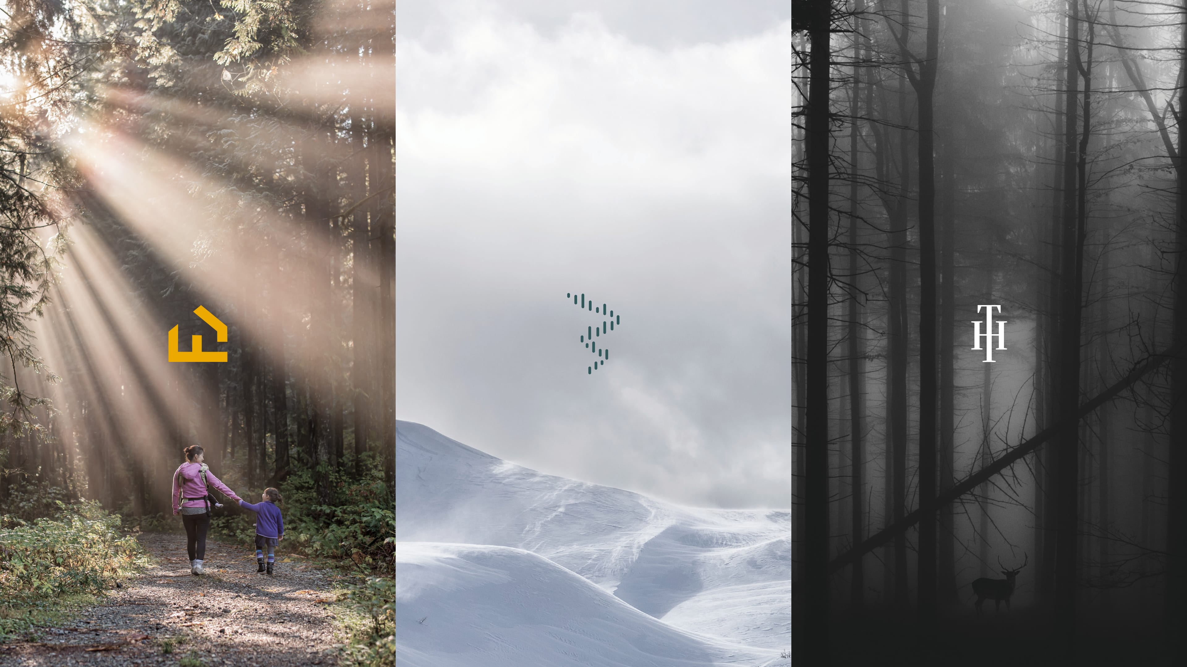
Building on the heritage from remote villages, surrounding nature and the natural produce.
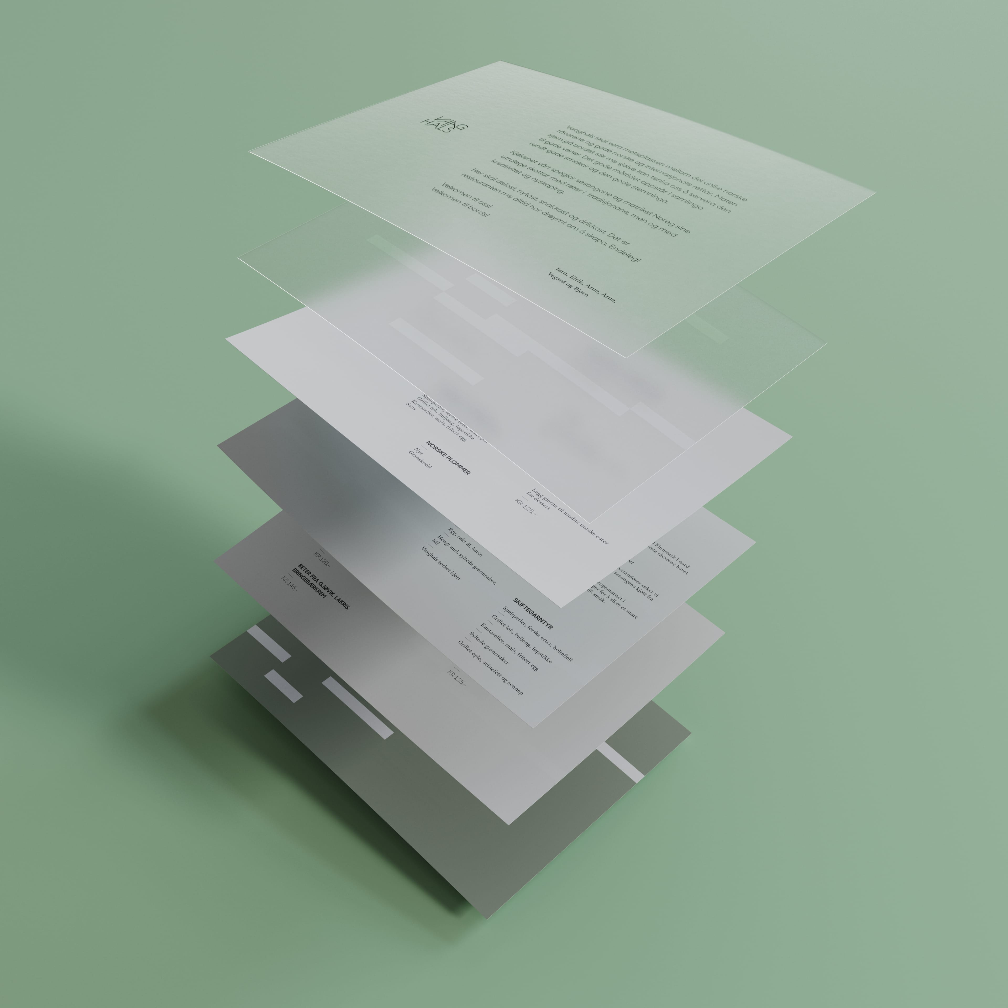
The identity is driven by black typography on white, with supporting colours to add flavour and texture to the expression.
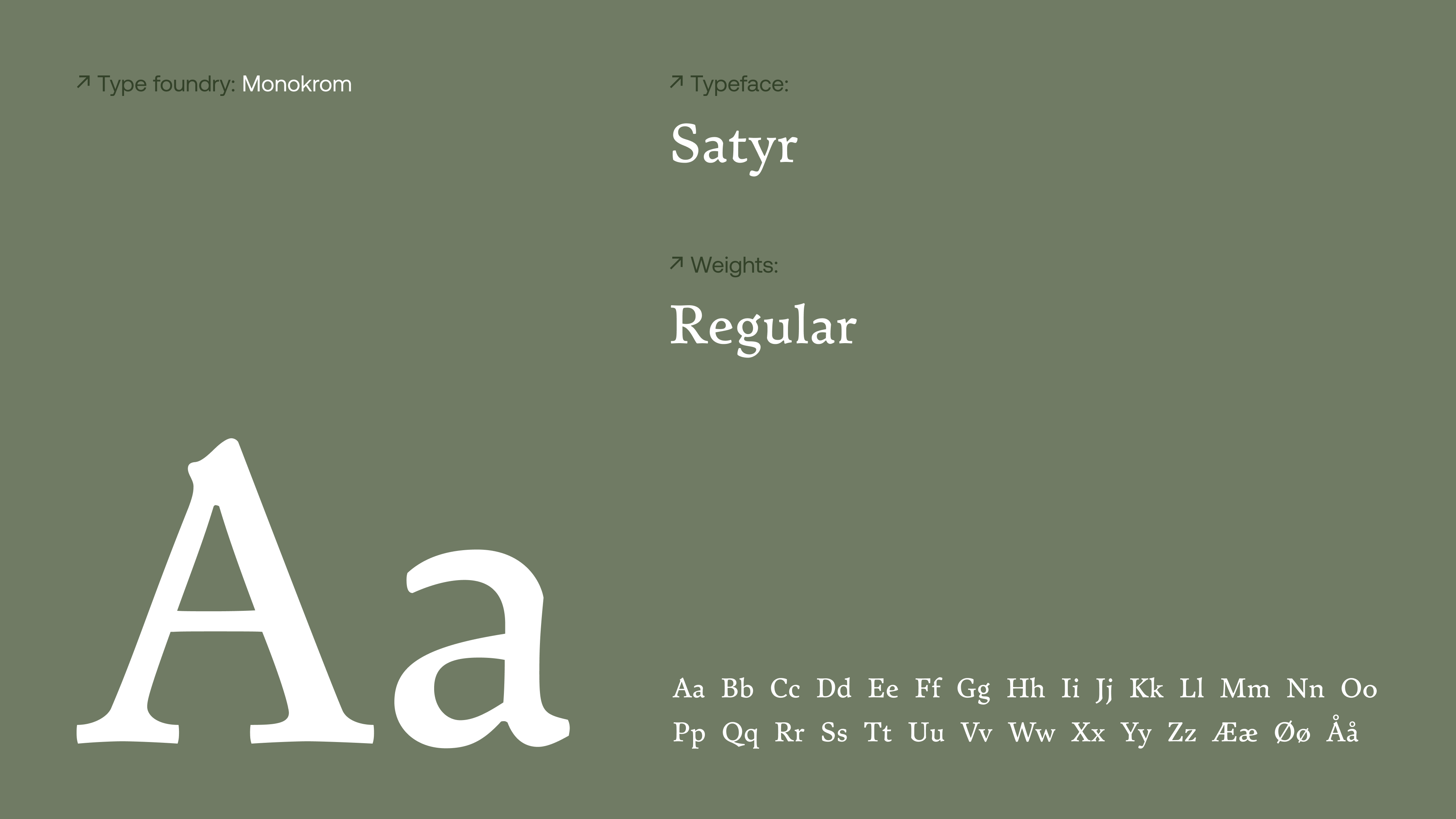
Monokrom foundry’s Satyr has all the flavour, heritage and detail to match the restaurants offering and the rough nature of the interior with wood, concrete and steel.
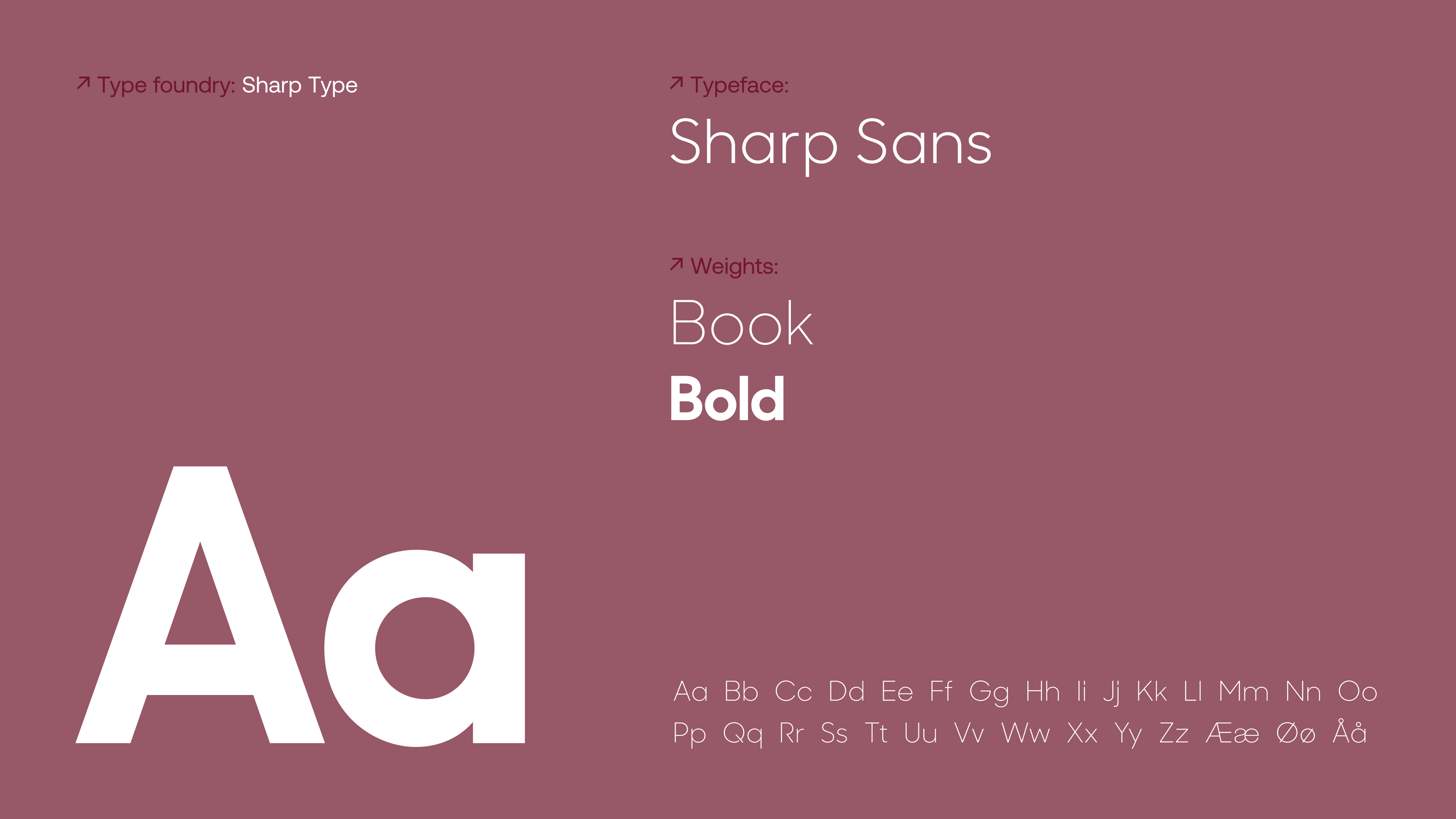
The modern alibi, complementing the texture of Satyr with a modern look and sleek fascade, not unlike the building in Barcode where the restaurant is situated.
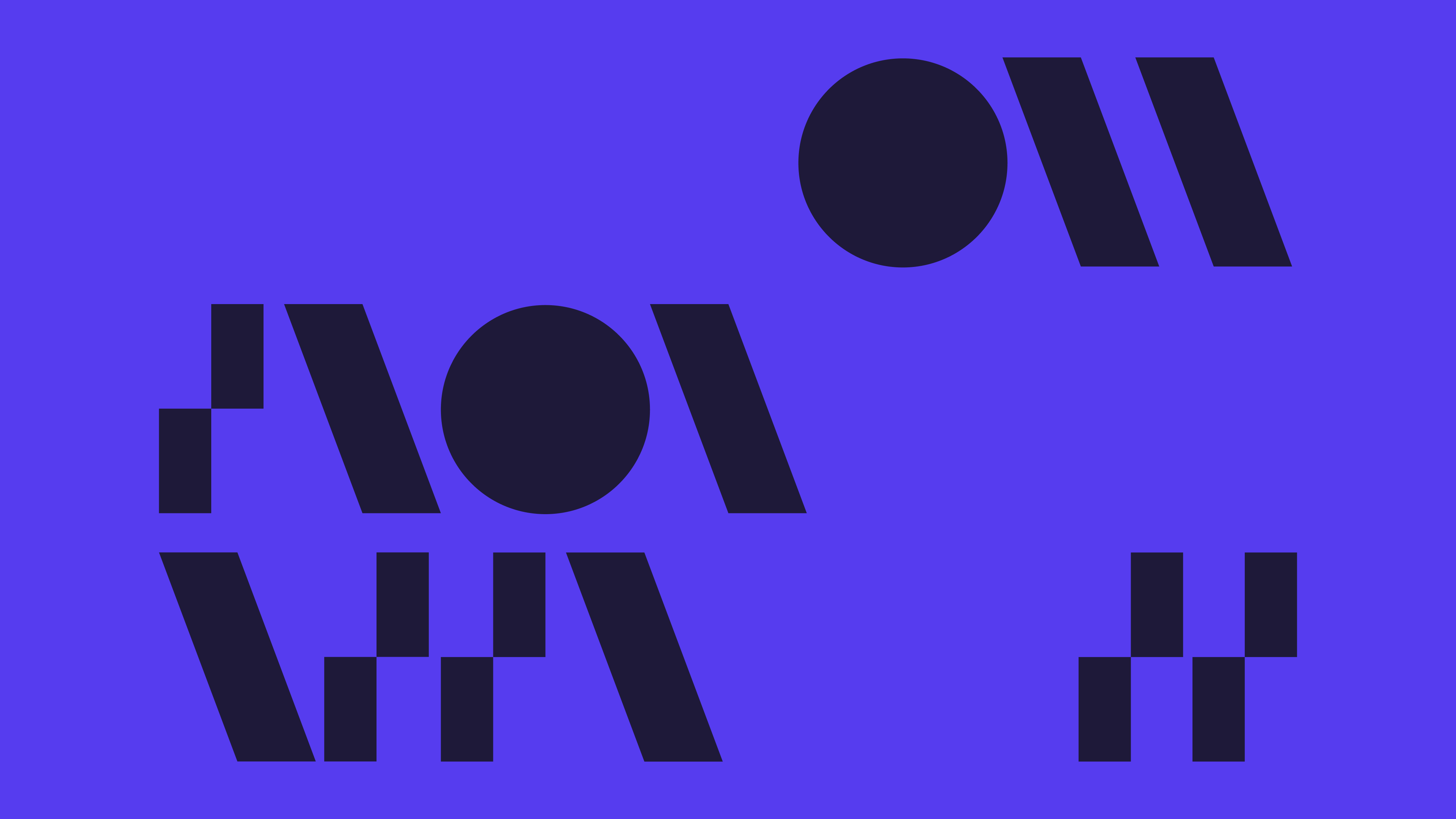
The sharing aspect of dining in Vaaghals, the way the platters are arranged around the table, became the foundation for a typographical grid.
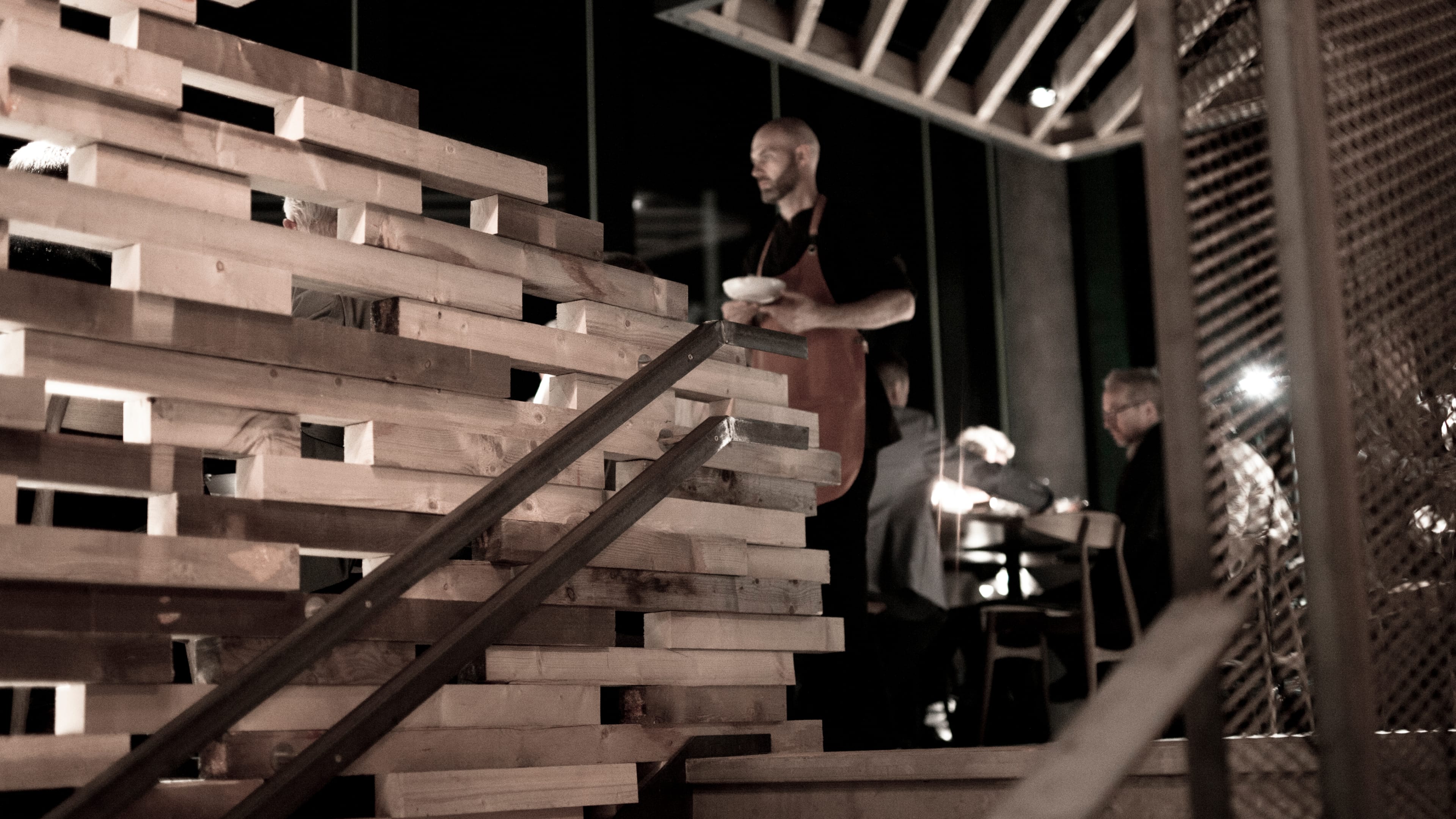
The modern but heritage-inspired interior were central in the graphic profile. A visual link between the centerpiece of the restaurant – an asymmetric wooden staircase – and the way light coming through the holes became the foundation for a visual pattern.
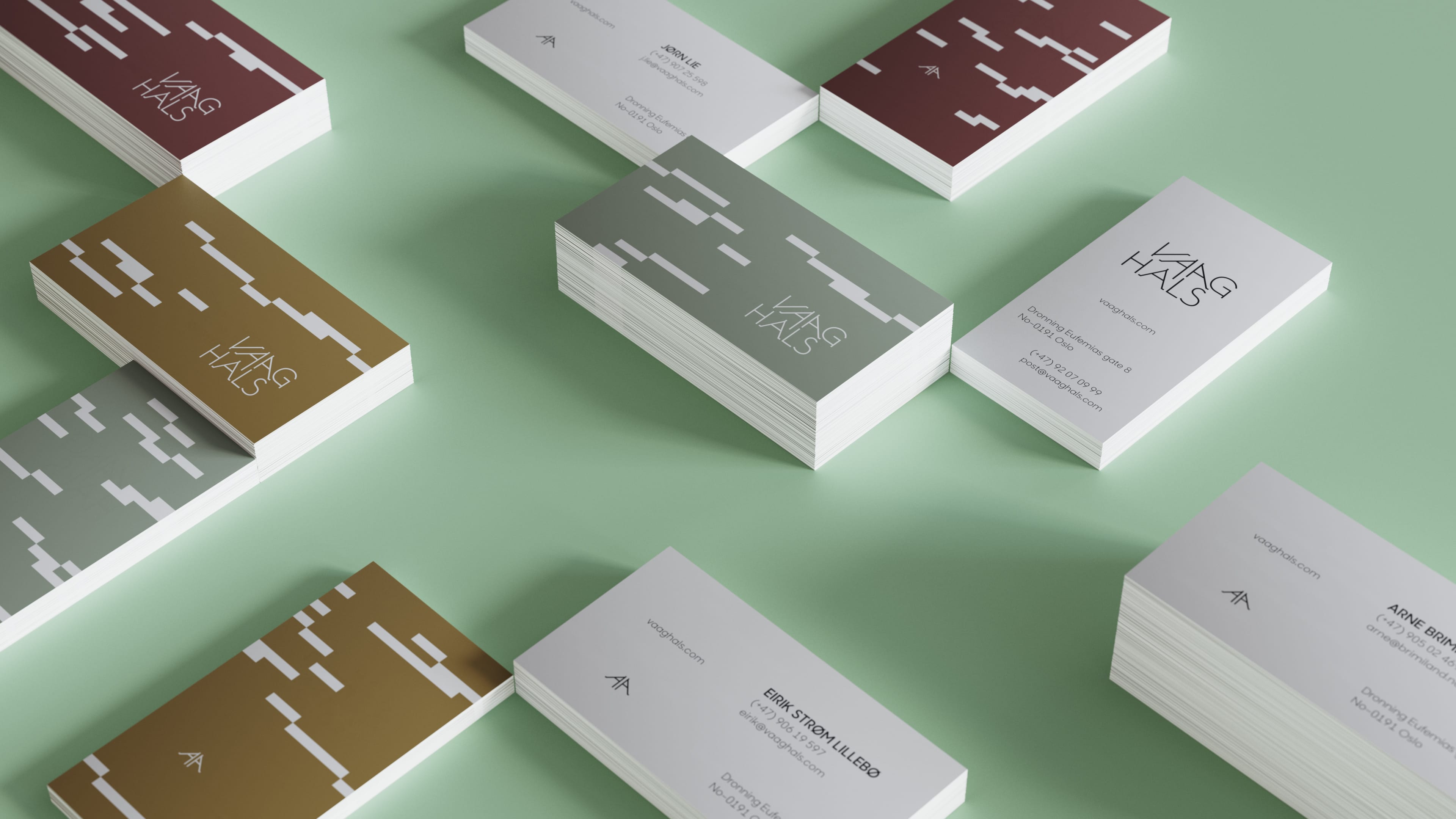
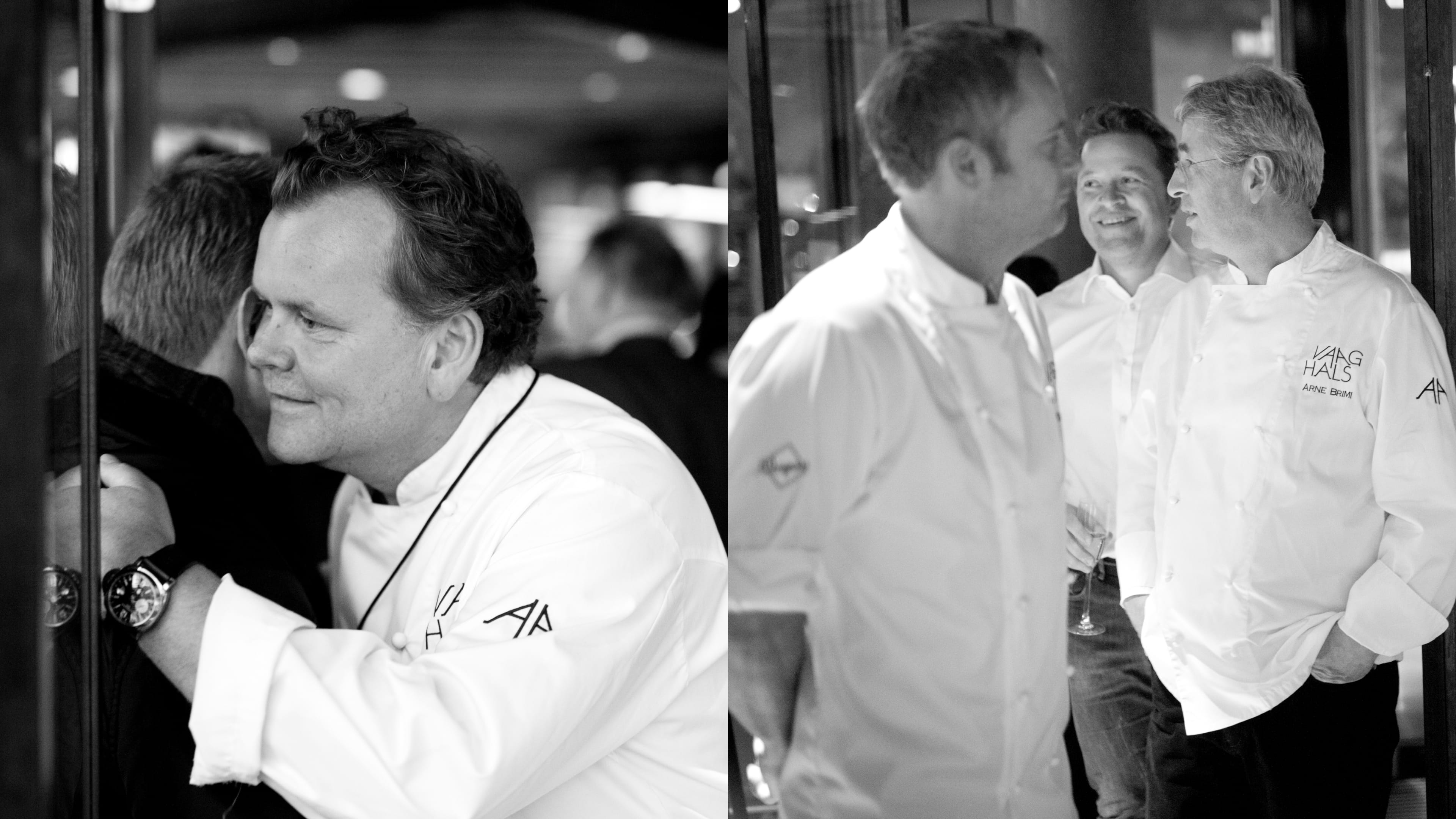
Business and restaurant cards.
A mouthwatering experience or a foul taste in the mouth? If you want to know more about this case or talk about generative graphics Get in touch!
Would you rather see some other cases?