Alytic is an investment company who works embedded in their portfolio companies to create growth, inject new technology and monetisation models within quantifiable data sources and insights.
When we met them, they had an interim identity which lacked distinction, and as a new-ish started company they also wanted some guidance in how they could communicate better, and more efficient with the tools they had available.
In collaboration with Alytic we established a brand platform and a fresh, flexible visual identity by maintaining their current logo (due to a recent investment in signage) and building a strong visual language from shapes in the logo and in a simple but bold colour palette to make Alytic stand out – whilst making it easy to use for laymen.

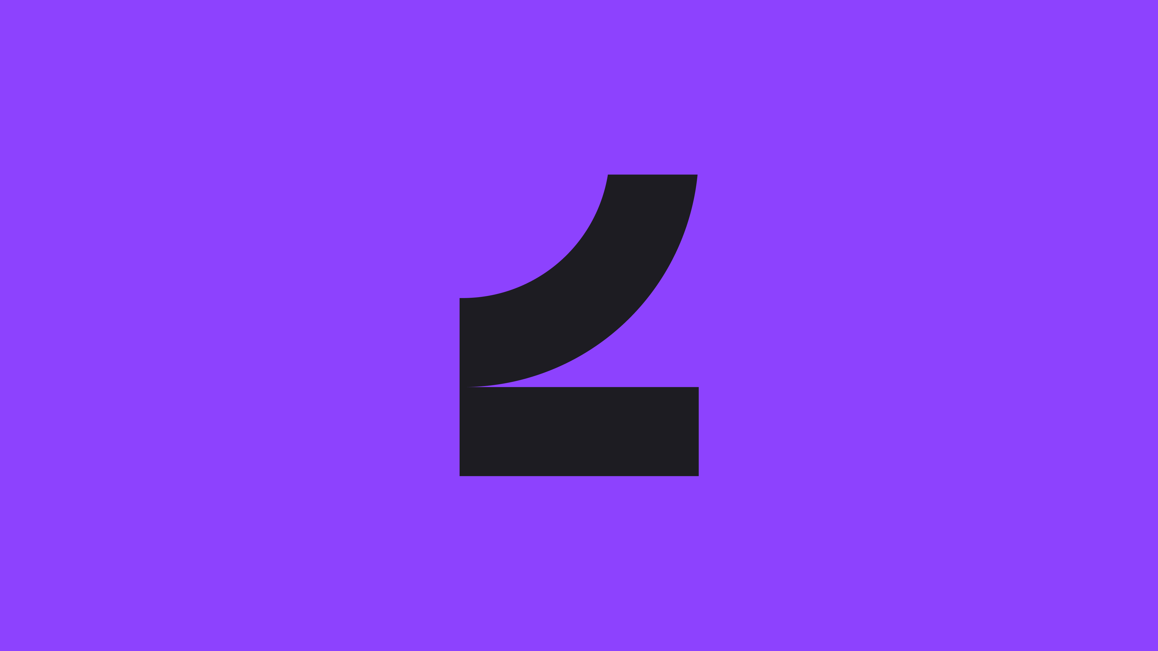
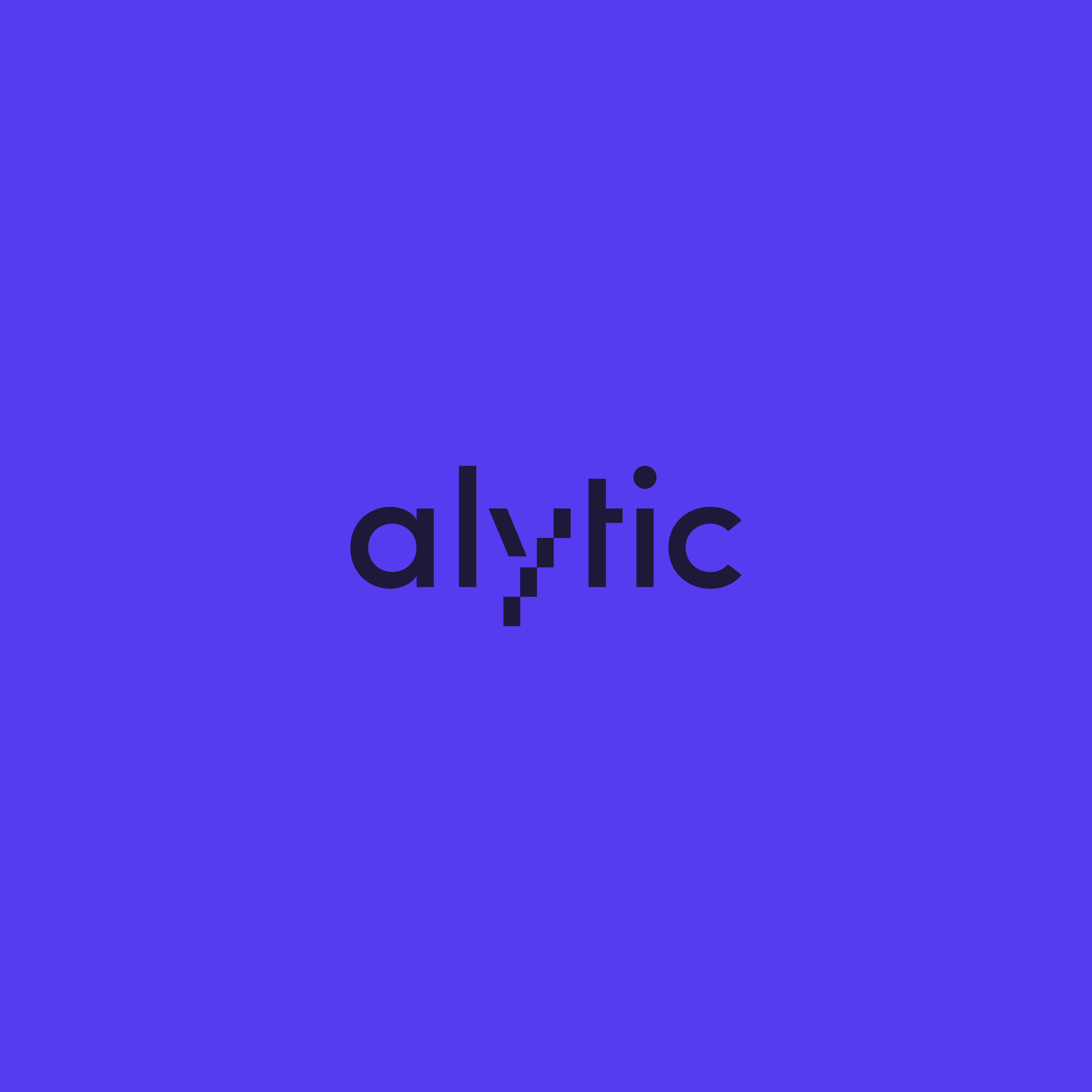
Although the brief said not to change the logotype, it would also be a lost opportunity to not make it look better with just minuscule changes, well knowing that everything we make for the brand need to use said logo.
The tittle above the i had an oval shape, which we made circular to align with the circular shape from the pattern, the stem of the l elongated to create symmetry with the optical peak of the i.
But most important, adjusting the kerning from a plain geometric spacing to be more optically pleasing.
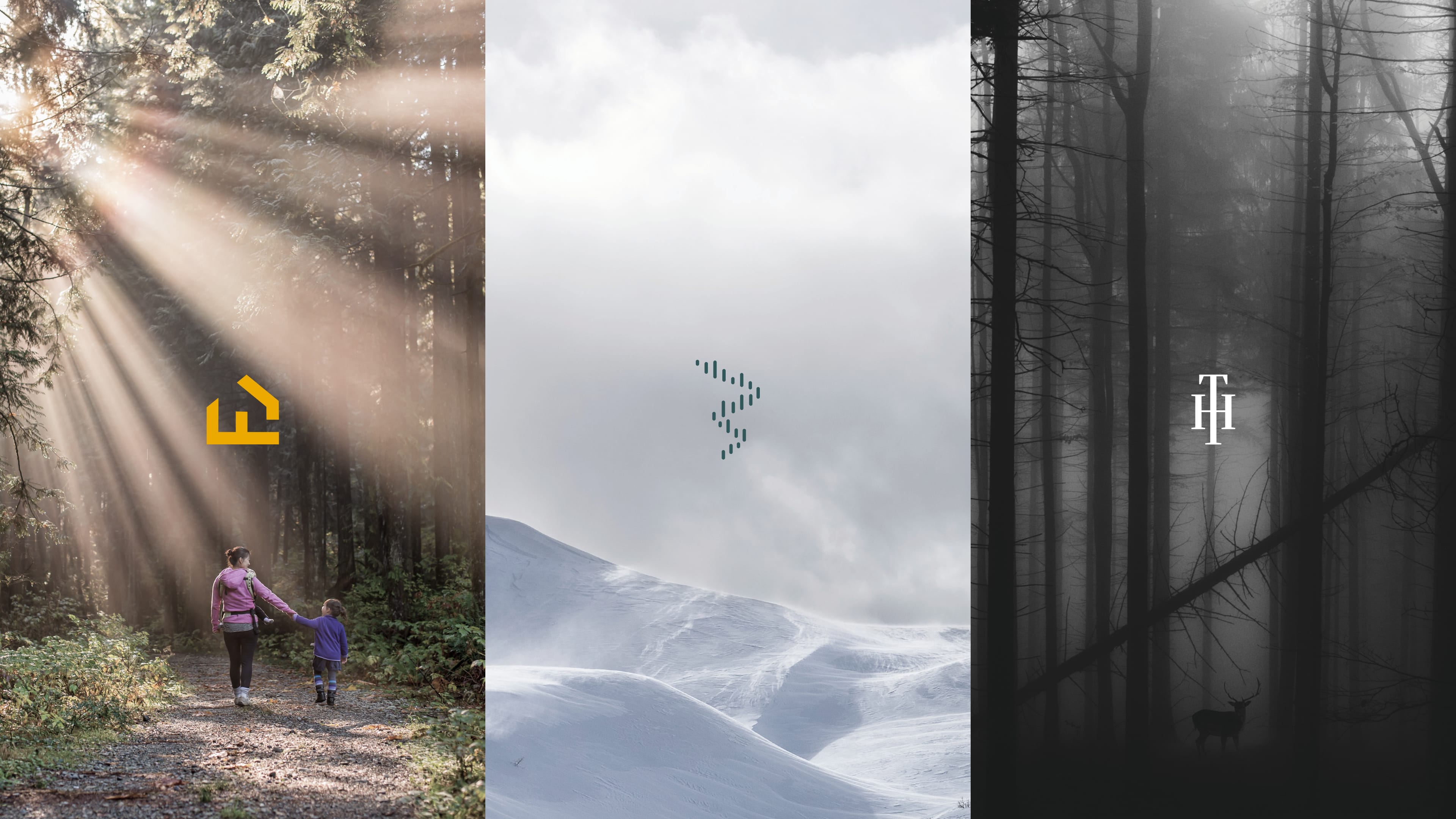
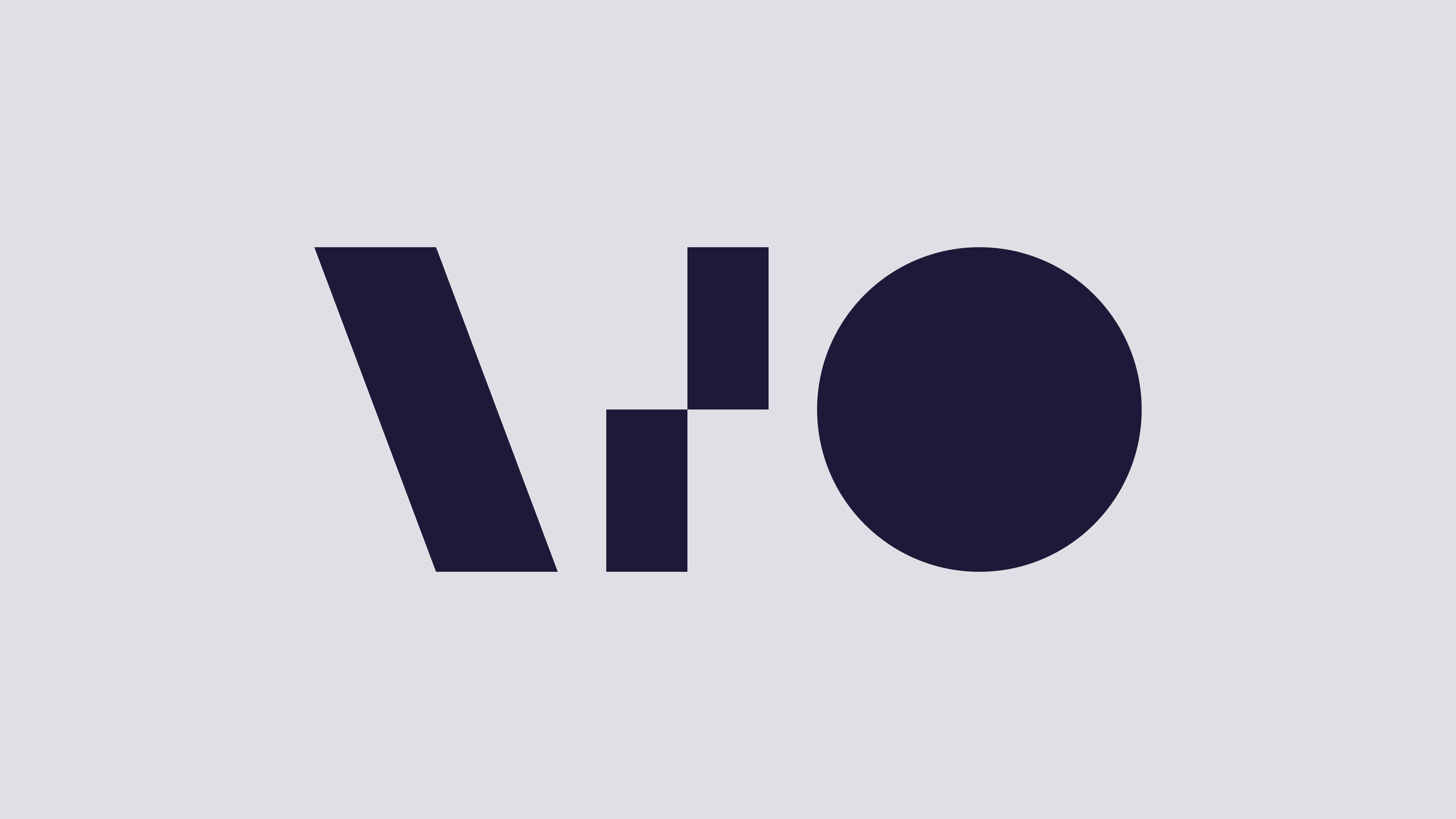
Extracting the slide, ladder and circle shape found in the logo, we built a visual language where these elements contribute to make the Alytic brand implementation more distinct.
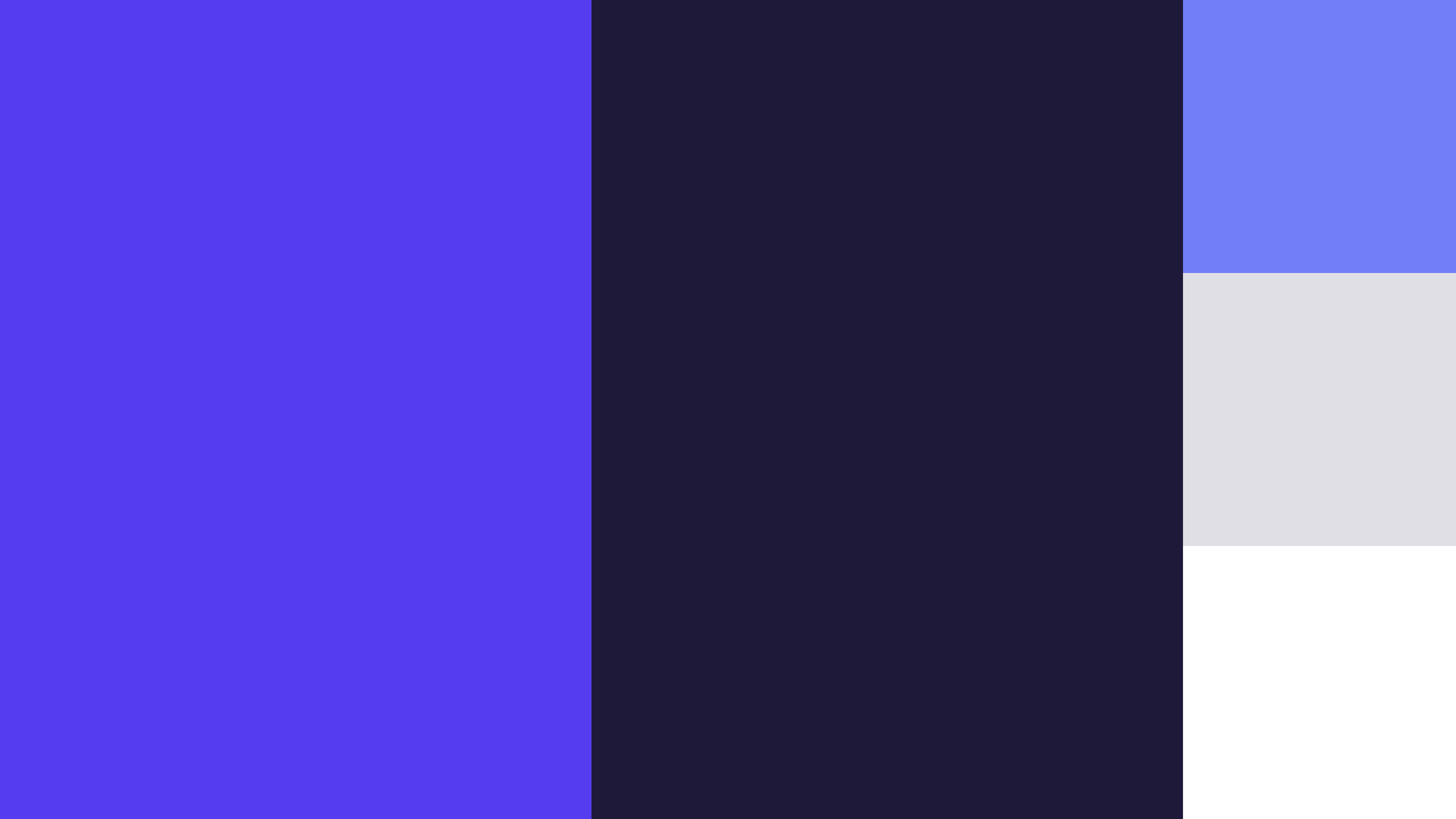
Looking at the competitor landscape, financial blue was in absolute overweight, and we challenged the client to look at alternatives as the perception of them is anything but a typical financial environment.
We built all the sketches in Figma, so we could easily iterate on colour palette with a simple change of swatches and see how that would affect the visual expression.
In the end, we still landed in the blue hues, but to differentiate Alytic from the market leaning more towards a warmer blurple™, as well as using a desaturated, darker version of the colour instead of black to add some softness.
We also included a light grey for softer positive backgrounds and a WCAG version of the blue for use on smaller type on negative in digital surfaces.
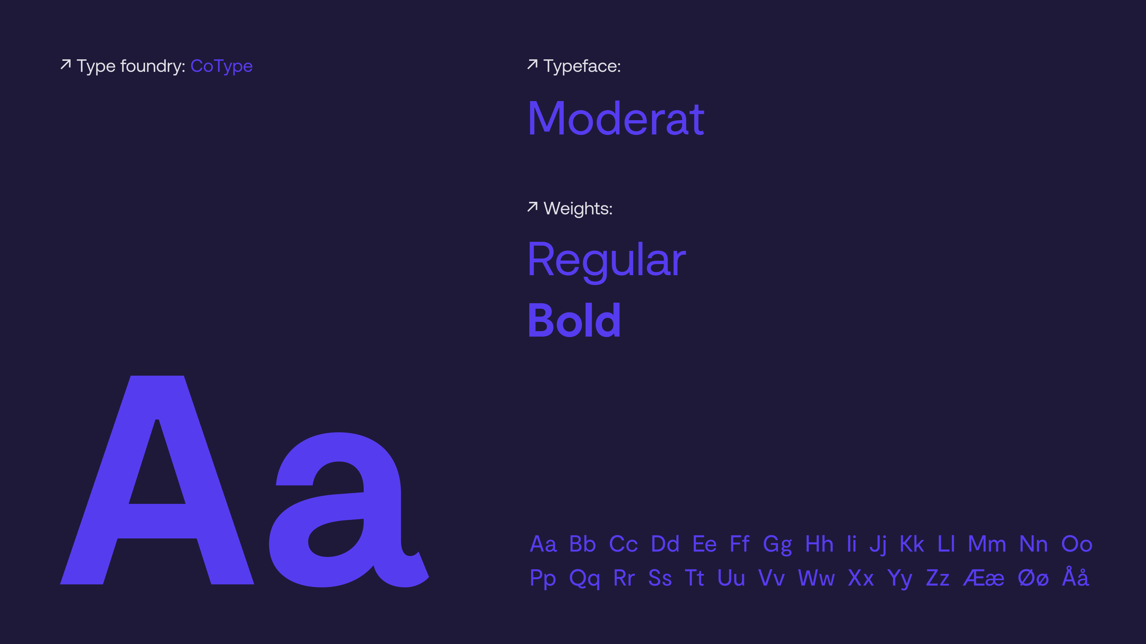
Tightype’s Moderat has the perfect combination of intricate details in the lighter weights, such as the humanist inspired tapering of the terminal or the double bowl g, and earthshattering punch in the heavier weights that made it a good fit for the visual expression of the
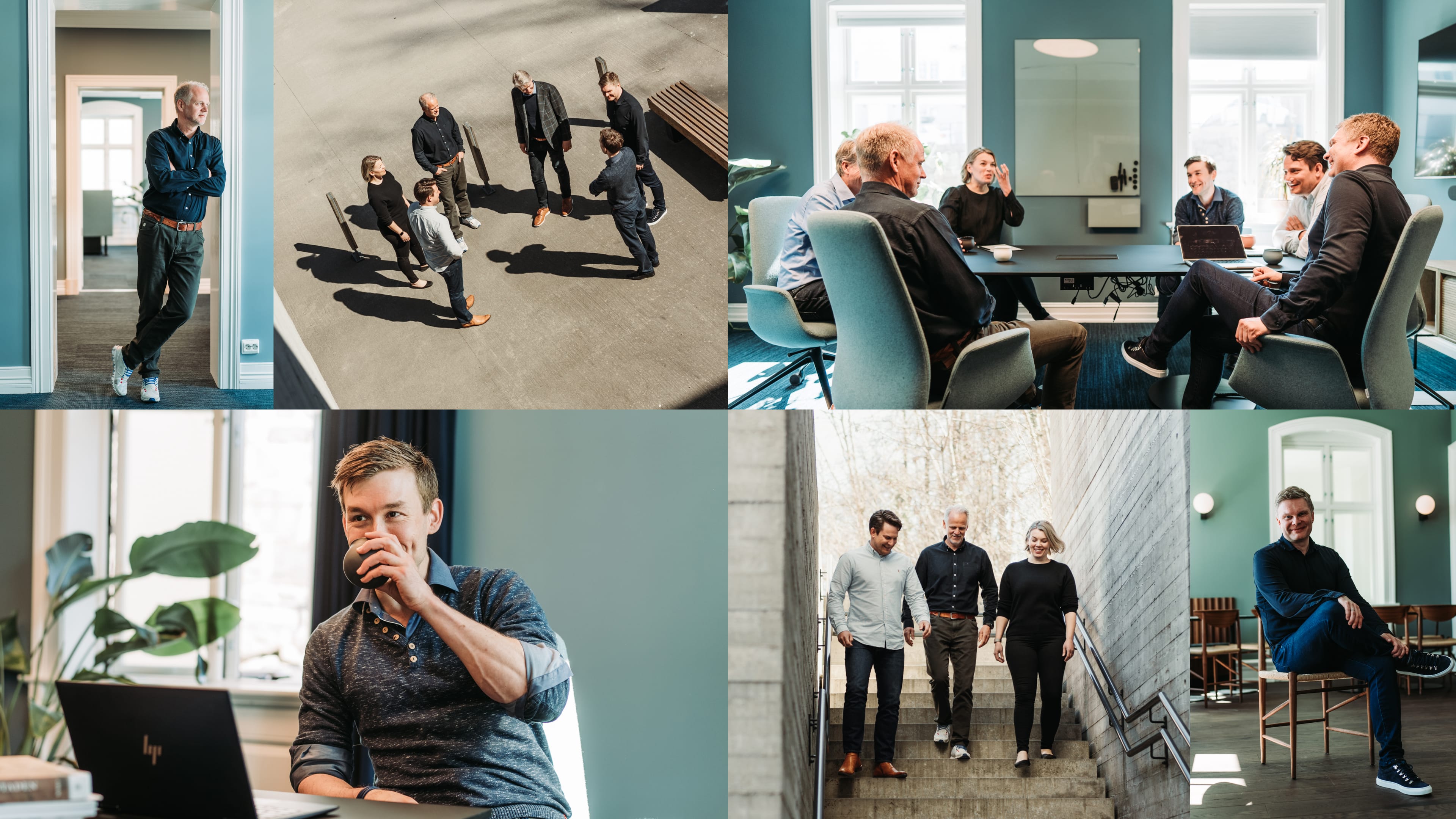
New modern photostyle, soft tactility and natural light.
The brand pattern/shapes can be applied in all brand colours on top of photography to frame people or situations, be applied as masks on images or be the hero over mood setting backdrops.
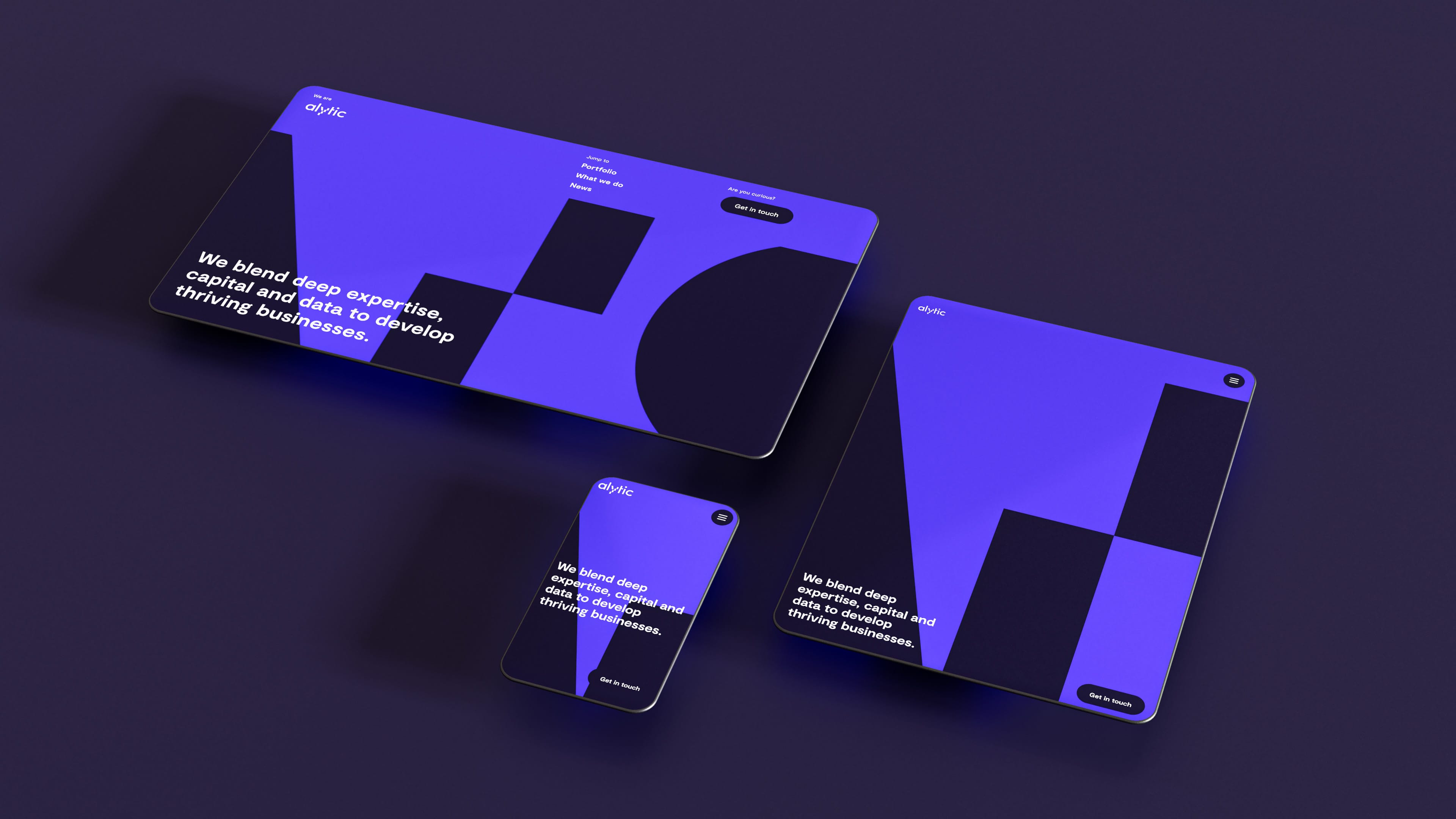
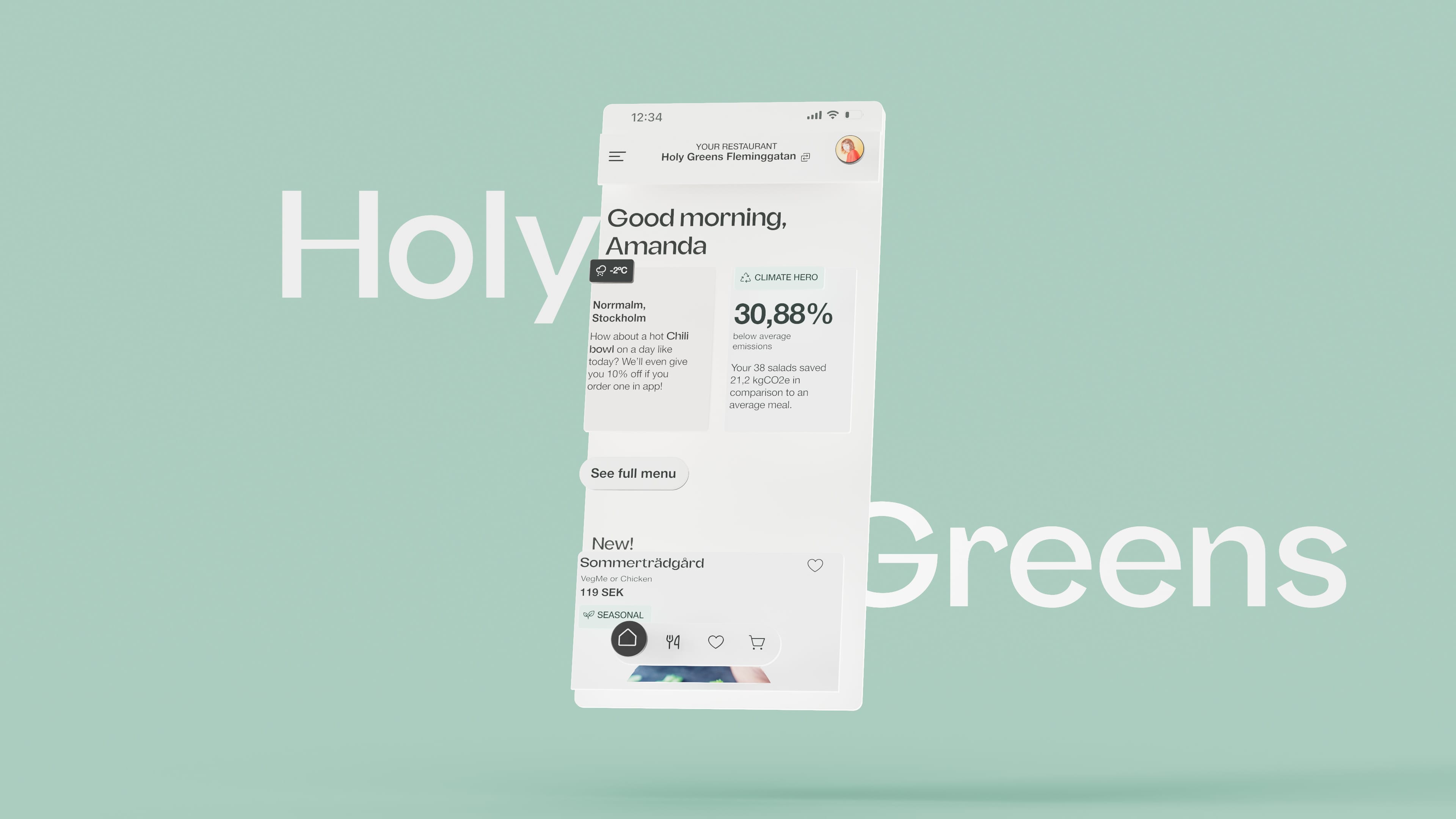
Responsive website.
The website has smooth transitions all across interactions. To align with this we also wanted the background to fade between sections instead of hard vertical blocks.
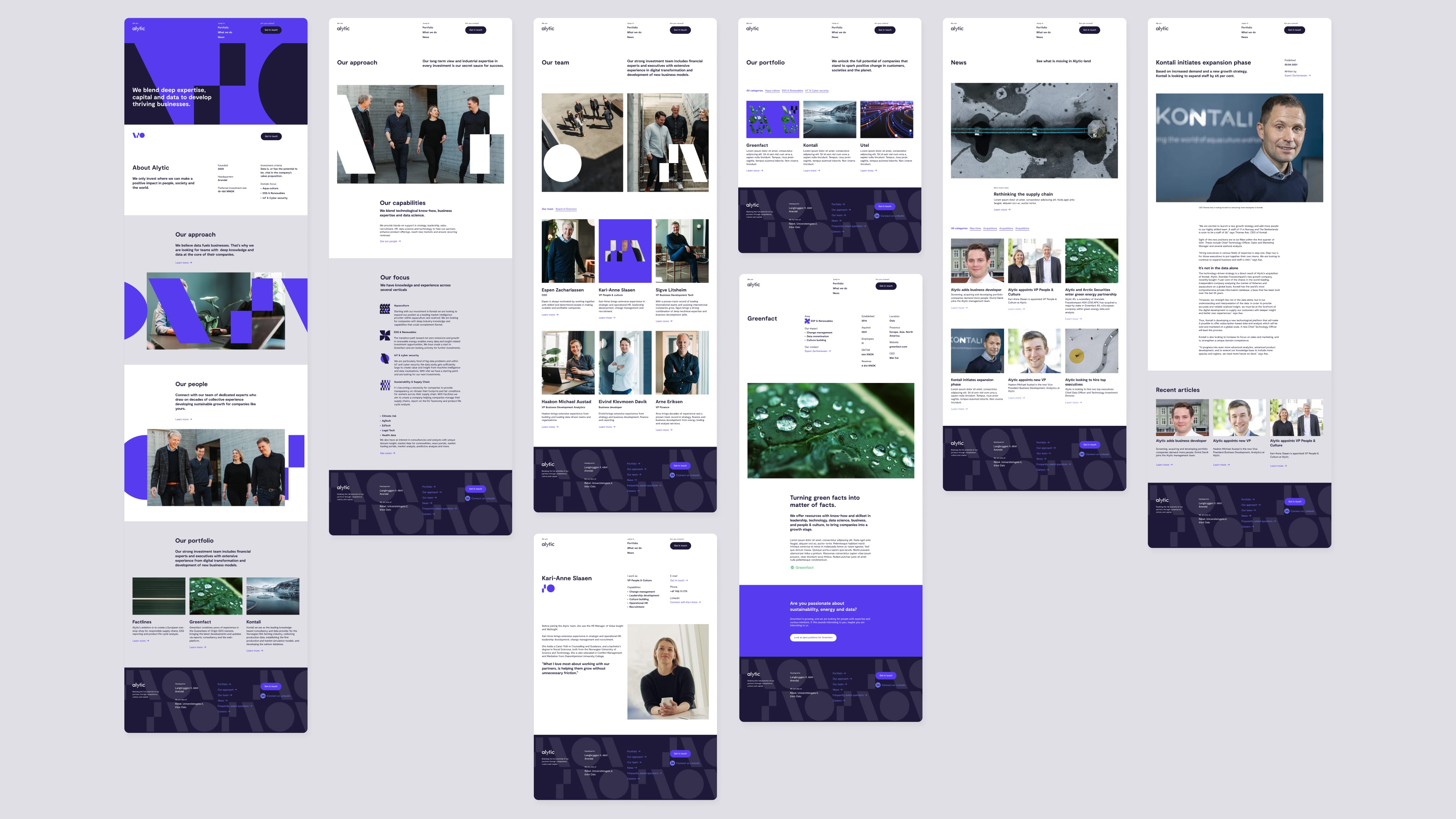
Web components.
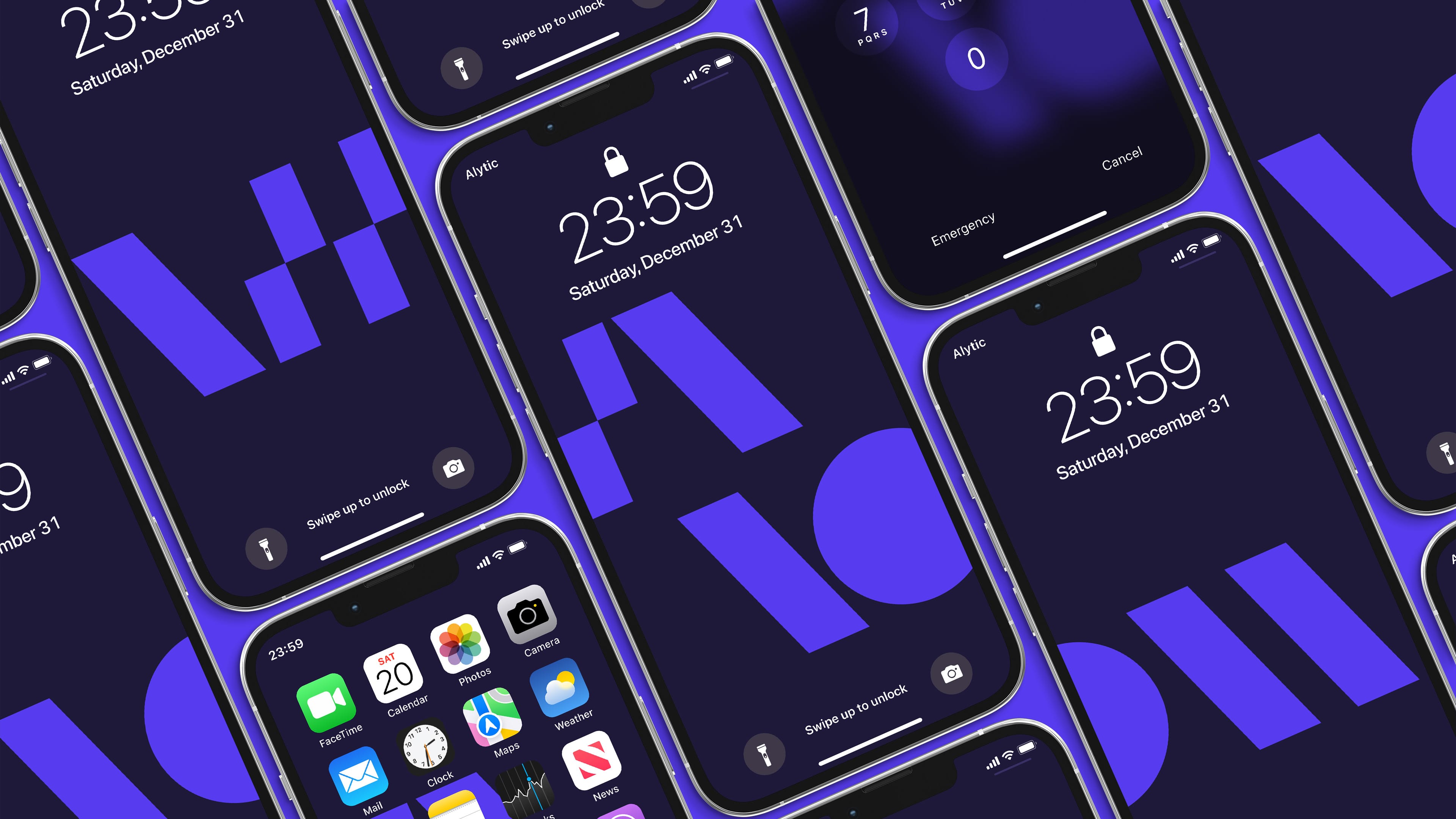
Personalised mobile backgrounds.
Did you like how that turned out? If you want to know more about this case or talk about how designing around restrictions actually can be a benefit Get in touch!
Would you rather see some other cases?