Holy Greens
A fresh customer experience
Competences
- Brand design
- Digital design
- UI Motion
Collaborators
- Toby WheelanUX design & testing
- Maria BjörklundService design & user research
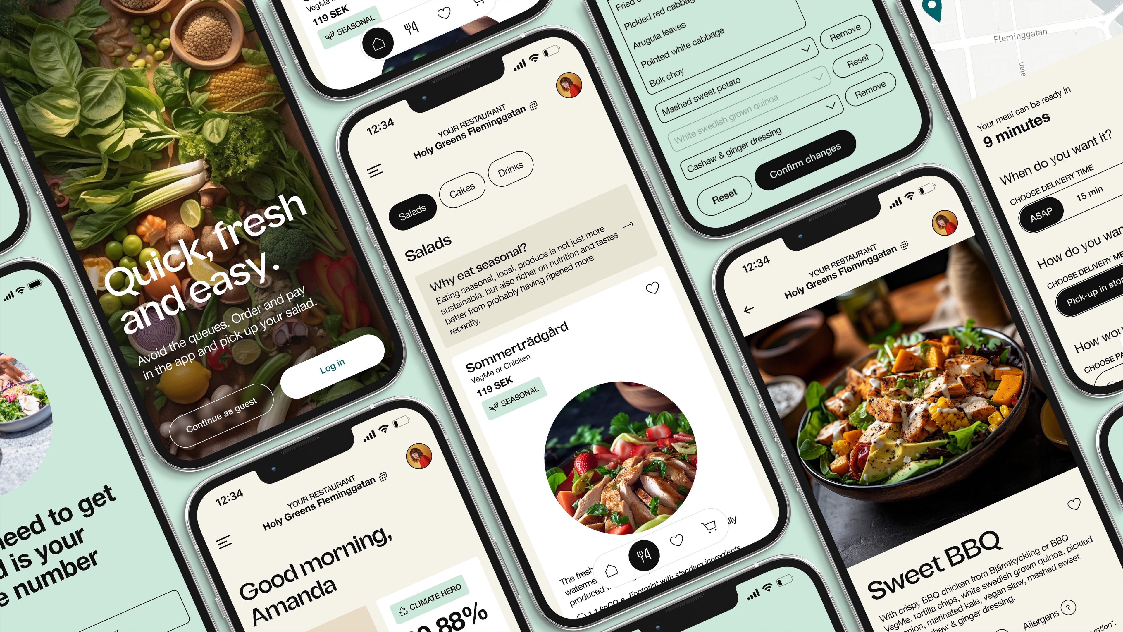
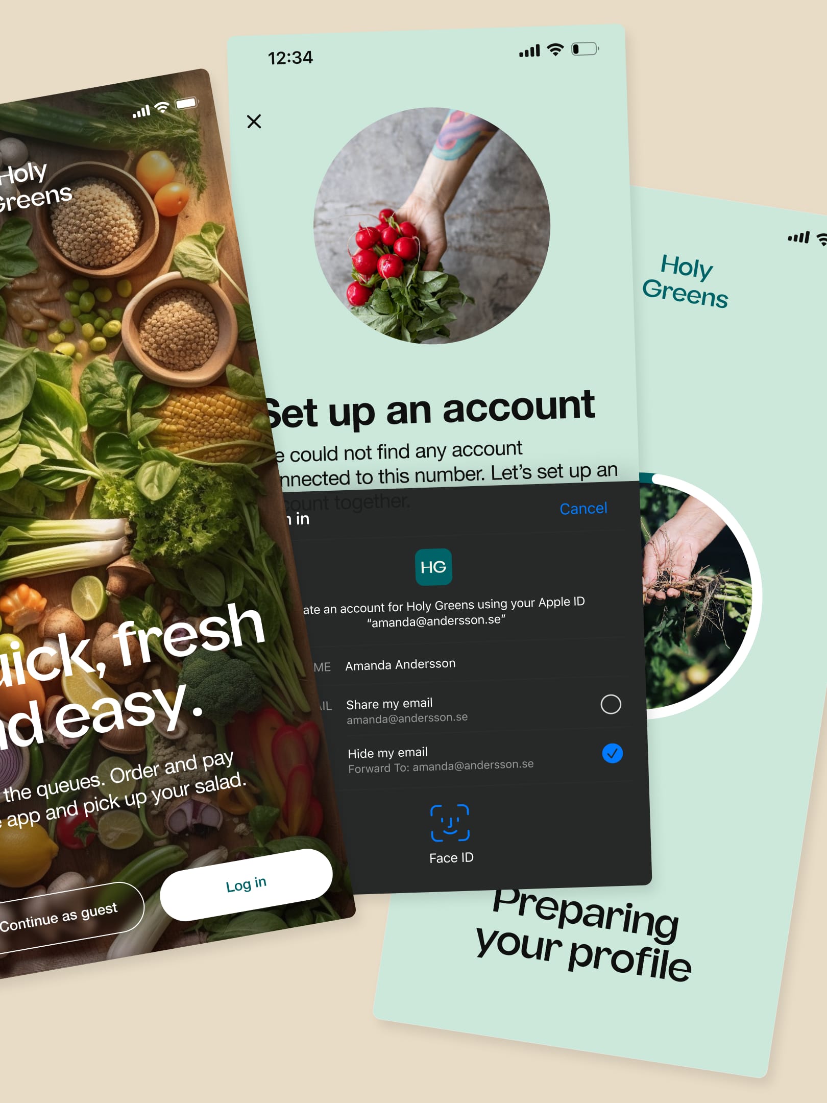
Lo-fi prototype of purchase flow built and recorded in Figma.
Description
We were approached by Holy Greens who wanted to get rid of their off-the-shelf white label digital platform, to ensure they had a custom solution that could give their customers a more bespoke experience, a more modern design than the templates they were stuck to, better foundation to gather user data and could connect with their users.
We first did user interviews in their restaurants and with some of their current B2B customers, and went on to deliver a concept presentation outlining opportunity spaces to explore in any further implementation.
After delivering the UX concepts to the client, it became apparent that we needed to expand on their visual identity. While technically out of scope, we approached it from a digital-first point of view, where we would use their identity as a starting point, tweak colours and type to make it seem tasty, modern and friendly like they wanted.
Toolbox

Grid and components
Built on a responsive six column grid, all margins, gaps and distances are based on a strict 4-8-16-24-32-40px rule. Utilising a strict set of styles, components and auto-layout in Figma to ensure a unified set of components for the design library.
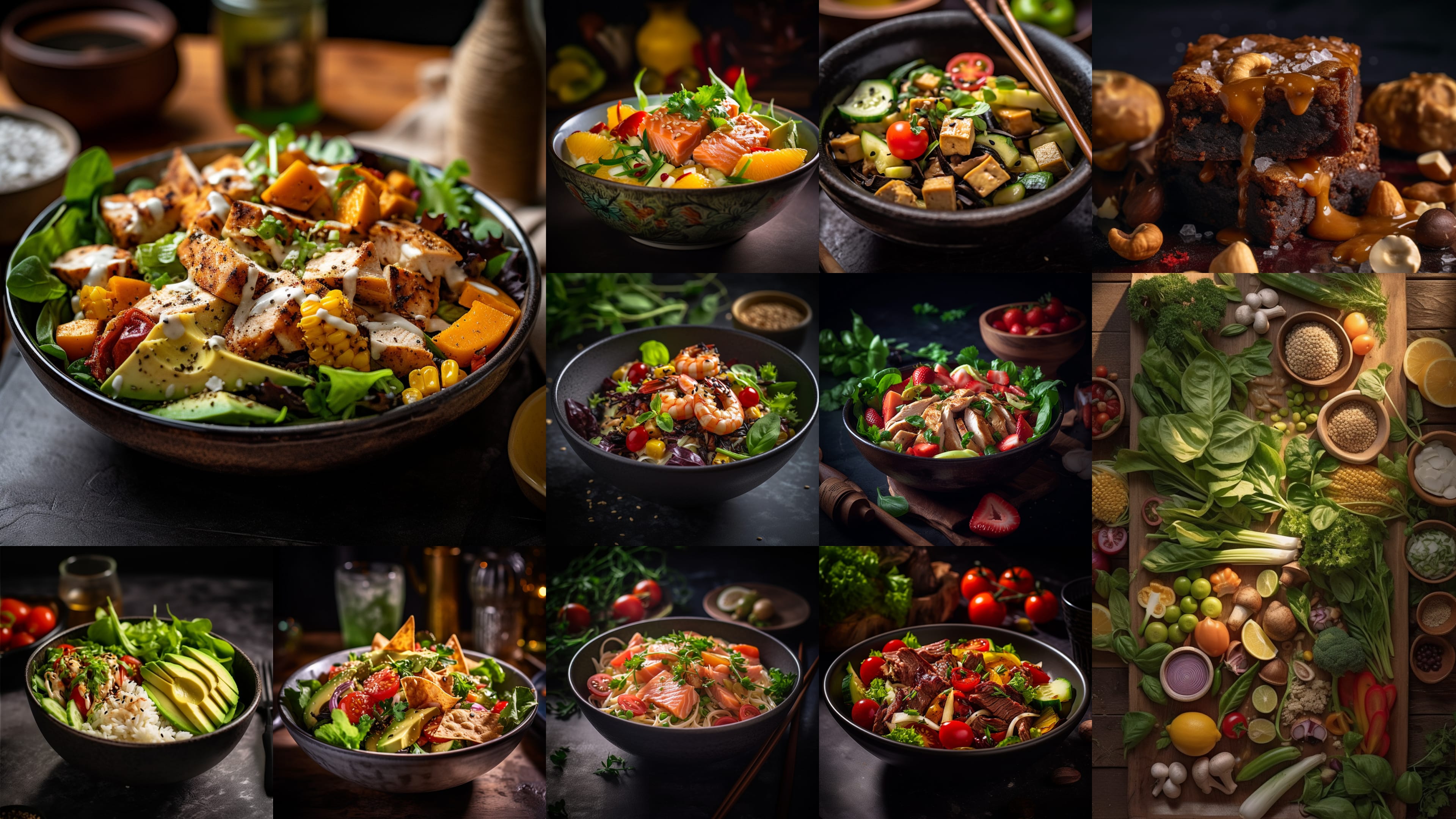
Product photography
Or ‘photography’, as they are all visualisations generated in Midjourney. Due to a lack of product photos, I wrote a set of prompts for Midjourney that simulates food photography, sprinkled with ingredients from the different items on the menu – except drinks which we had original artwork from manufacturers.
Type: Fregan Sans
A modern grotesk that provides flavour, combining geometric shapes with organic curvy details, we use this for titles and product names.
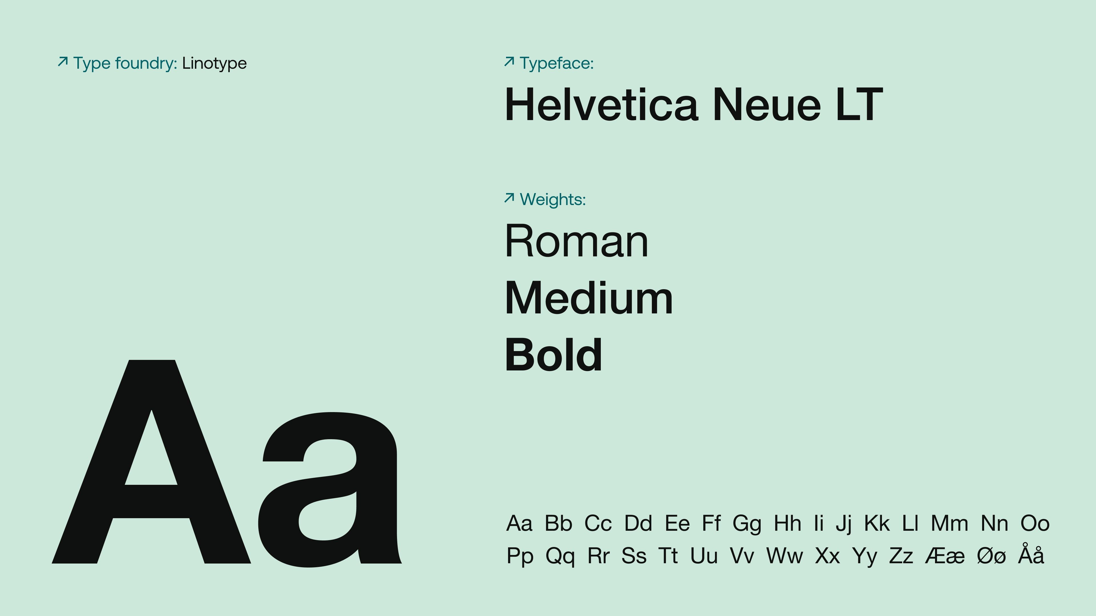
Type: Helvetica Neue LT
The client originally used a different sans-serif with extremely poor x-height, making it illegible and difficult for use in UIs. We wanted something that both had a no-nonsense forwardness in making the user experience better, but also something that had a bit of character on it’s own.
Implementations

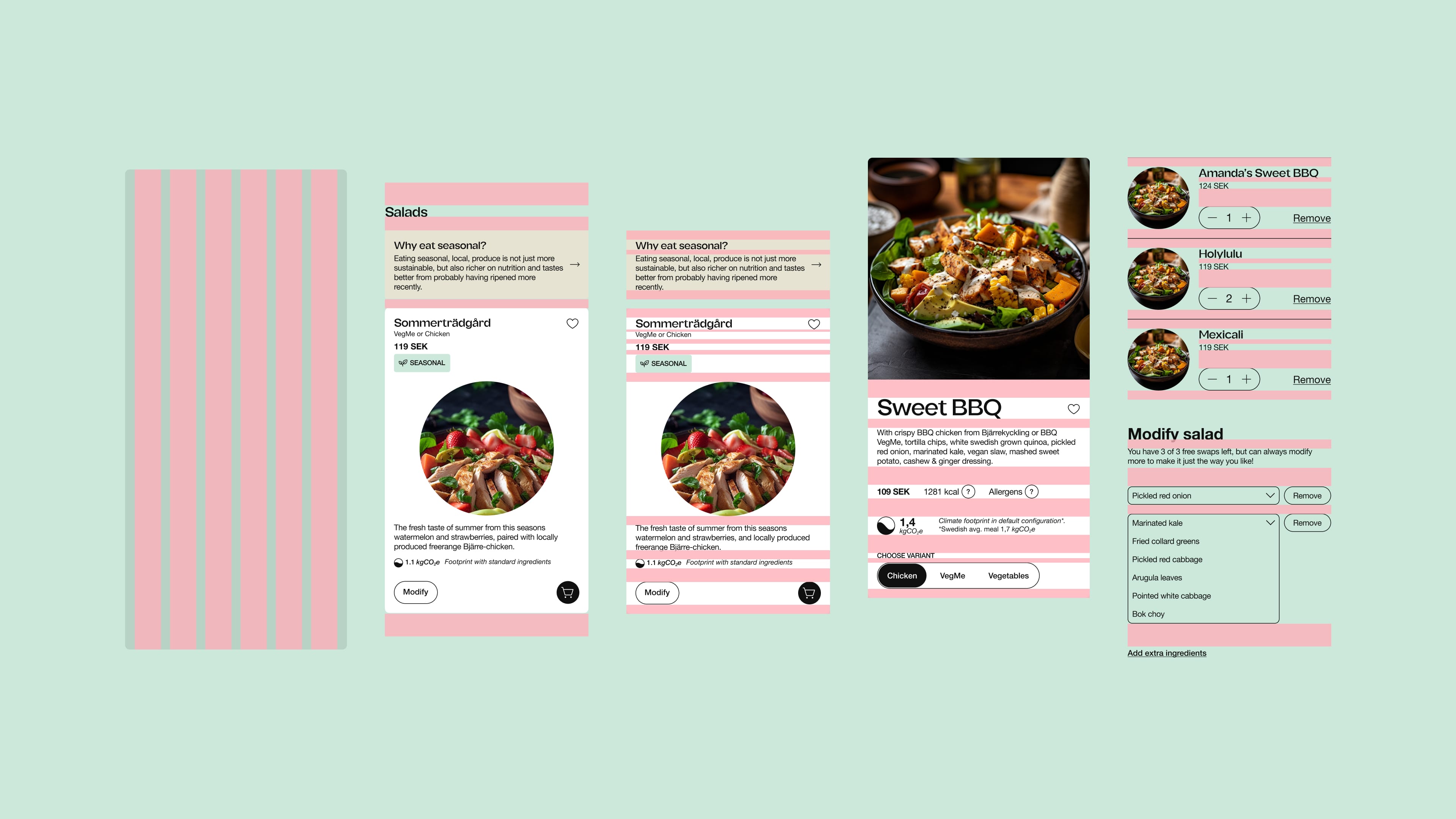
Splitting the navigation between the sticky bottom navigation for everything purchase related, the burger navigation for secondary features, and everything related to the user’s data under a user menu.
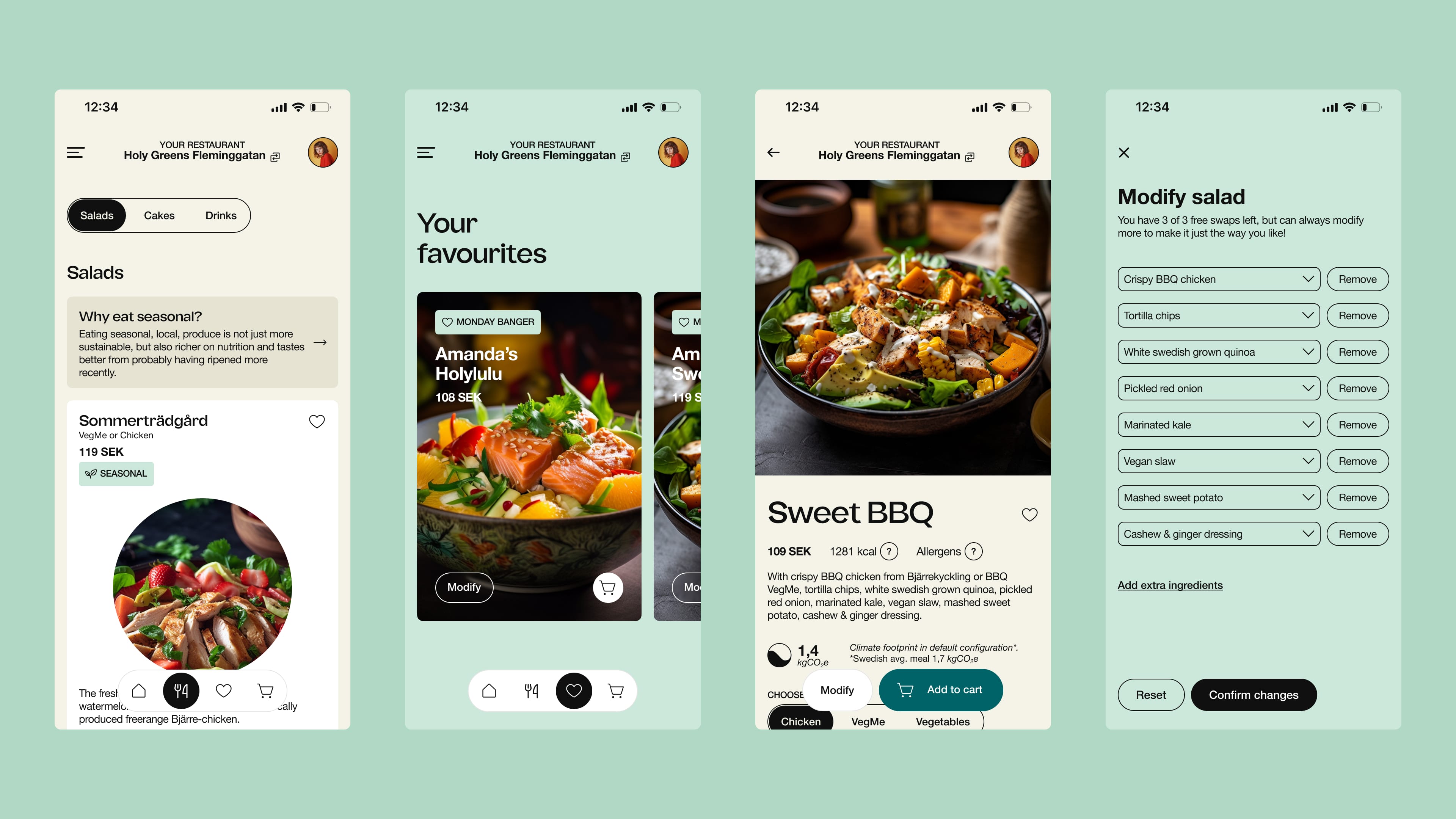
Easy access to the dishes from homepage, menu or stored favourites. Quick-buy or go to a full product page to learn about ingredients, nutrients, allergens, climate footprint, modify salad or purchase the standard variants.
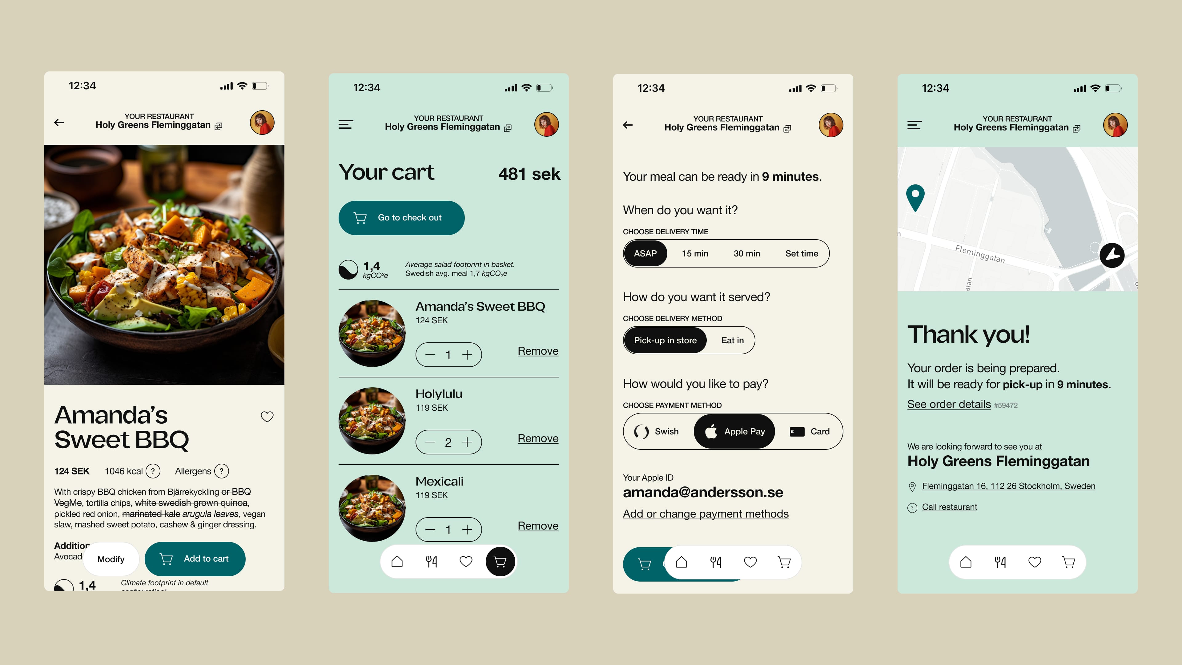
Checking out through the cart, the user get an overview of their order, before choosing when and how they want the salad, and performs the payment directly in app before picking up in their nearby Holy Greens.
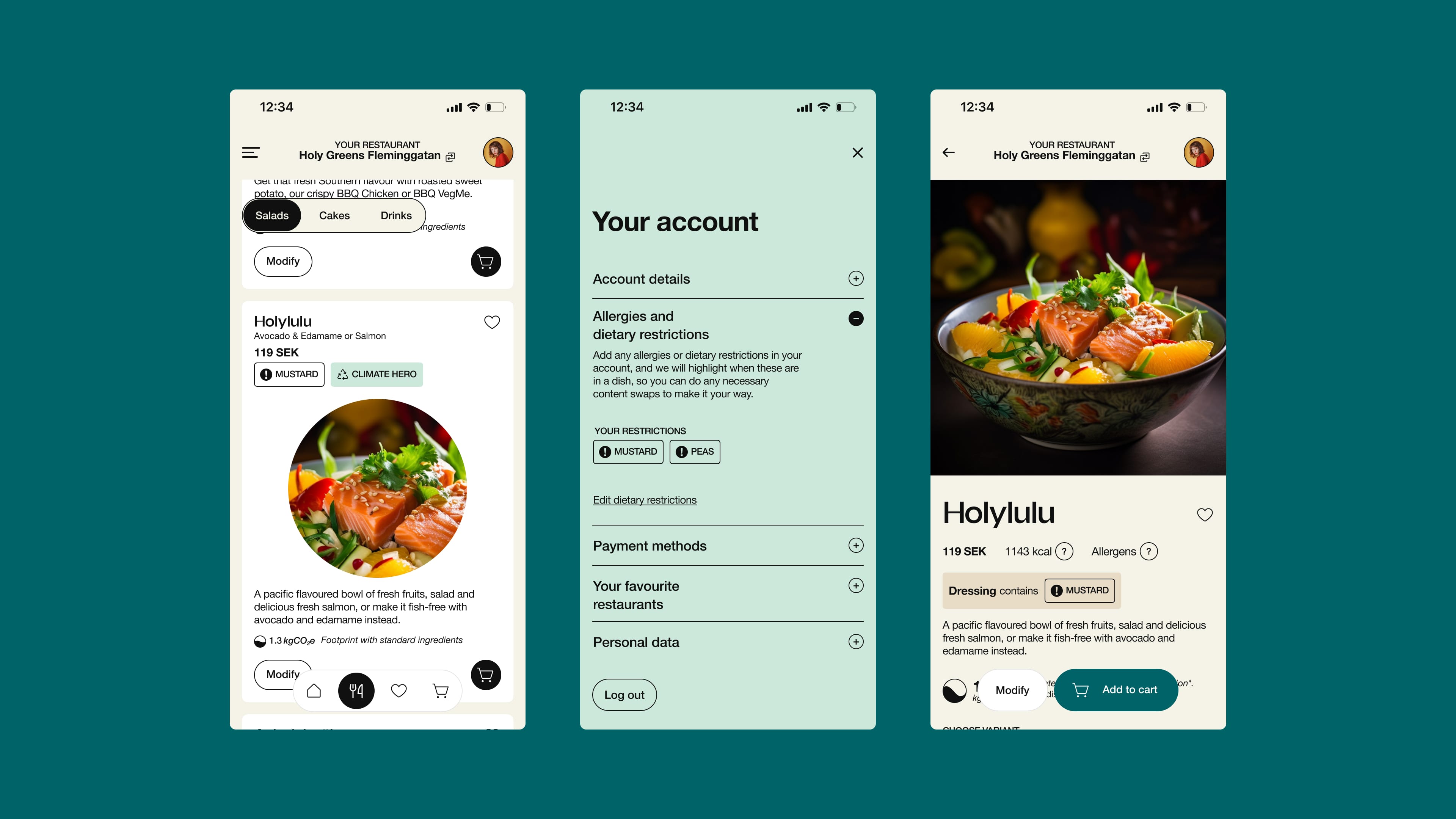
Setting dietary restrictions in user preferences, so that we could alert the customer. Because all dishes can be modified to suit the customer and because the user might order on behalf of someone, we worked on balancing how strong the alert should be, with a thin line between getting attention and not being to off-putting.

While we did adapt the experience for desktop, all our data from interviews suggested this will predominantly be relevant to the B2B market. Based on this, and interviews with business customers we ideated how to bring forward a better solution for bigger orders typical for the segment as well as scheduling orders. Giving the option of fulfilling manually, but also providing a feature to send a poll to meeting participants, or by sending an unspecified bulk order where Holy Greens comes up with a selection.