Myrkdalen is a valley and settlement nestled between the majestic mountains and fjords of western Norway. The first ski lift opened here only ten years ago and since then Myrkdalen Mountain Resort has grown fast to become one of the biggest in Norway. A key asset is the incredible amount of snow that falls every winter.
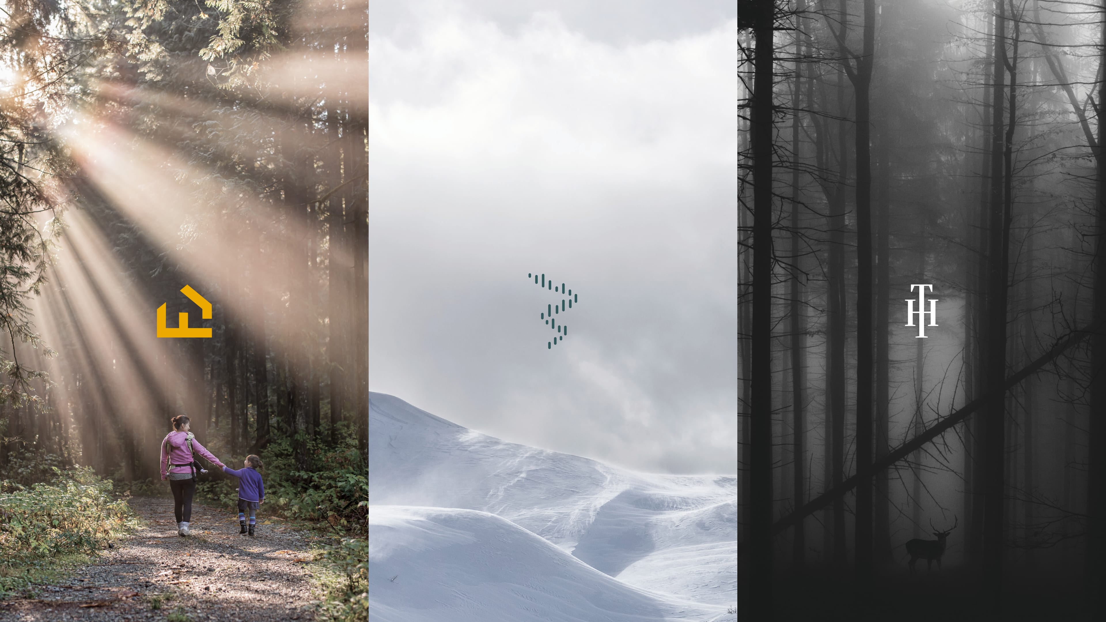
Myrkdalen needed to differentiate itself from other destinations and mountain resorts in Norway and internationally to attract guests to the somewhat remote location. They wanted to position themselves as ‘in the middle of adventure’ – partly explaining the unusual logo placement and size. They wanted to be perceived as a contemporary resort but with a strong and credible local flavor.
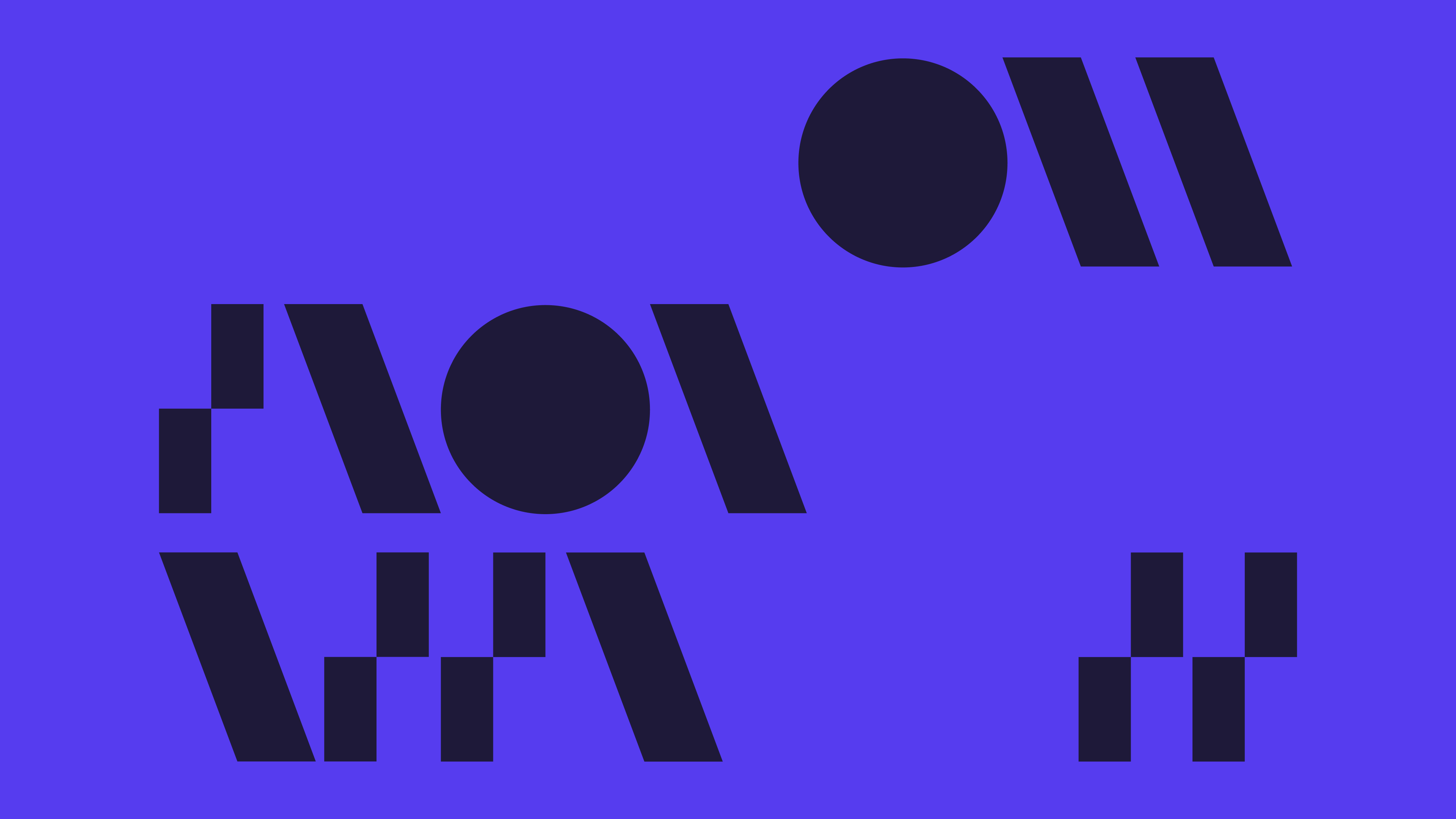
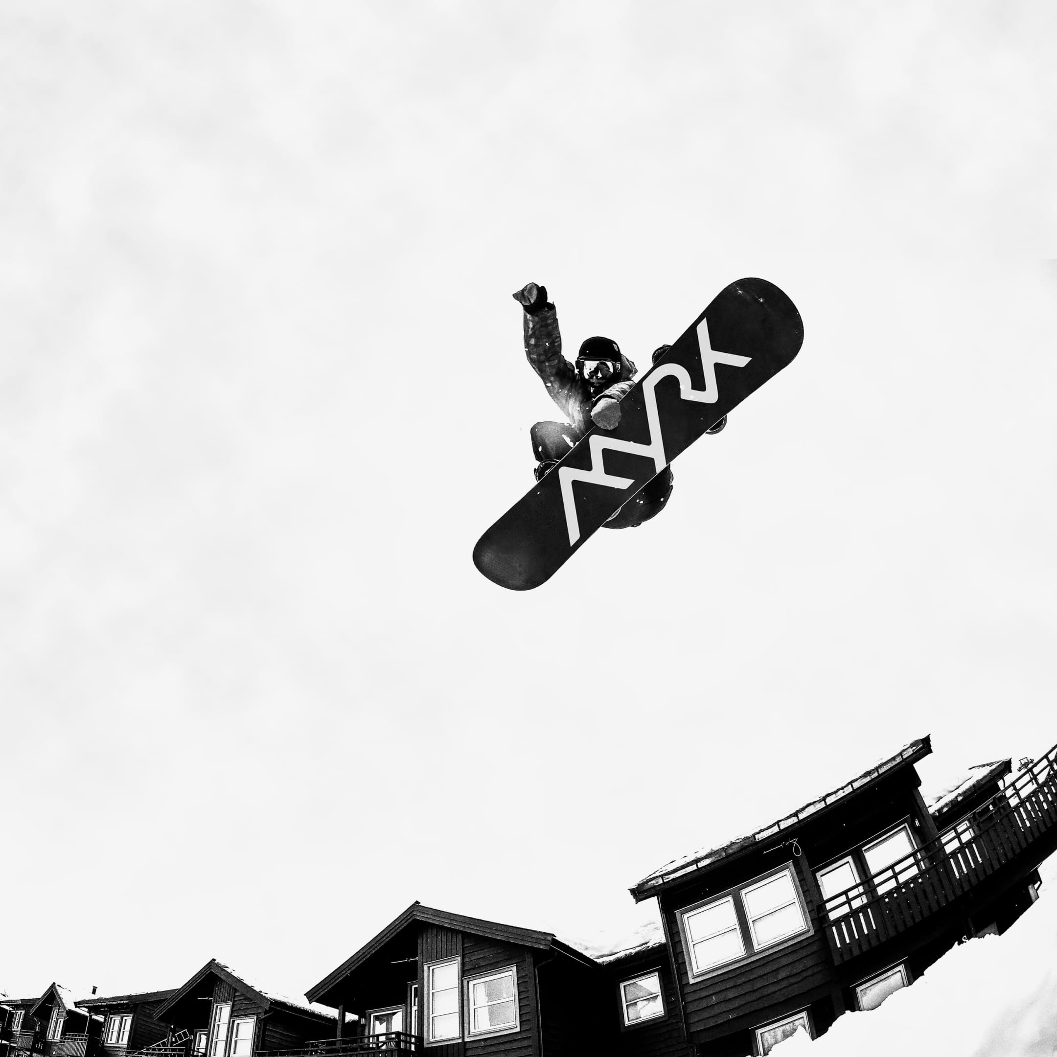
The identity is inspired by the dramatic local landscape: valleys, mountains and fjords. The diagonal division is a bold deviation from the competitors and provides the setting for imagery showing the variety and contrast of the Myrkdalen experience. With its sport and lifestyle feel the logo also works well with clothing, sports equipment and local food and drink.
The central aspect of the logo is how the strokes come together to form mountains and valleys, so when looking to animate the logo we looked at several possibilities for how it could come together to form a visually pleasing motion as well as emphasizing the ‘in the middle of the experience’ feeling.
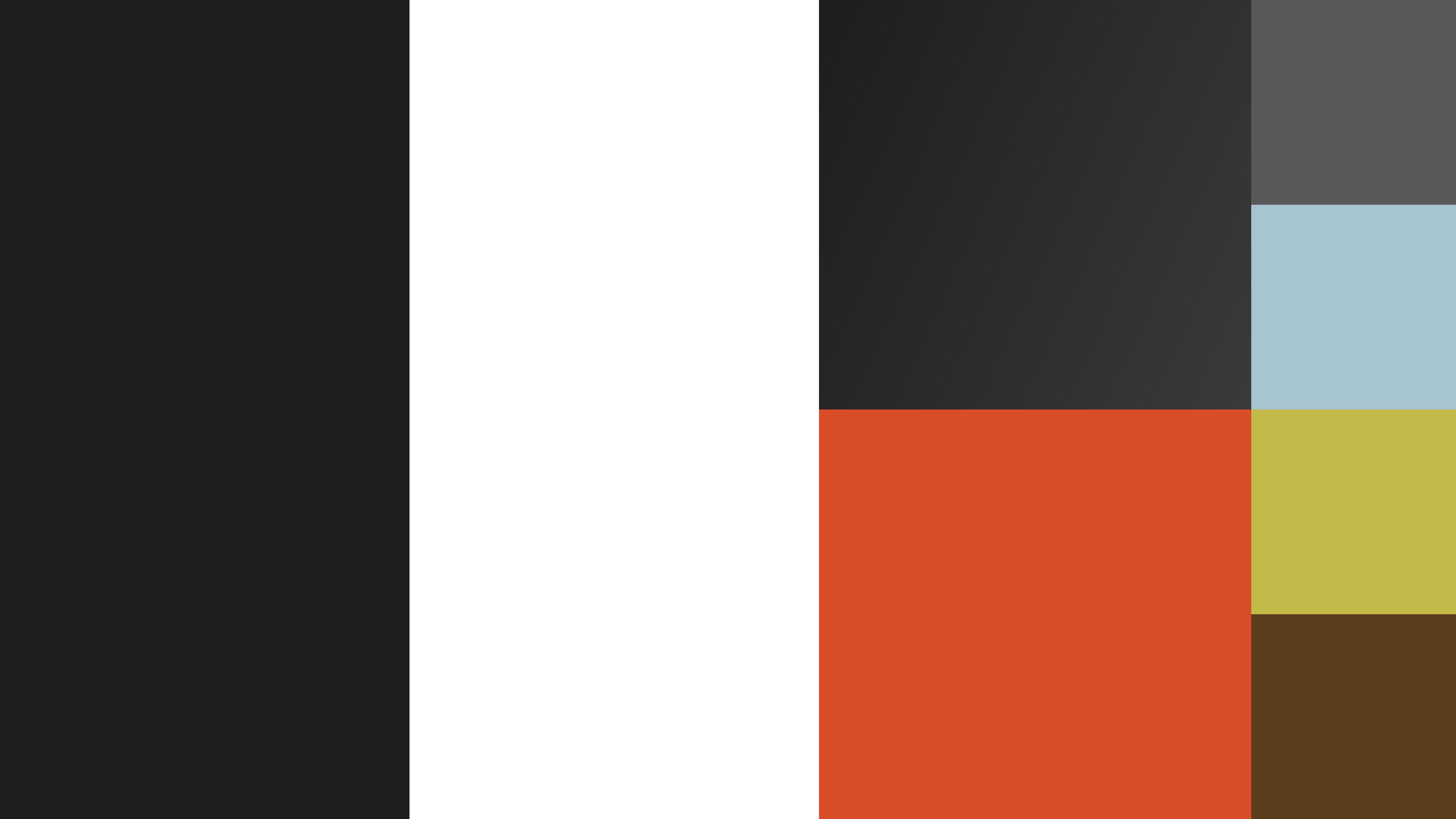
The brand uses a lot of photography, so in terms of colours we had an emphasis on black and white.
We also introduced a gradient that could be used in opposite direction on left and right side of the diagonal split.
As an accent we introduced the orange, which contrasted a lot of the cyan-blue tones of snow. The tertiary palette was added for seasonal variations on the website.
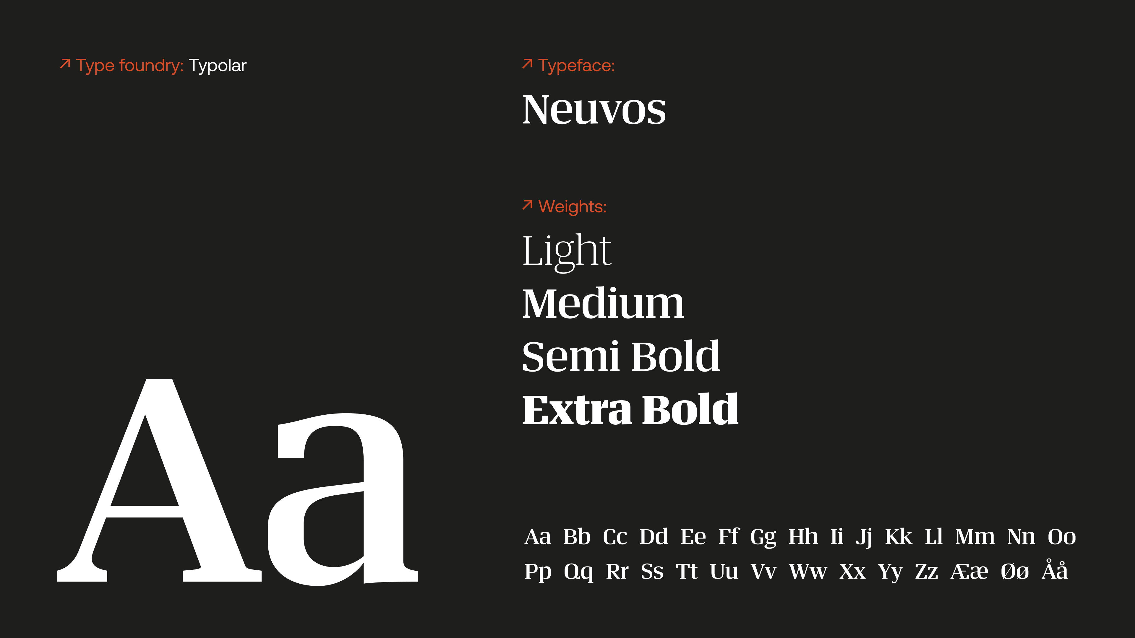
Elegance with a pinch of quirky. The old wooden barn with handcarved lettering as much as the modern sleek hotel. Neuvos fits right in as a display typeface.
The heavy lifter for all body copy. Clean and minimalistic, with a good contrast in weights from the nimble light to punchier bolder weights.
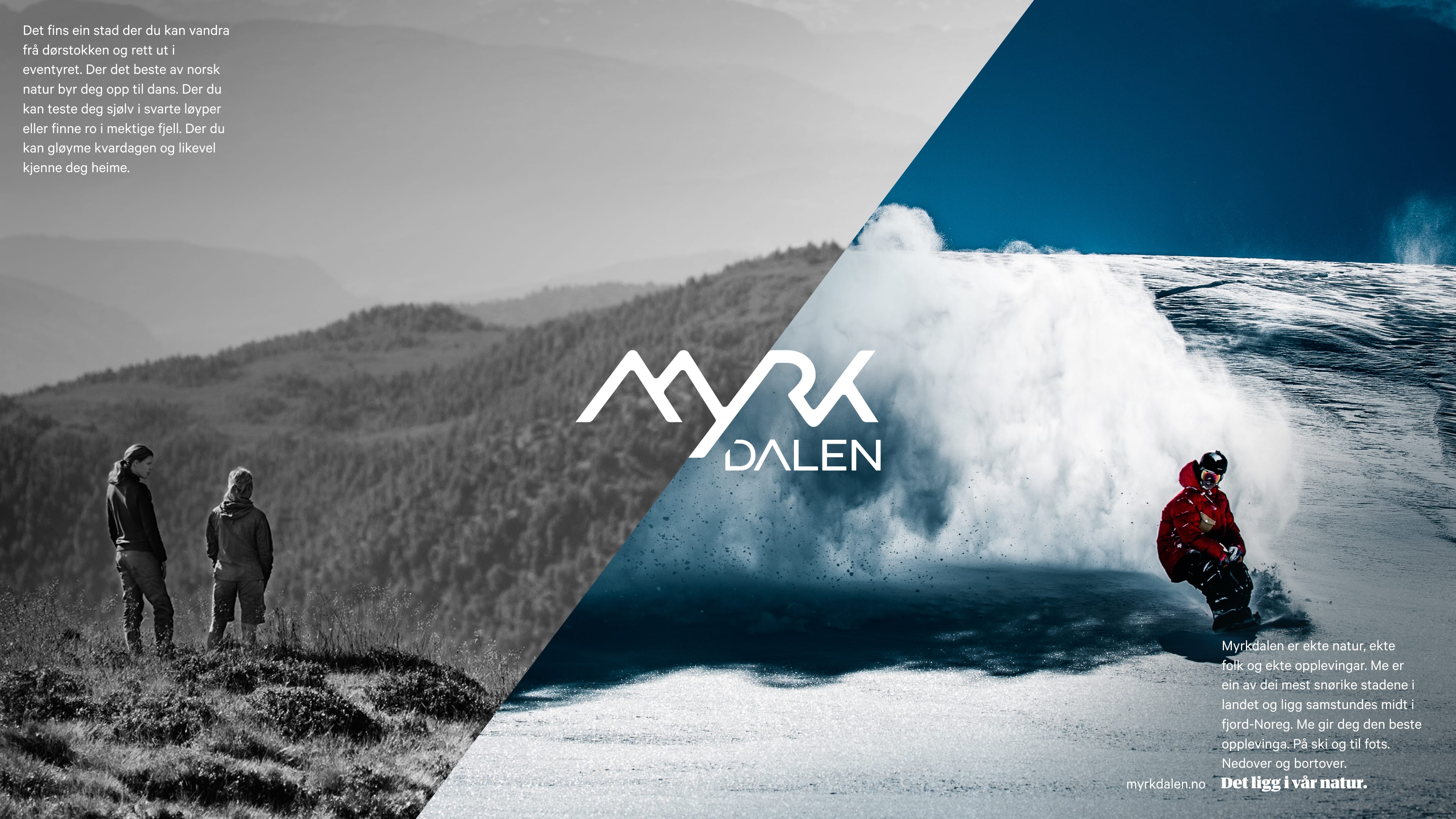
Level 1 communication: Communicating the over-arching experience of Myrkdalen, showing off it’s summer/winter seasons.
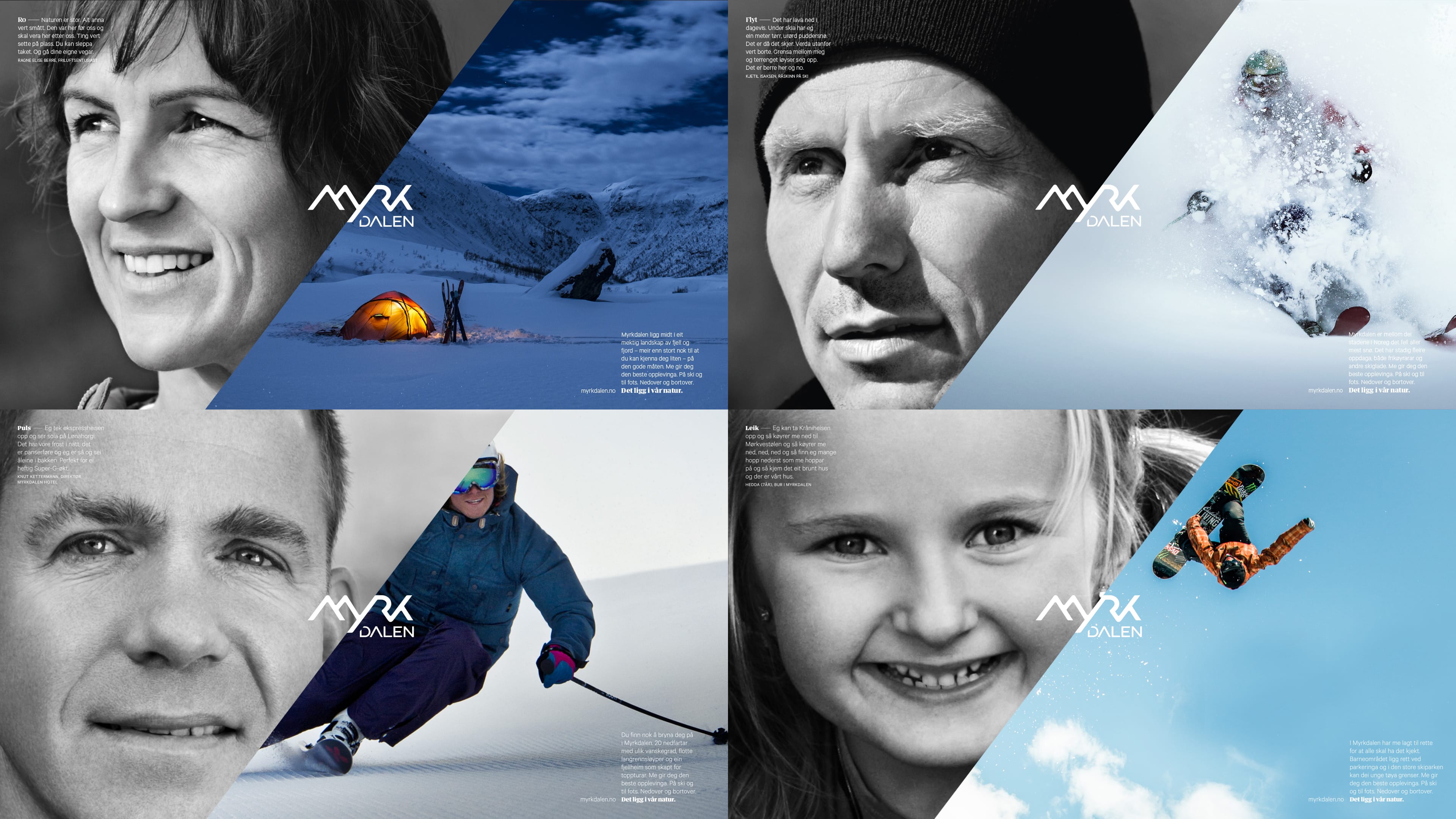
Level 2 communication: Using local ambassadors, we targeted particular categories of audiences, connecting them to the different feelings one might achieve on a visit to Myrkdalen.
Ro Tranquility. Flyt Flow. Puls Adrenaline. Leik Play.
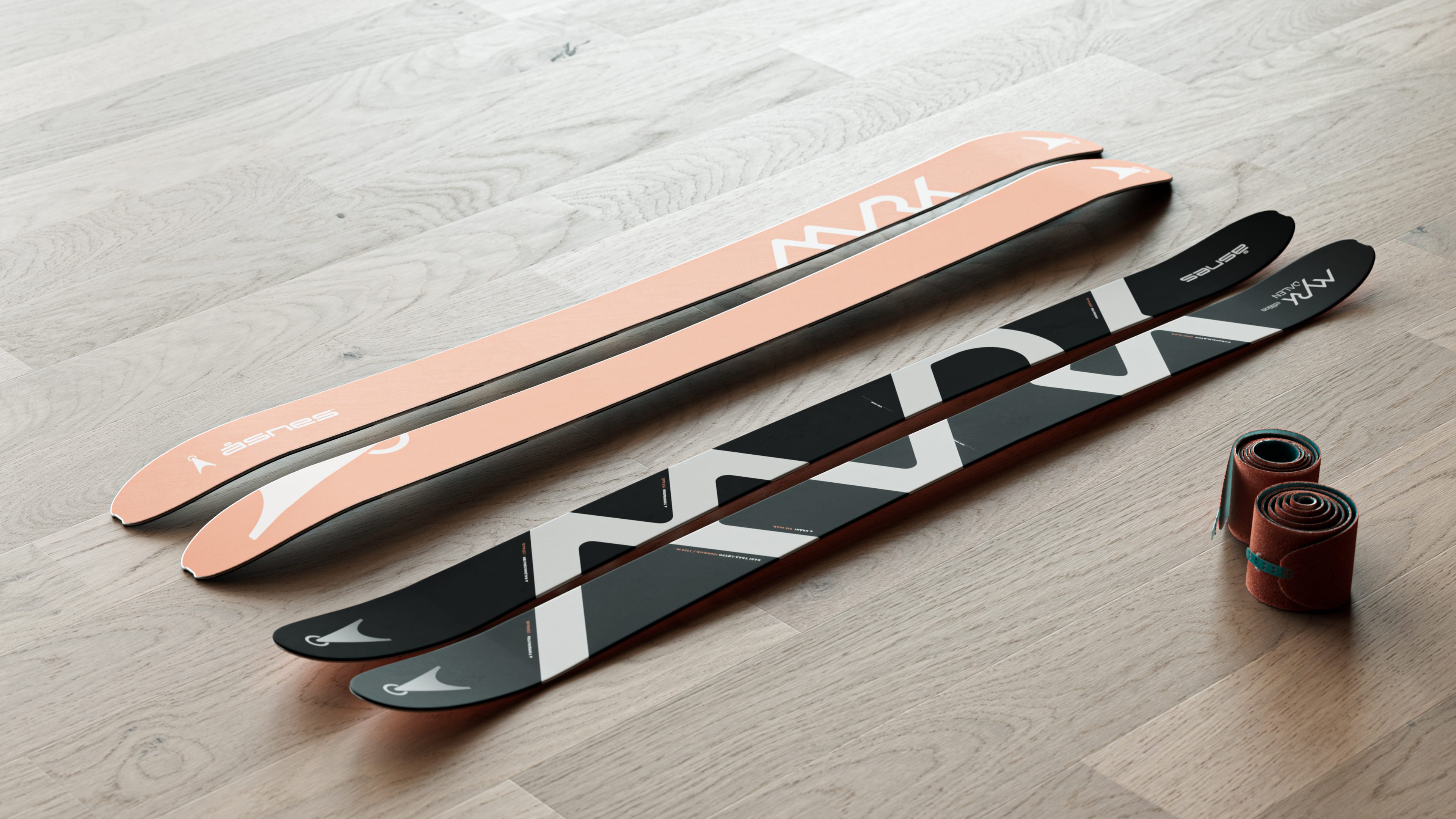
In collaboration with ski manufacturer Åsnes, we made a limited edition ski-touring model for Myrkdalen. The graphic features the valley’s different peaks and their altitudes.
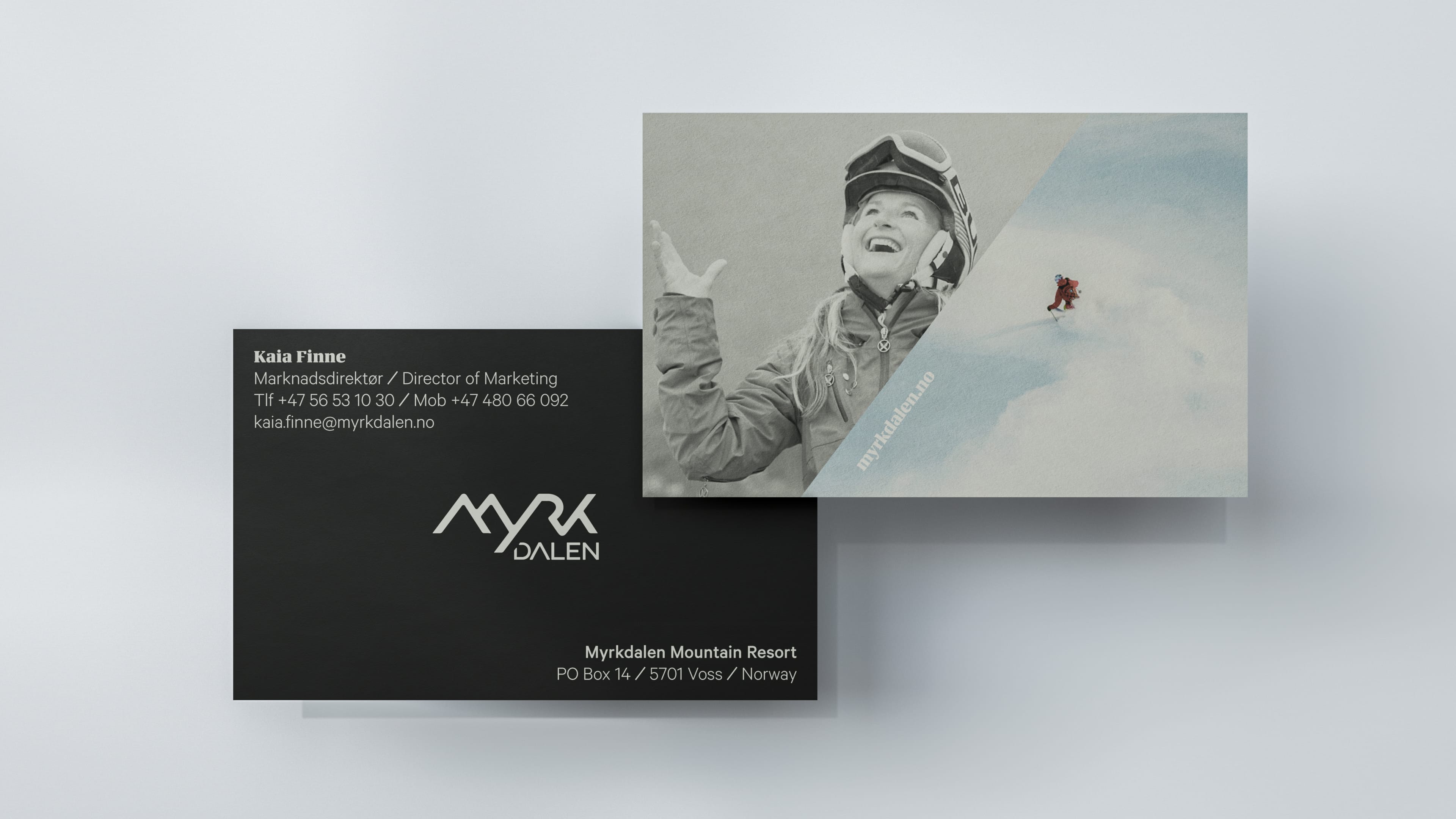
Businesscards for their active employees.
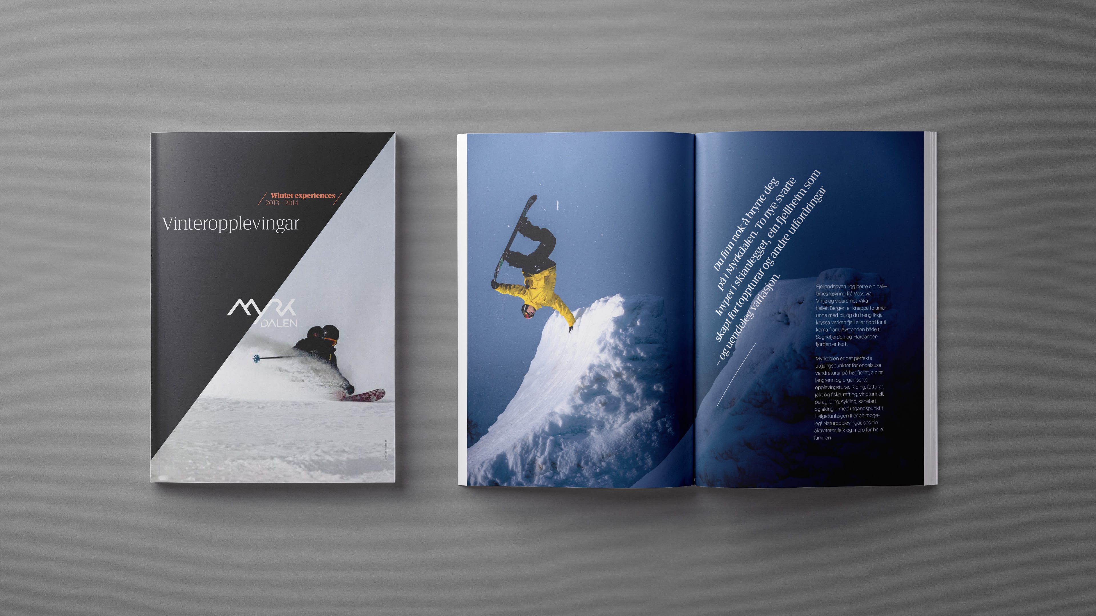
Front page and teaser spread
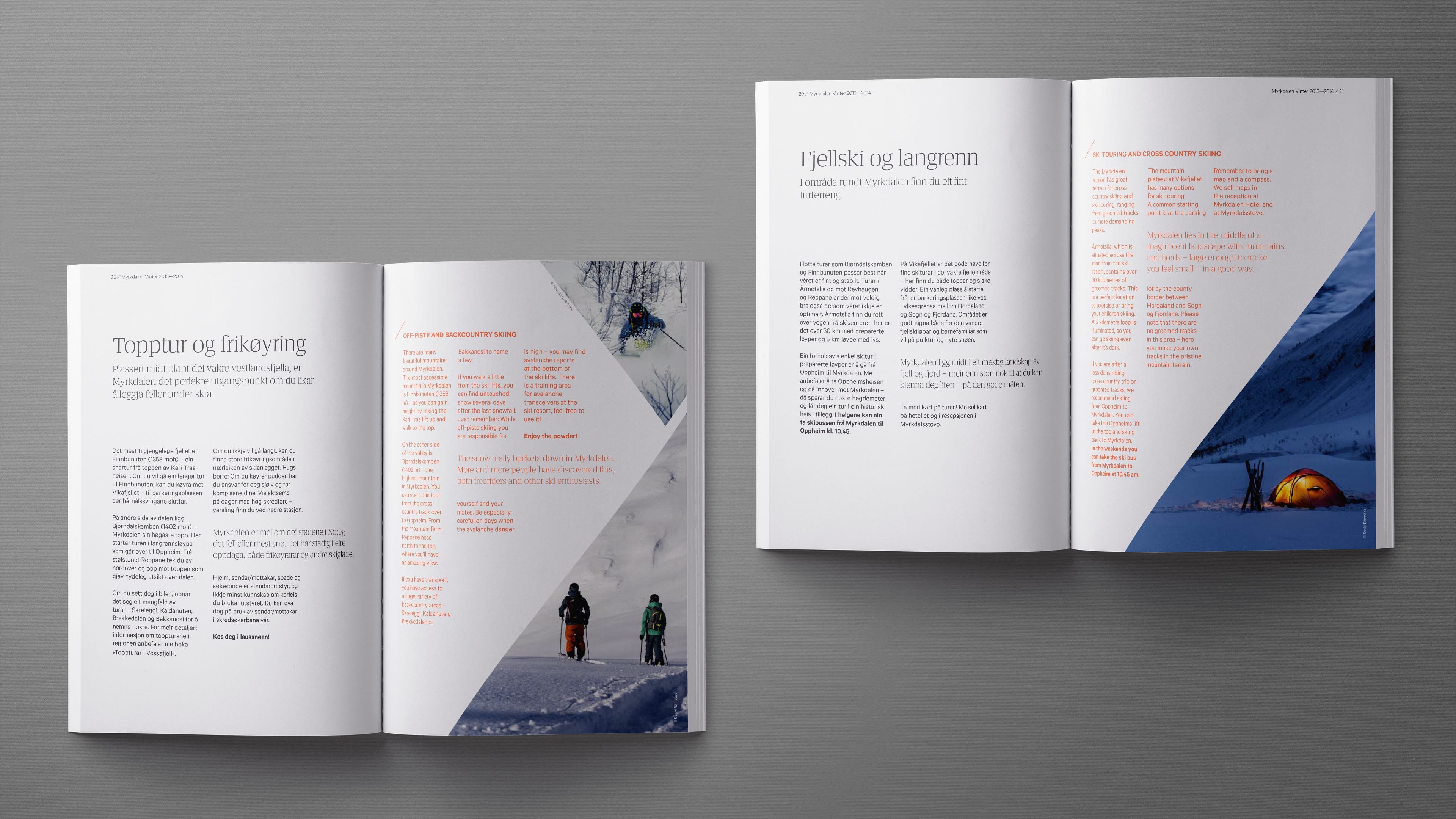
Catalog content.
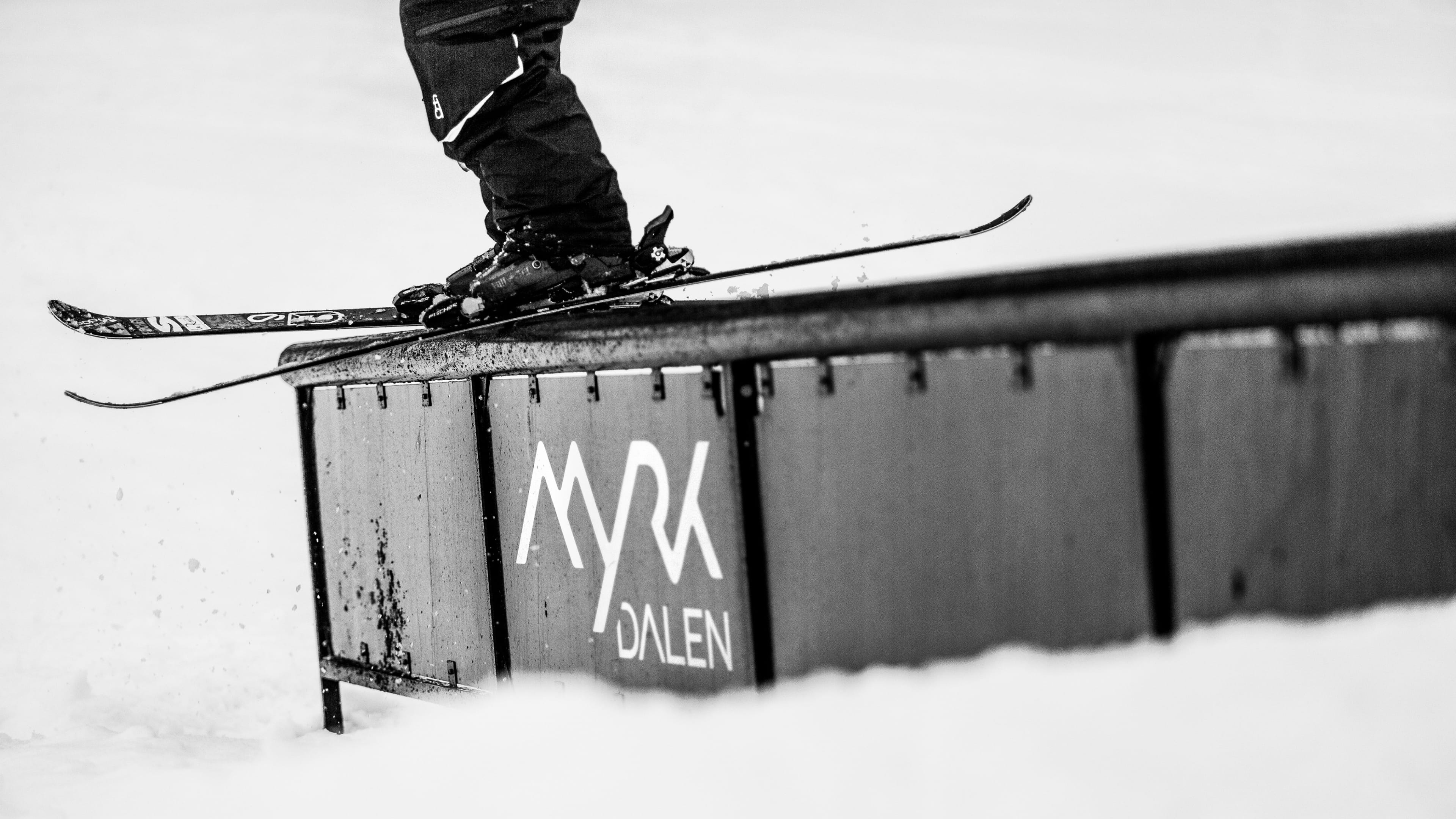
The resort has been taking it’s marketing seriously, with the brand mark applied to everything from rails in the jib-park to their snowcats, employee tattoo’s and paragliders, their reach in social media is almost unprecedented.
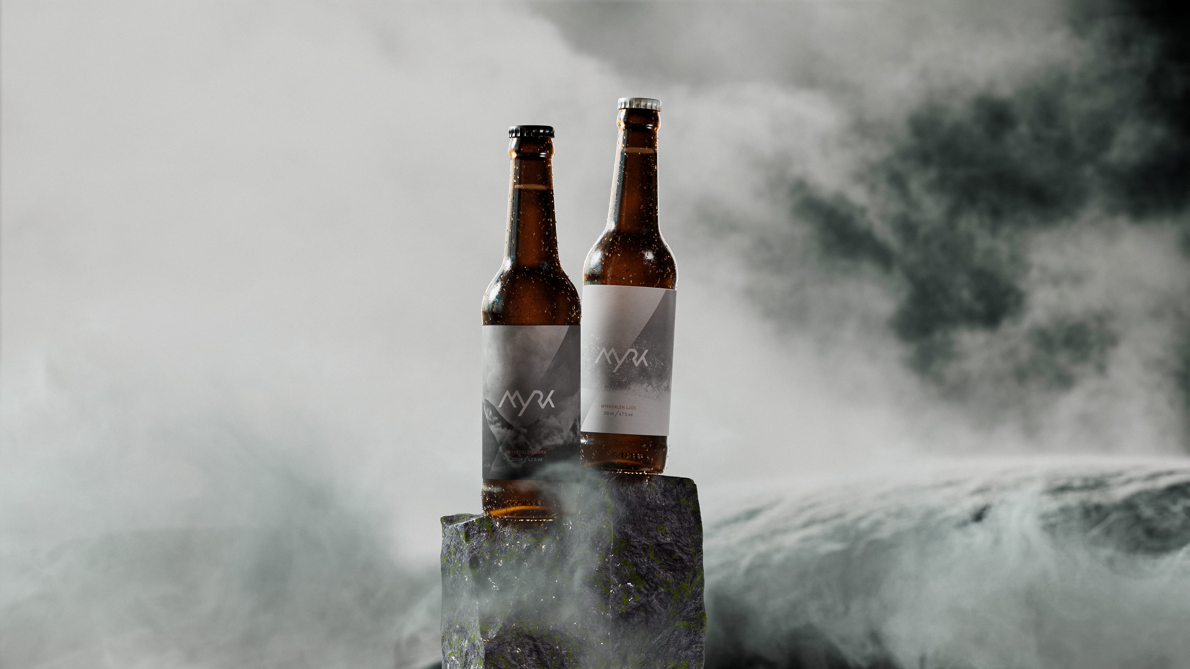
Brewed for the brand launch and a limited period after, the hotel bars and restaurants had their own beers brewed by Voss bryggeri. One dark like the clouds ready to drop tons of snow, and the other light like the powder the valley is so known for.
Are you dreaming about your next winter? If you want to know more about this case or simply talk design Get in touch!
Would you rather see some other cases?