FHG
Three in one
Competences
- Brand design
- Editorial design
- Digital design
Collaborators
- Marte ViksmoenDesign & strategy
- Tage HaunUX & Digital design
Description
Initially the scope was to design a branded house with slight variance to differentiate the different companies, but after getting to know them it became apparent that the stakeholders for each brand were not on board with this, resulting in adjusting how we approached the project.
Ideally, this would lead to rescoping the task, but by applying a good amount of pragmatism and agility, we were able to stretch the foundation across a diverse collection of brands while building some key tools to differentiate them under the same scope.
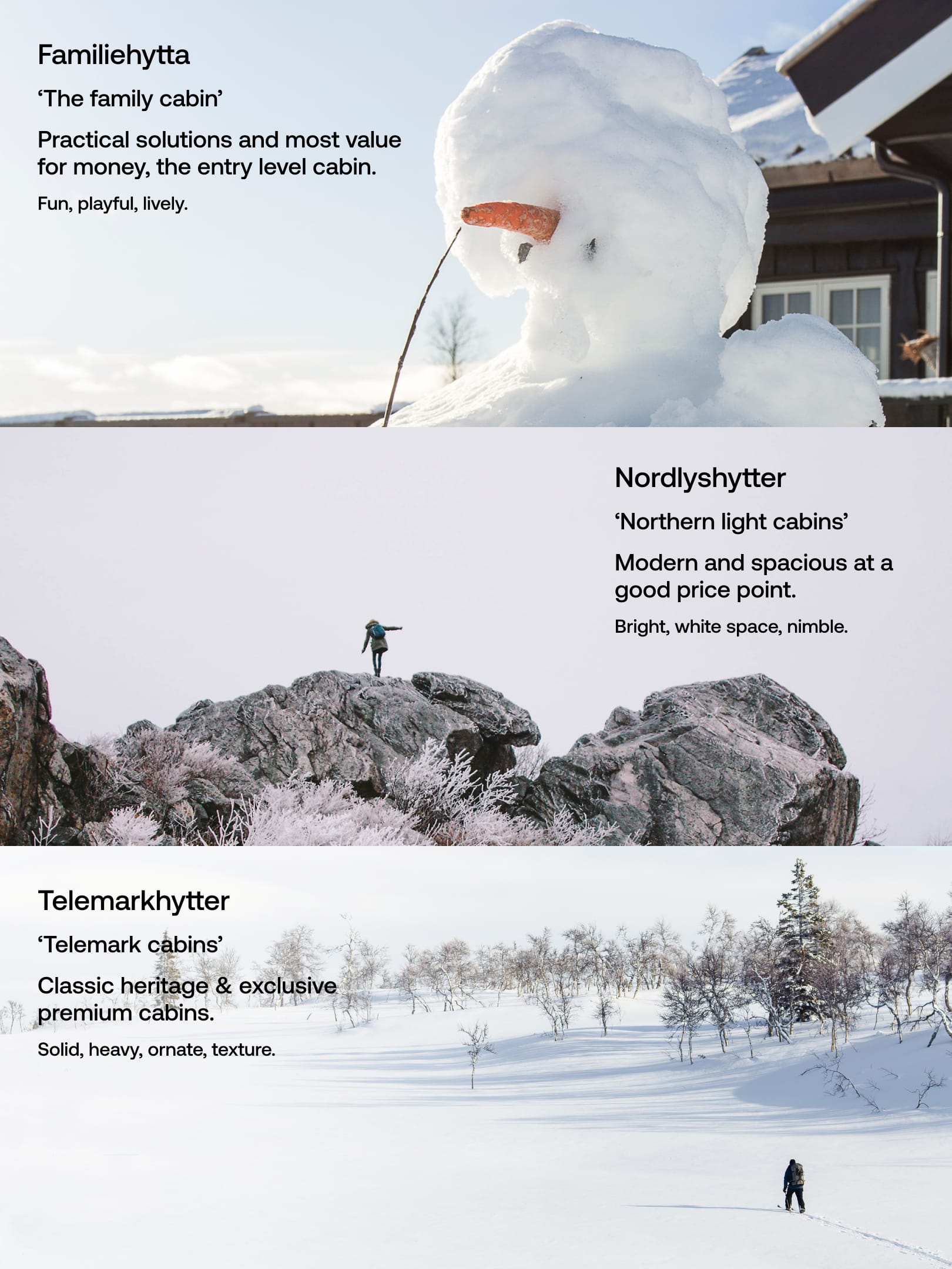
In looking at their products, we tried extracting the uniqueness of each cabin into some descriptors to aid in visualising their brand. Familiehytta is the affordable entry level cabin with clever solutions for families with children, Nordlyshytter is all about modern looks with bright light coming in through the large windows into the open floor plans, while Telemarkhytter gives off a lodge-feeling with robust construction, solid wood, rich on details.
Toolbox

Colour palette
To represent the budget brand FH, we wanted to lean towards a saturated look that is reminicent of IKEA, Lidl and the likes. For NH we looked at winter landscapes in picking some bright blue hues with darker tone-on-tone contrasting colours. TH is predominantly black and white, but we used more textures to gain a tactility instead of having additional colours.
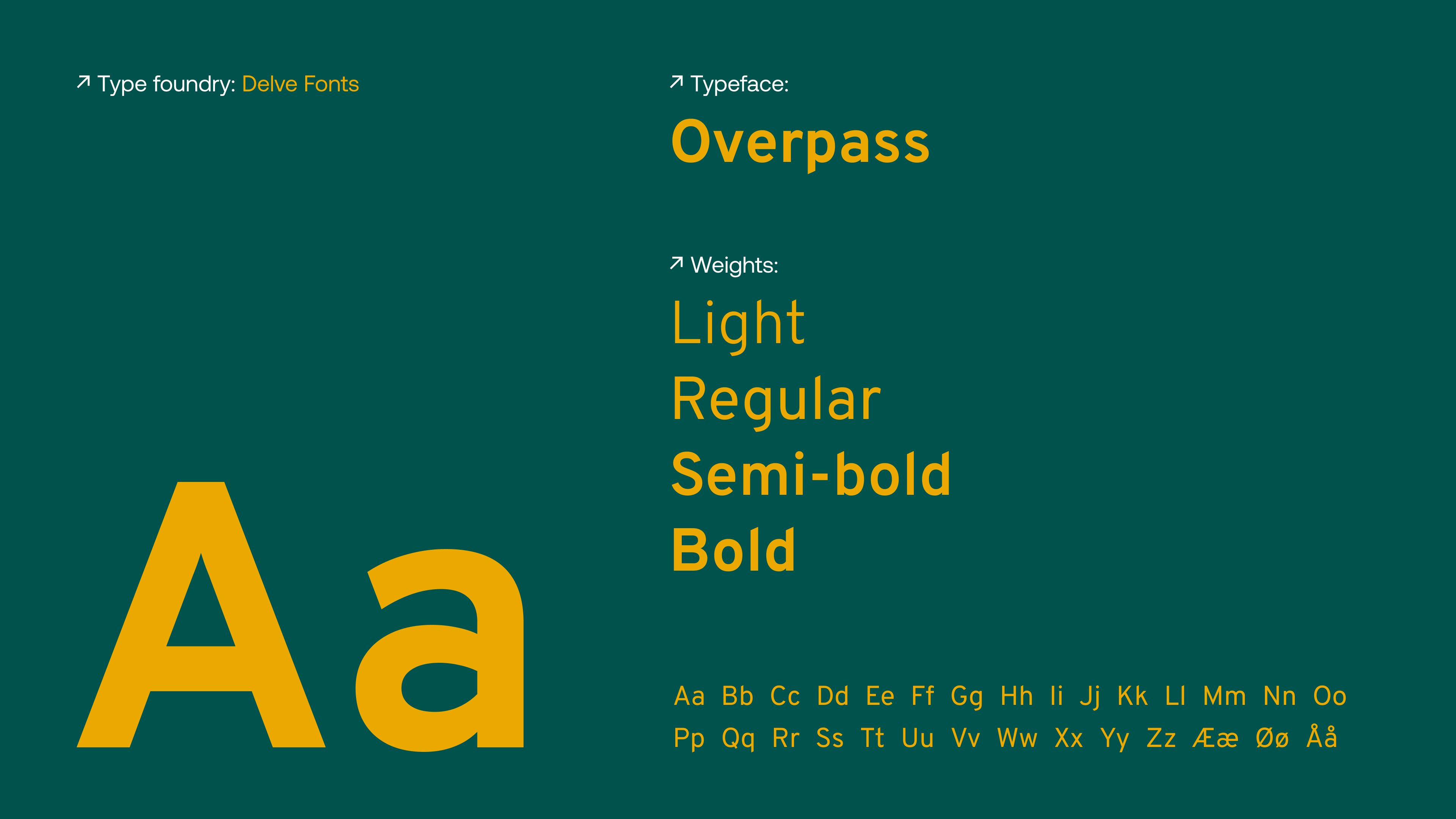
Base typography: Overpass
One of the biggest hurdles for this project was that the companies needed one font that all employees could use in their communications such as letters and contracts, so we ended up with a Google-font that both could create some distinctiveness, had a variety of weights and all free of charge. For Nordlys and Telemark we used additional display fonts, while Familiehytta as the most ‘straight forward’ of the brands would solve all it’s typography using Overpass.
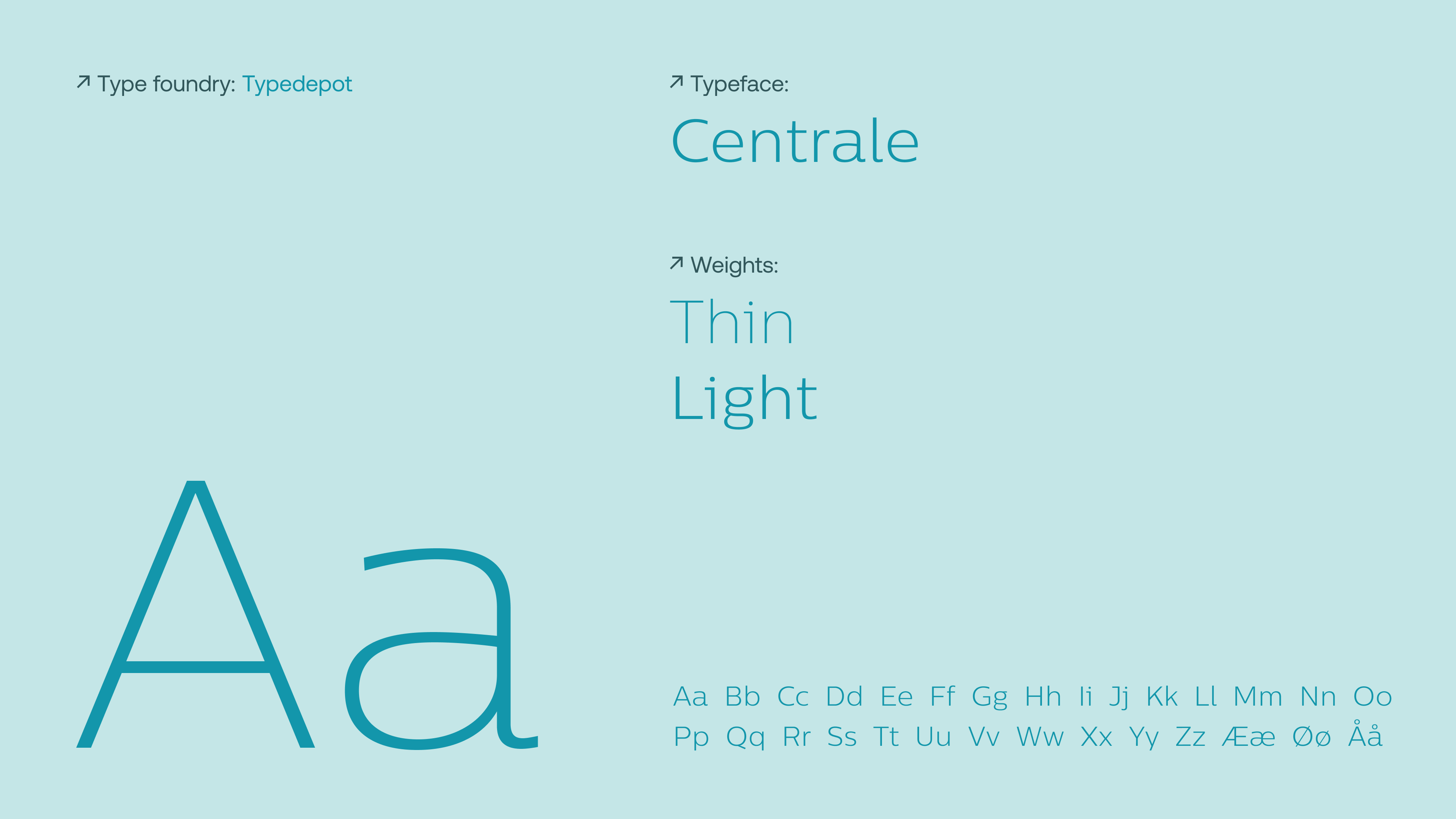
NH Type: Centrale Sans
For the light look of Nordlyshytter we assigned them with Centrale for all headings (and logotype). In thin and light weights it’s nimble, tidy expression is a good match. It has both soft and geometric features, with a large x-height that let a lot of air in through the letters.
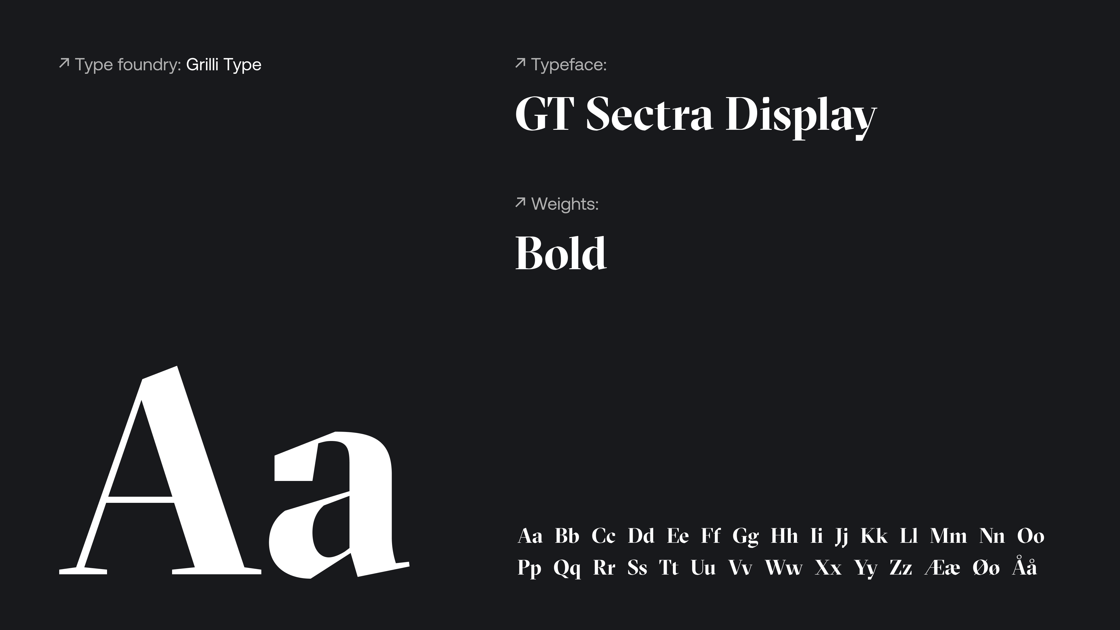
TH Type: GT Sectra (Display)
Solid, rugged, heritage, ornate, texture. Sectra had everything we wanted for Telemarkhytter. The font’s nature aligns with being the most premium of the brands, and works great both in small and huge sizes. While the display type has increased contrast, we used the ‘regular’ Sectra for the logotype to increase legibility in smaller uses.
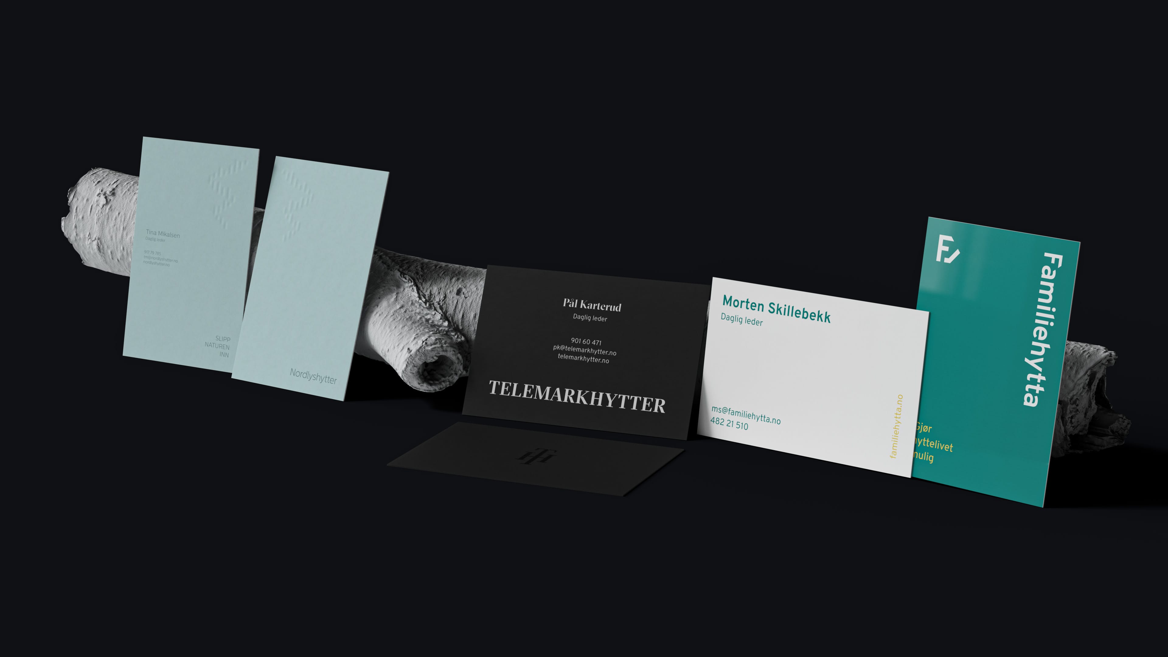
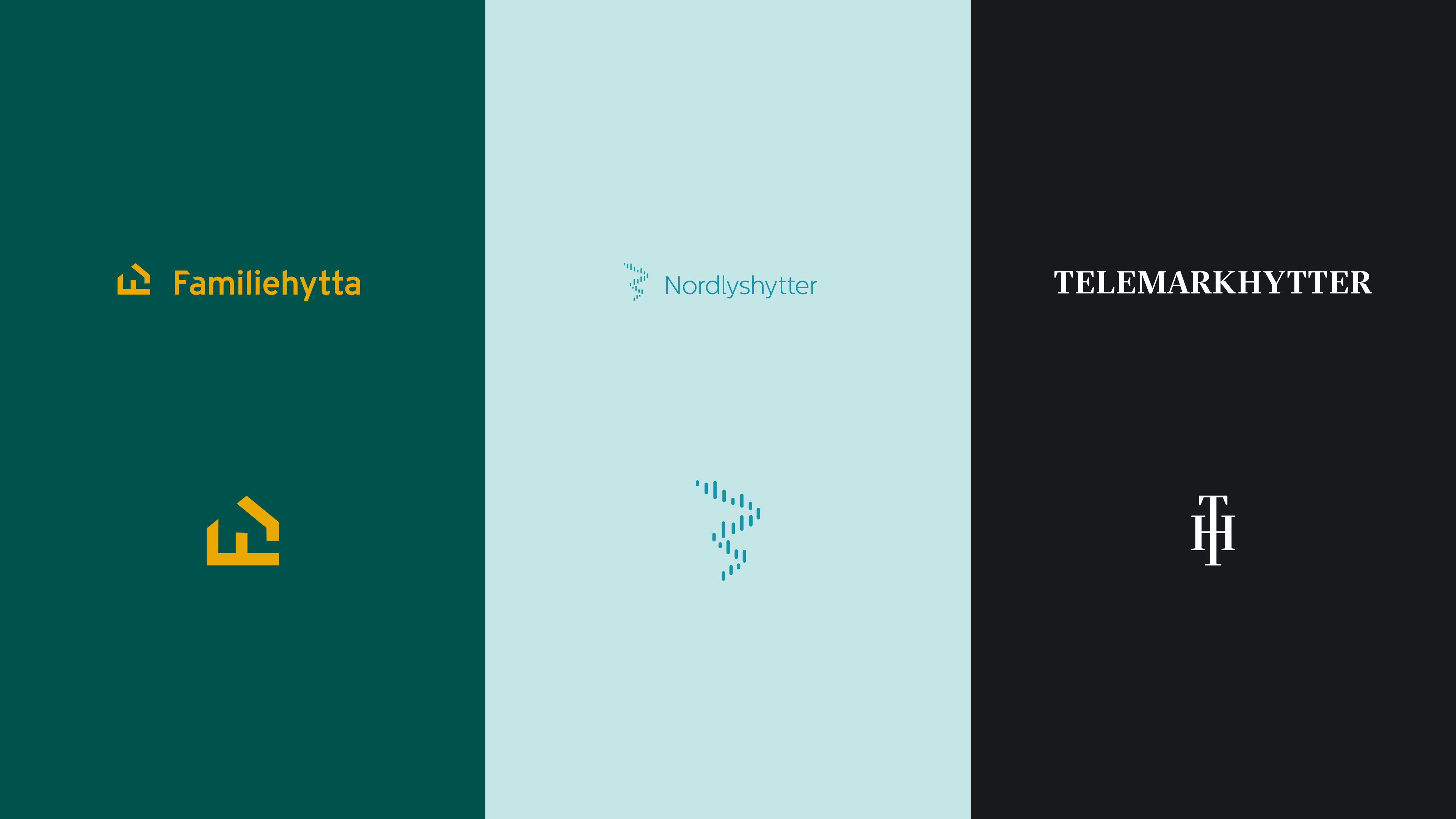
Trying to build on each of the brands’ uniqueness, Nordlyshytter’s business cards had their logo embossed instead of printed, to keep it light and airy with the rest of the graphic printed. Telemarkhytter’s card would get a richer treatment with white foil stamped on black card stock, and the symbol in clear spot coating on the back. Familiehytta builds more on colour and rotation to add a splash of playfulness.
Catalogue
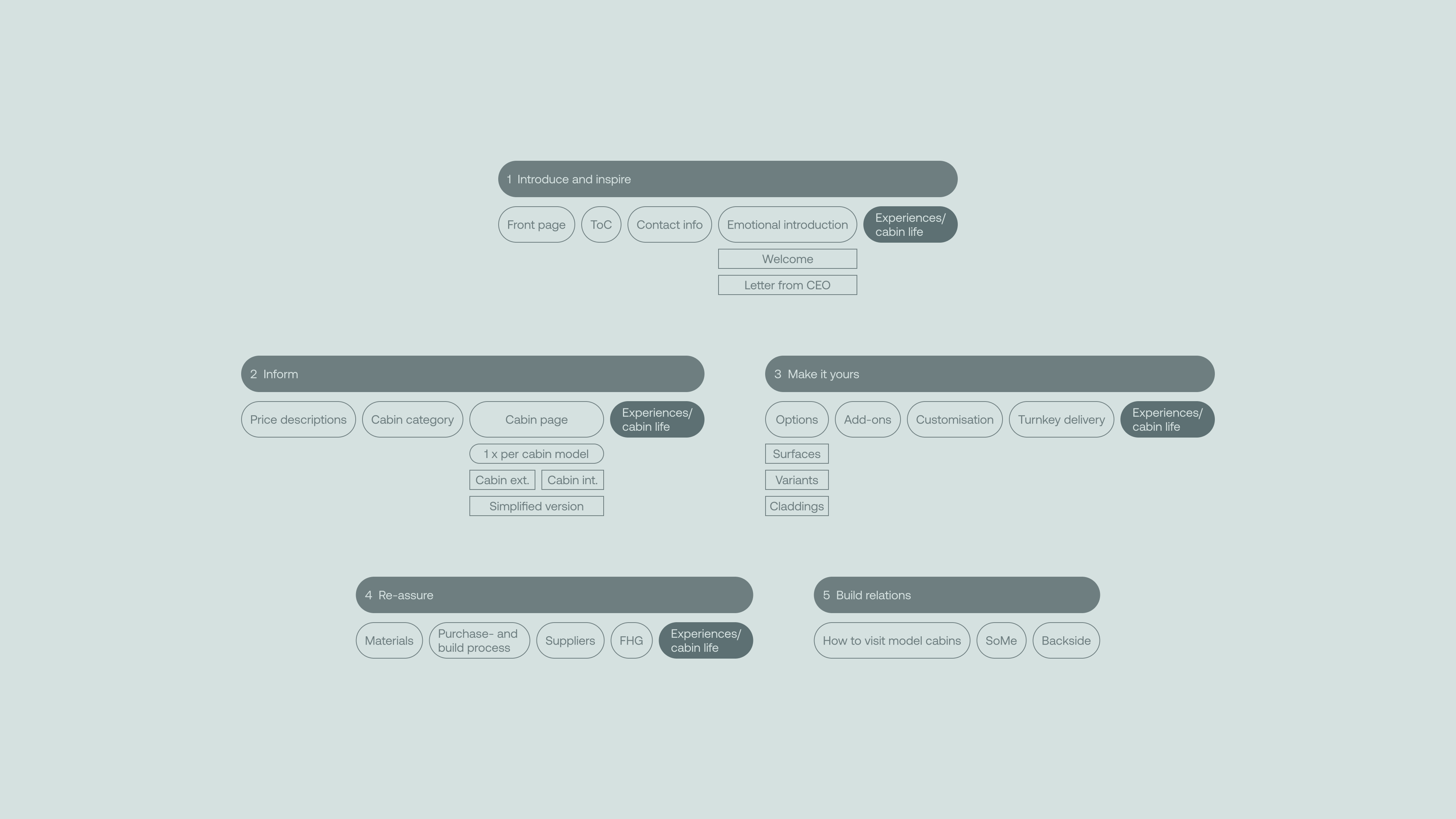
After analysing their former catalogues, which were three quite different dispositions, three different formats, using a lot of different ways to do the same task, we defined one common content architecture that could communicate all three catalogues, in their own style. This was a detrimental part of solving three different catalogues in as many weeks of work.
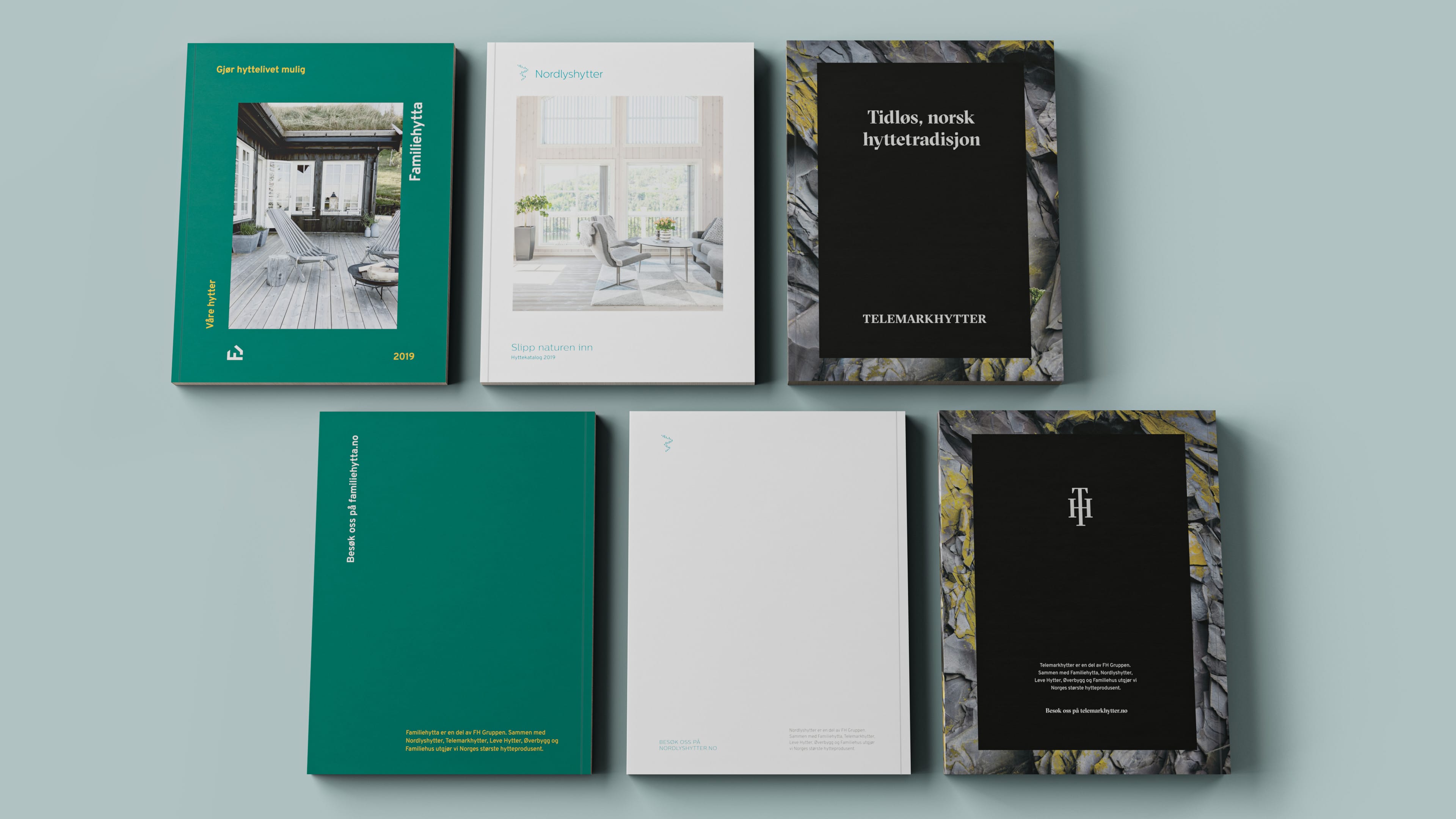
In differentiating the brands, we kept building on the same way of treating the respective brands. FH with the more playful, naive look, NH with airy and nimble and TH with a robust look. Common for all catalogs was the square on the front that would work as a window into their universe. For TH we did not want to use product photography on the outside, but rather make it feel more explusive. We inverted the shape by using a solid colour block in the middle and adding a photo of slate texture on the soft-cover version.
Each brand got their own grid to let the diverse typographic treatment work. Nordlys with it’s more swiss-inspired grid gave more options in placing items to introduce whitespace in between. Telemark a more classic, straight forward, grid that still gave enough option. Familiehytta with a straight forward, no-nonsense four column grid, but with the more playful elements floating outside of the grid.
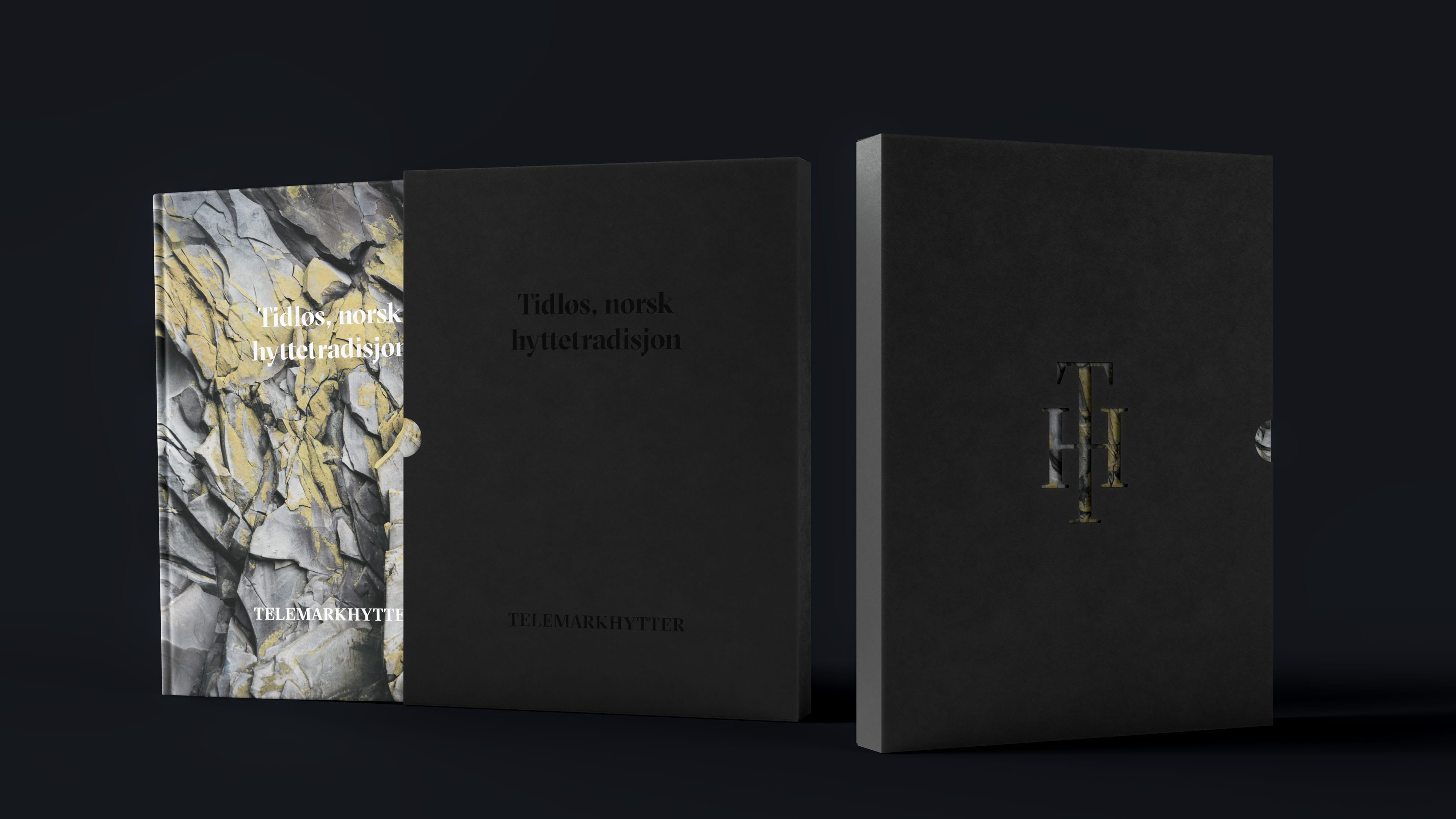
For Telemarkhytter we also made a more premium version of the catalogue in a hard-cover book. Here we let the slate texture take over the entire cover, while the graphics were foil stamped in white on the cover. The book sleeve mirrored the foil stamp from the cover with a black-on-black foil stamp, and the symbol was lazer cut on the back of the sleeve to let some of the texture through.
Websites
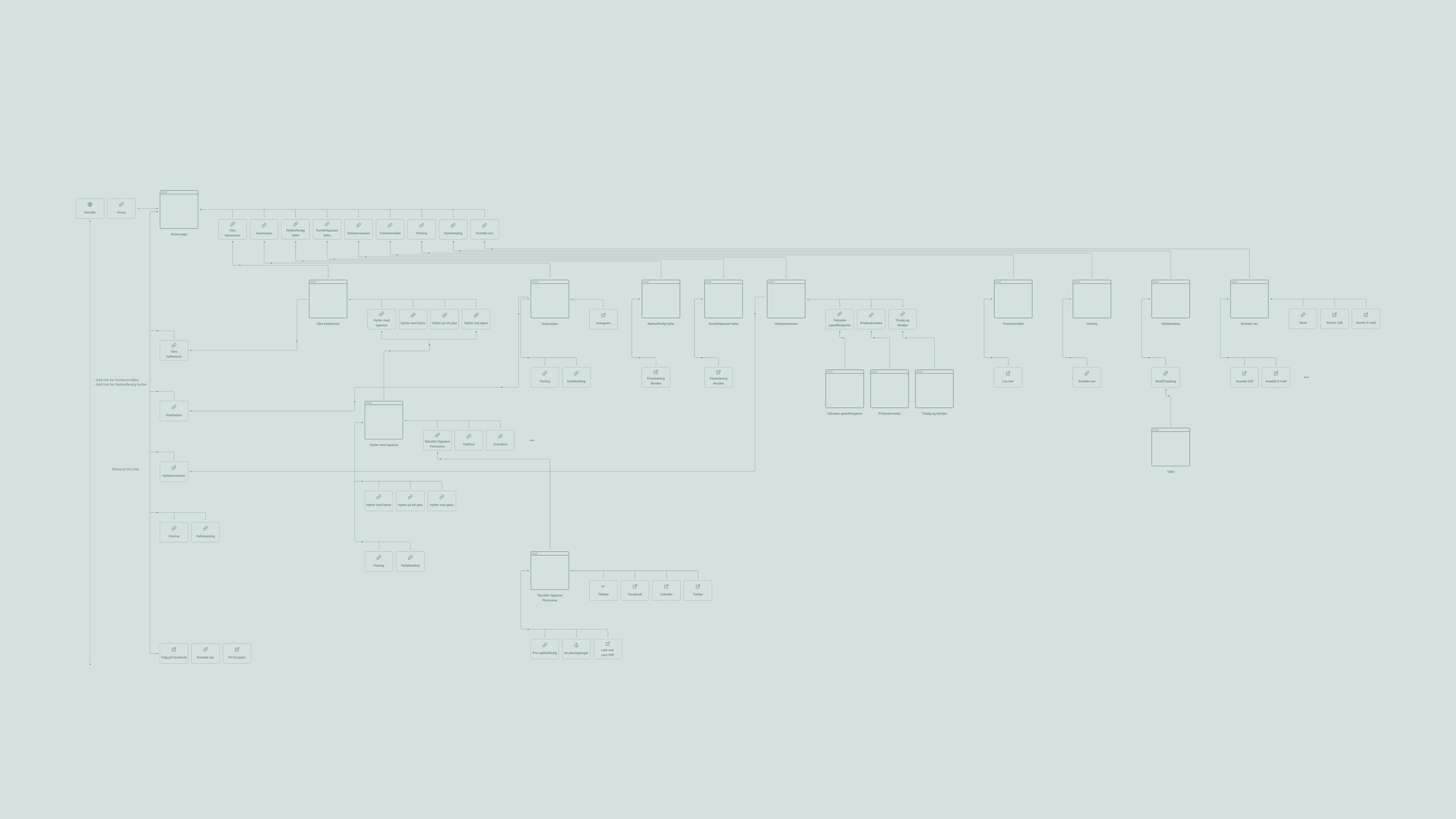
Just like we did for the catalogue, we built a common information architecture for the websites. Although we needed some modifications to how they divide the different cabin categories, much could be solved through the same foundation.
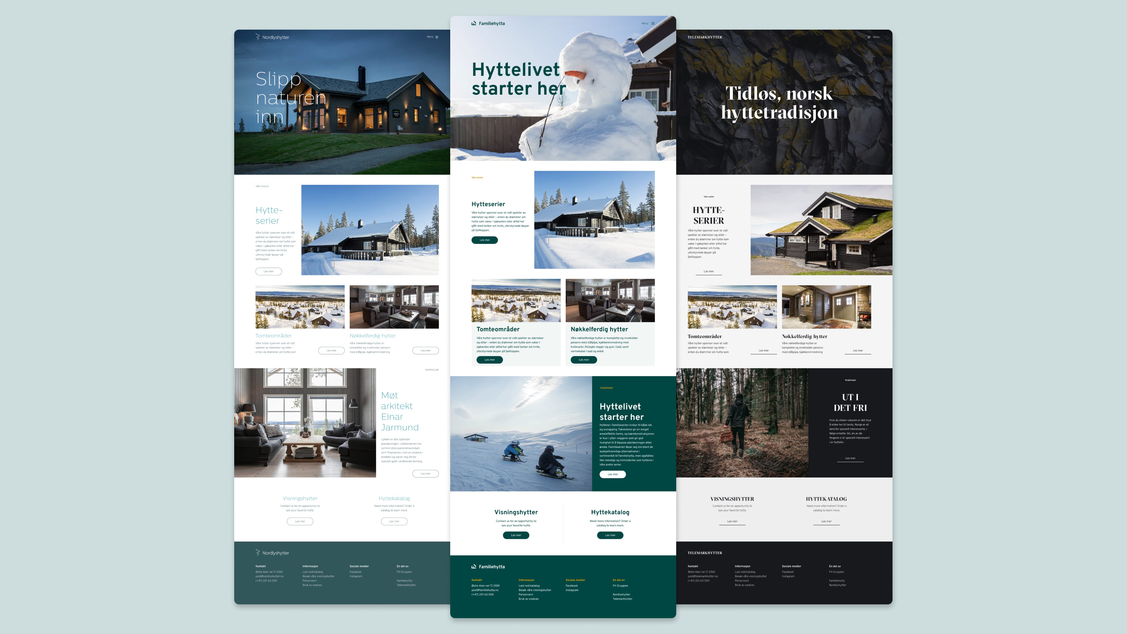
The three websites were all built on the same component library, while trying to push each brand in different directions stylistically.
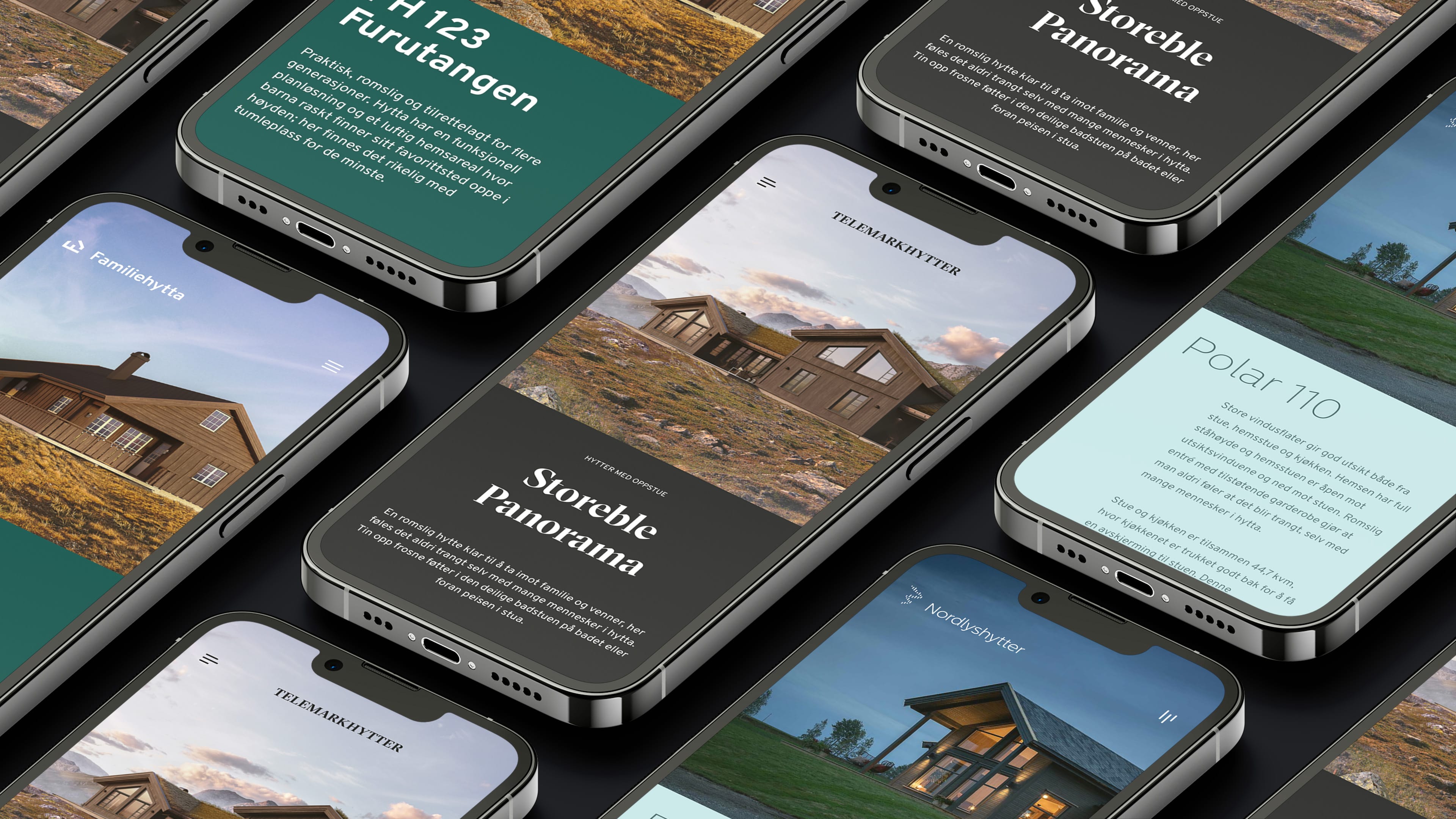
All responsive from desktop to tablet and mobile.
Page type comparisons across the different sites.