Dekkteam is one of Norway’s largest chains for tires, rims & tire hotels, serving everything relating to wheels for a large portion of private customers’ and public services’ vehicles.
Car ownership has changed a lot the past years. Data tells us there has been an increase in female car ownership, the younger generations are not interested in the car as a hobby as much as a means of transportation, wheels and rims are gigantic, apartments and storage space tiny and having a car is increasingly becoming a sleek service rather than a chore.
Yet most of the brands you meet in the industry are plagued with the same old tropes of masculinity, grease, burnt rubber and carbon weaves, causing a detachment that doesn’t speak to the majority of potential clients.
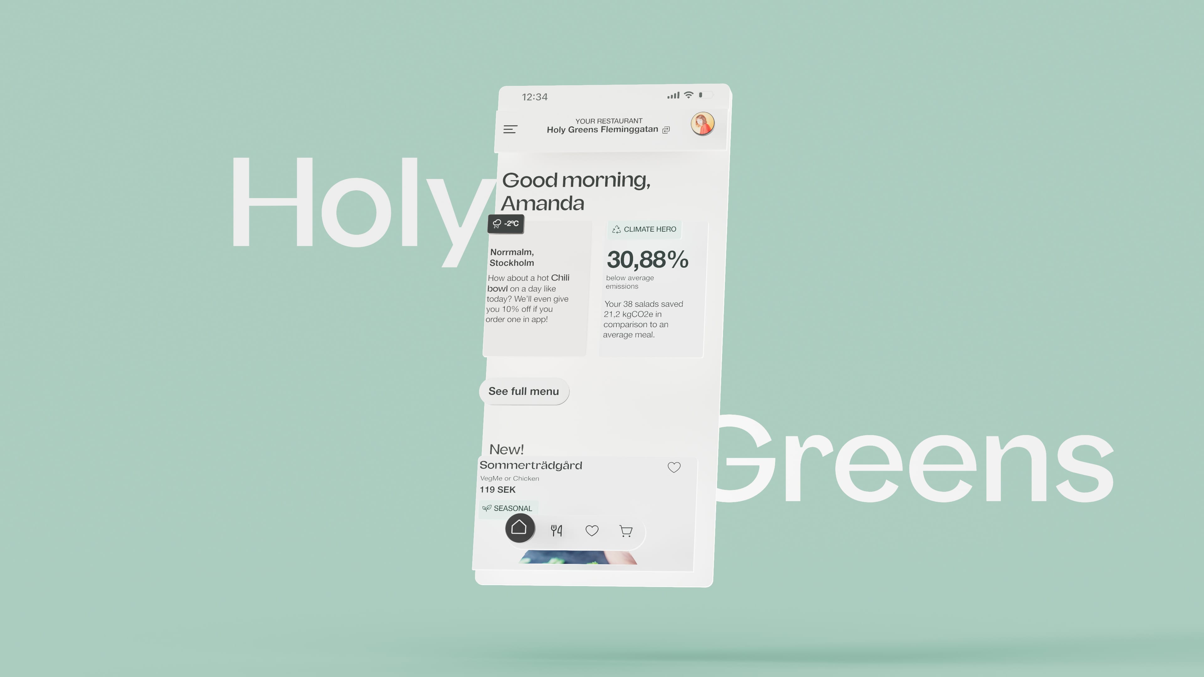
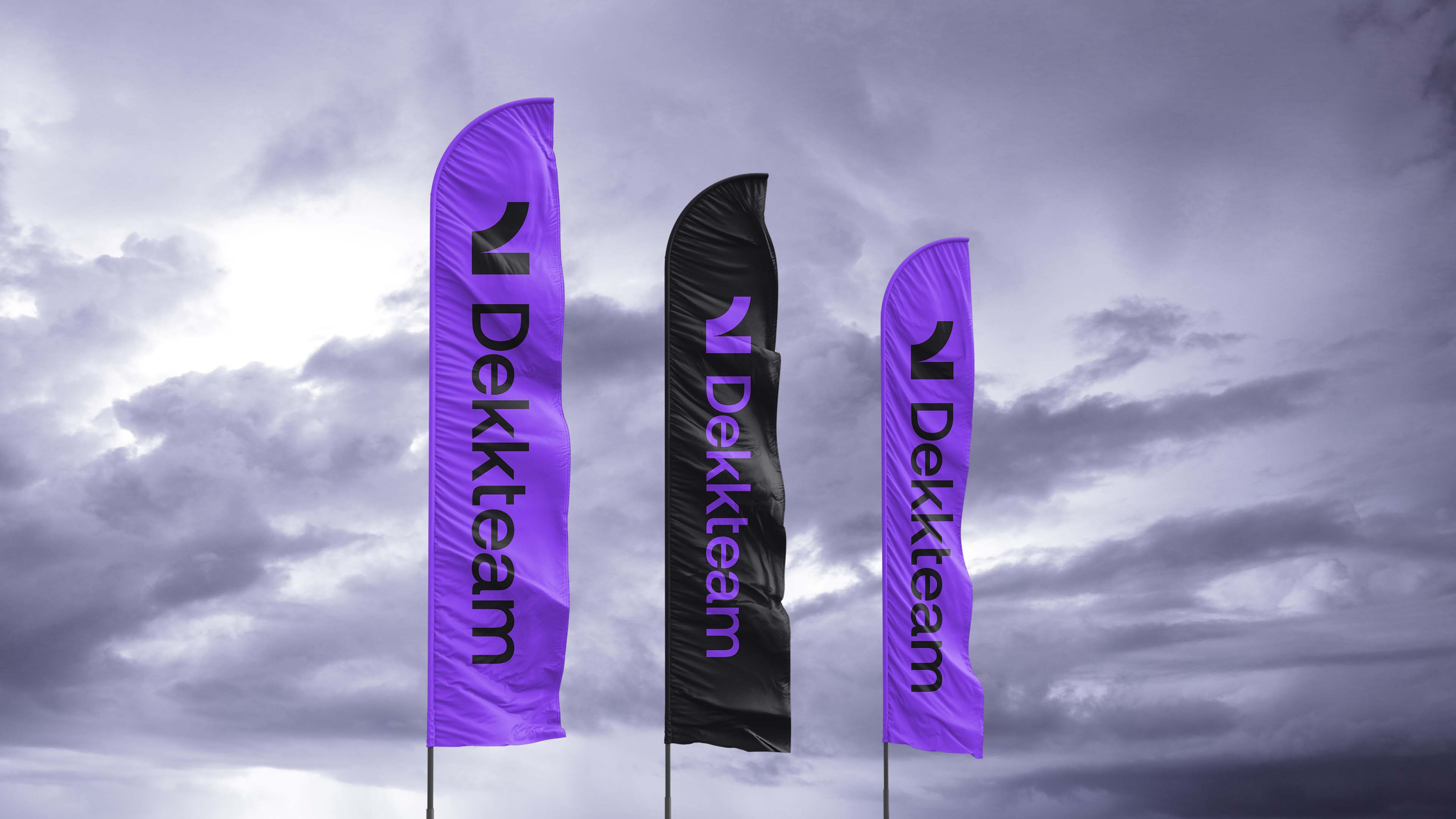
Our solution was to focus on a clean and accessible brand that better represents what owning a car should be. Going slightly more feminine, without ostracising the male demographic. Punchy colour combination and bold shapes, but also a solution that could be toned down and be a background element.
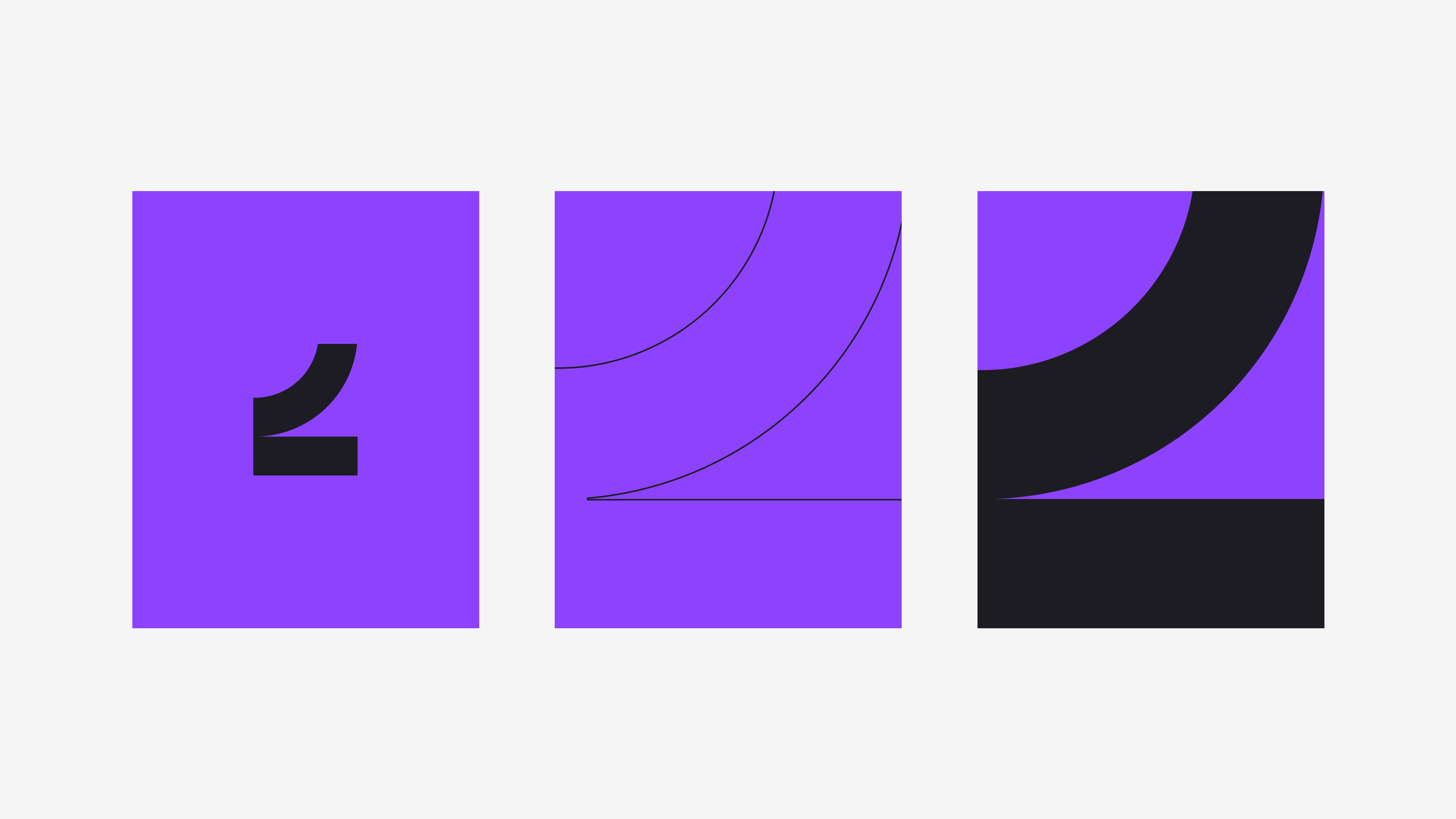

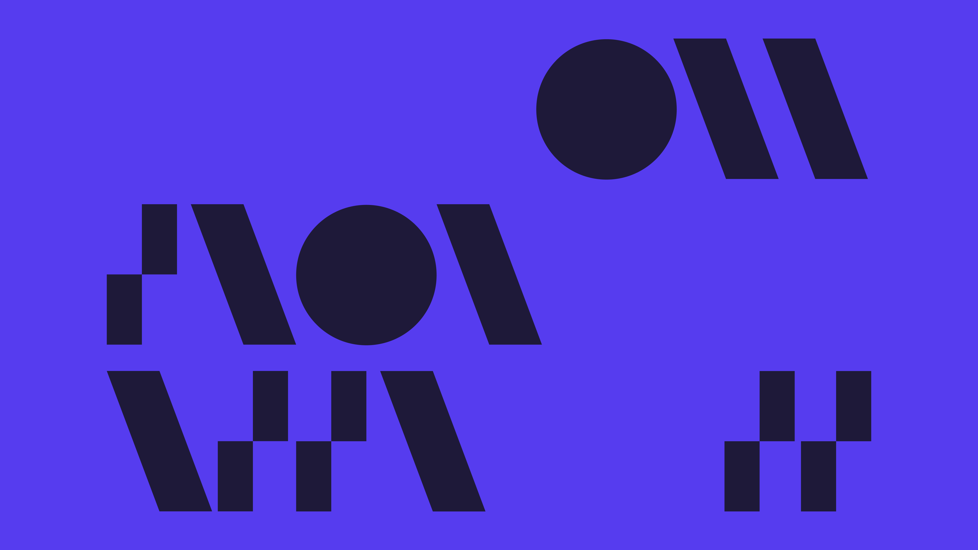
The logo symbol depicting the tire grabbing onto the surface.
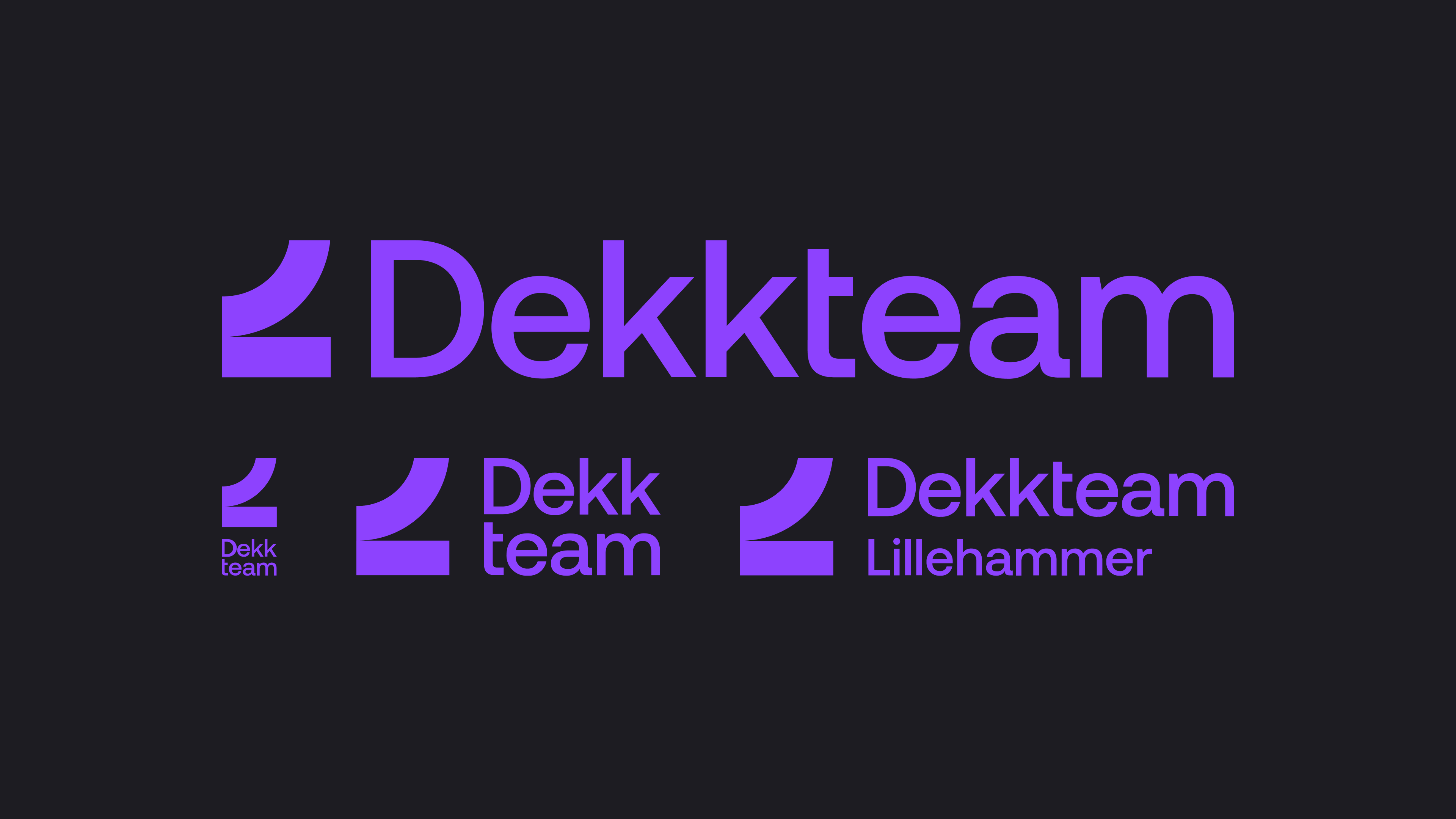
As a system we made a full length version, a vertical format, a condensed version of the full length and a secondary logo for local use.
The symbol can be used separated from the logotype and used either as an icon, outlines or colour blocking of a format.
In modernising the Dekkteam brand, we got rid of a whole bunch of greytones, emphasised photography together with a softened white and black, and suggested an energetic purple that either works as an accent with photography or as a fill on plain coloured surfaces.
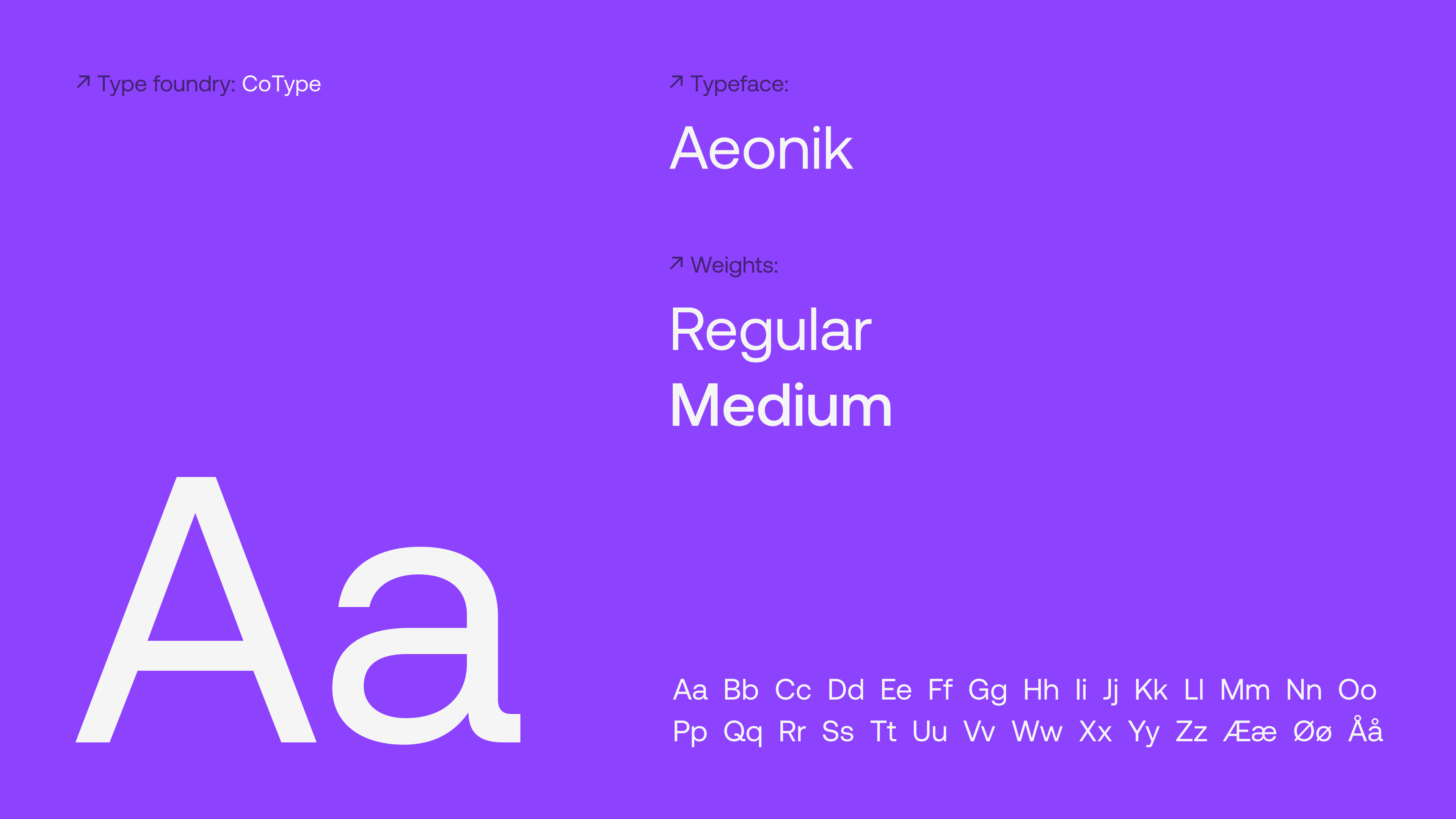
A modern grotesk with mechanical details, geometric in form but narrower than a pure geometric sans serif, making it a sturdy, but economical font. A great match for the Dekkteam identity.
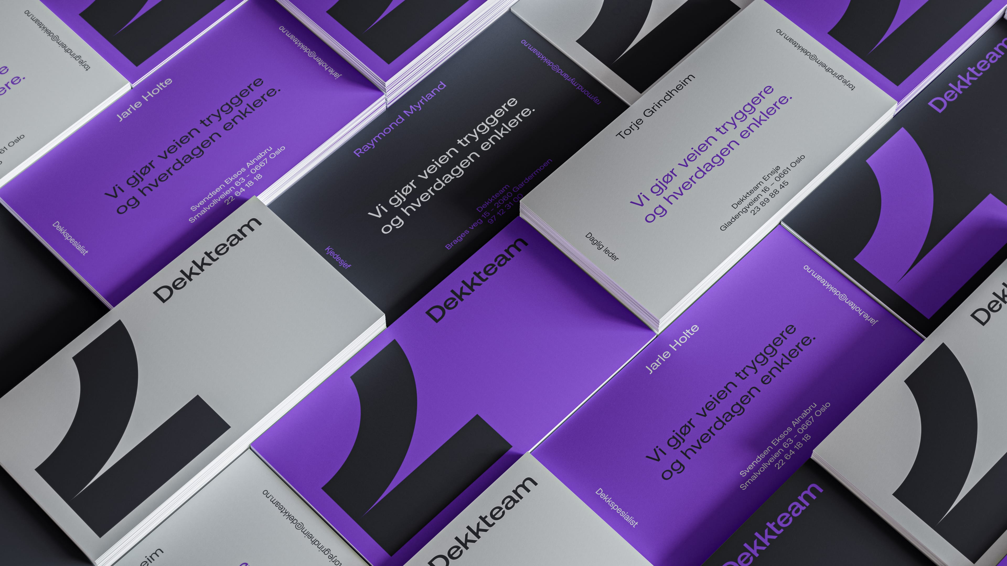
Multi coloured business cards for employees

Ads.
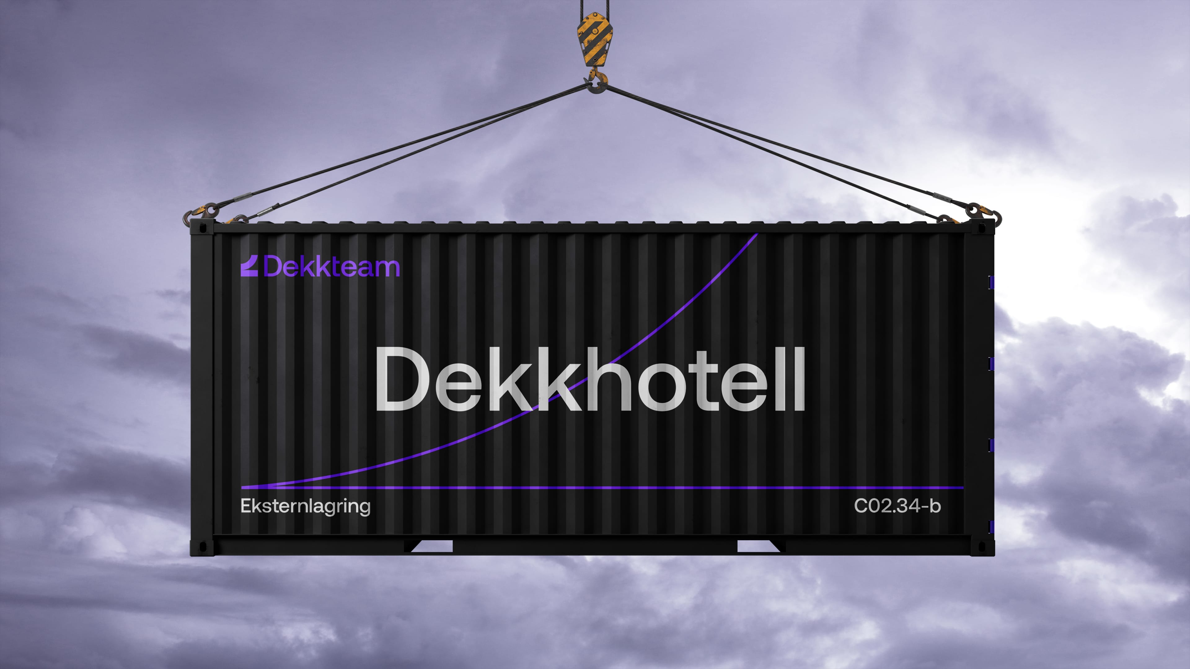
While all private customers have indoors storage, for a lot of the corporate clients such as the norwegian postal service, Dekkteam stores hundreds of thousands of wheels out of season in containers.
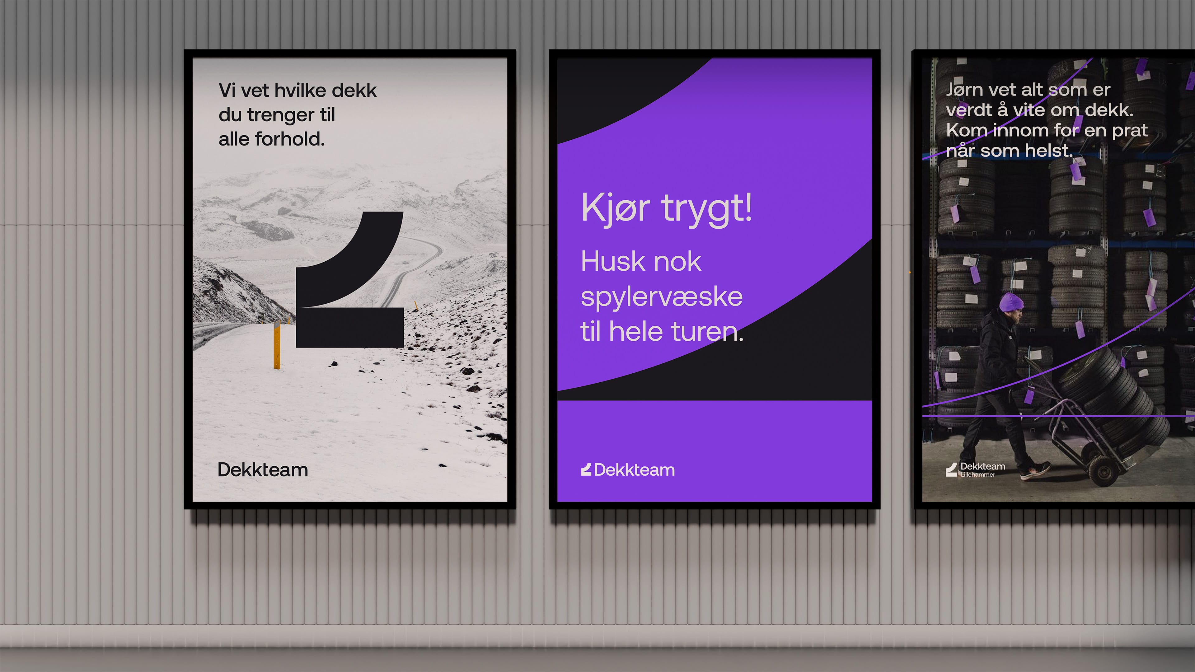
Posters for overarching communication, in-store tactical messaging and local campaigns that build relation between the local experts and the audience.
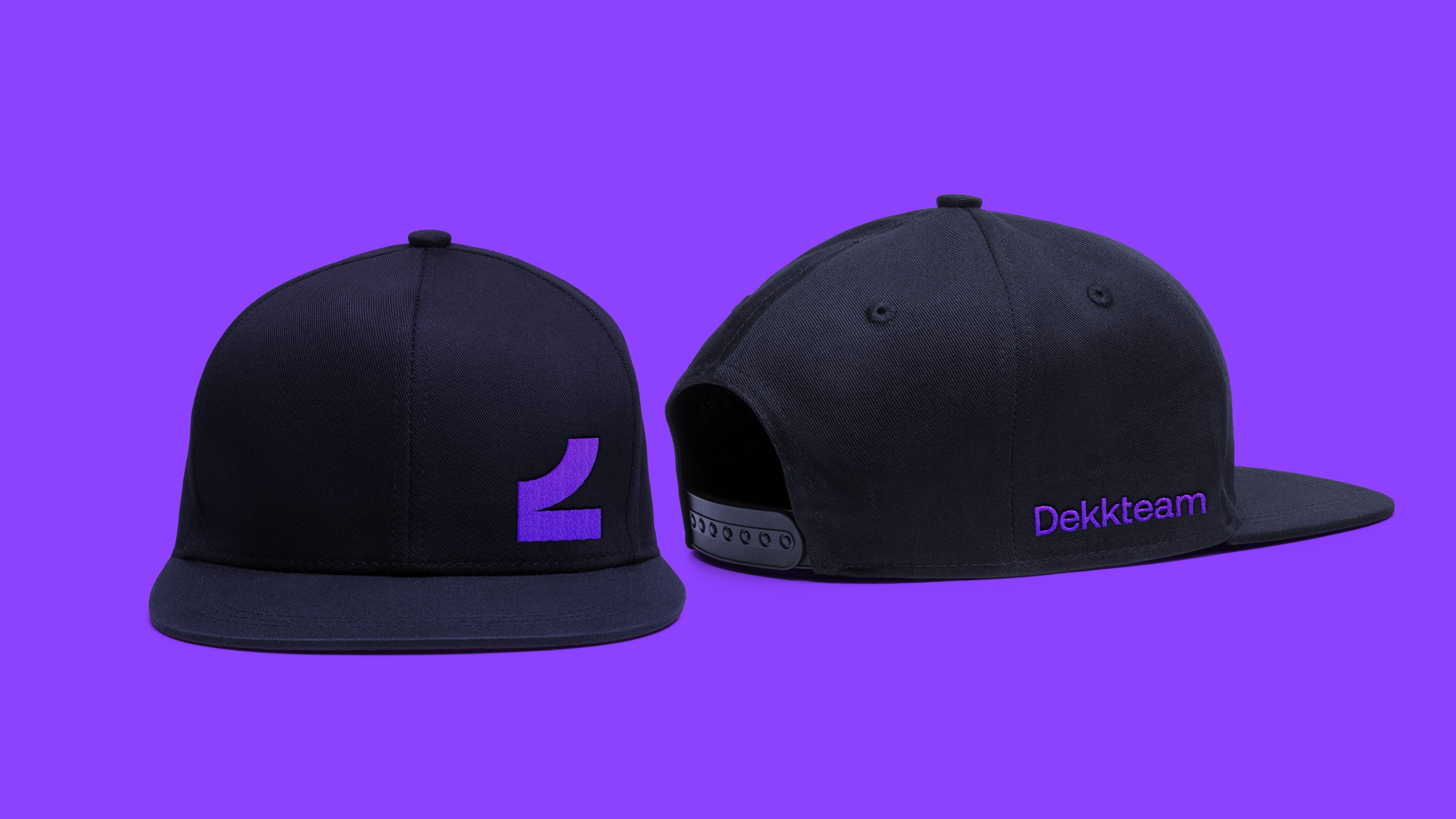
For employee outfits we let the symbol stand on it’s own, with the logotype more subtle, making the wearables feel more playful, less like an advertising billboard and more like something you would want to wear.
Did that peak your interest? If you want to know more about this case or simply talk design Get in touch!
Would you rather see some other cases?